We already spoke about character designer Nobuteru Yuki during the interview with the CEO of CyberConnect2 in IG 11. Renowned in the world of animation, he also did the character design for Tail Concerto and other video games. Namco Bandai called on him for Solatorobo, an action/RPG on DS that takes us into a fantastical world. Mr. Nakata (producer) and Mr. Yuki spoke to us at length about the design work on this title.
Why did you choose Madhouse for the cutscenes? Is it because Nobuteru Yuki has often worked with them?
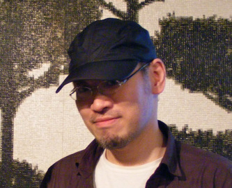
R. Nakata: Actually, they were two independent decisions. On the one hand, we asked Nobuteru Yuki to work on the character design. On the other, it was the production unit that asked to work with Madhouse for the animated cutscenes. These decisions were moreover made by different people.
Mr. Yuki, you have worked on many console titles for over ten years. Have character design working methods evolved a great deal?
Nobuteru Yuki: As a designer, I can tell you how I feel. A huge number of things have changed between yesterday and today. The main difference comes from the way the story is highlighted. Before, people mainly used designs that recalled fashionable manga or anime. It was very stylized. Today, we tend to see titles with a realistic graphic style that is quite far from what I am used to doing. Some companies like Namco Bandai continue to collaborate with famous manga artists and character designers to make series like Tales of. But most publishers prefer to release titles with photorealistic graphics. My feeling is that it is nevertheless more difficult to tell stories with realistic graphics. As a Japanese person, I have less desire to go on an adventure with a character that corresponds to reality than with a stylized hero who reminds me of a manga. In my character design, I continue to give a fantastical, stylized look closer to manga. Young people today probably find this style a bit dated, but I think it is important to detach oneself from what already exists by offering something more fantastic and different in terms of visual identity.
At E3 2011, Square Enix, a Japanese publisher, presented almost only titles made in the West with this photorealistic graphics. Do you regret that?
N. Yuki: Actually, as a user, I quite like this type of game with those realistic aspects. On the other hand, from a developer’s point of view, I find it really unfortunate that it is not possible to dig deeper into the visual identity of titles so that they stand out more from one another. Let’s take an example: place a Metal Gear character in a Resident Evil: no one would be shocked. Yet they are two games from competing publishers. I find it really sad that everything looks the same. What I regret most is the standardization at the graphic level.
Do you still have time to play action/RPGs?
N. Yuki: I still play, but it’s true that compared to before, I do so much less because the internet takes up a huge amount of my time.
How did you start in video games?
N. Yuki: I didn’t do much to work in it. In reality, it was Squaresoft who approached me to handle the character design for Seiken Densetsu 3.
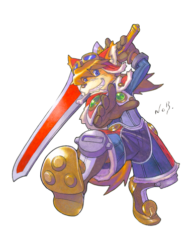
I thought you had done illustrations before that title.
N. Yuki: If you’re thinking of Brandish [editor’s note: action/RPG released in 1994 on Super Nintendo], I only did illustrations for the covers and marketing images. I did not take part in creating the game.
Was your first experience at Squaresoft very different from what is done in animation in terms of character design?
N. Yuki: When Squaresoft approached me, I had already moved somewhat away from animation. After Record of Lodoss War, I had paused my activity as a character designer to draw my own manga. I think that is what attracted the people at Squaresoft. They knew Lodoss, but for Seiken Densetsu 3, I was able to use the style I have in my manga [editor’s note: Vaelber Saga, published in France by Kraken in 1995].
Manga is rather solitary work, whereas video games require teamwork. Which do you prefer?
N. Yuki: I don’t really know. It’s true that when I was doing my manga, I was a little sad and felt lonely. I would say to myself: “Why do I have to do this very painful thing alone?” Even if I had assistants, I found it a very difficult and solitary job. I then really missed the atmosphere of animation, where many of us were drawing and laughing in the same office. So I think I prefer teamwork!
In Tail Concerto and Solatorobo, the characters are anthropomorphic animals. Can we see the influence of Miyazaki’s Sherlock Holmes there?
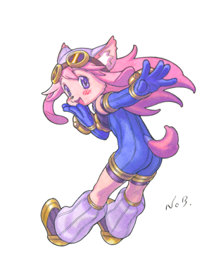
N. Yuki: I am obviously a big fan of Miyazaki, but my main inspiration for this kind of character comes from Osamu Tezuka. Moreover, I didn’t absolutely want to do animal men; it was rather one of the constraints of the commission.
How did you decide on the art direction for Solatorobo?
R. Nakata: As you can see, there were many prototypes, and the team didn’t know which style to settle on. [Editor’s note: the producer spreads out on the table numerous explorations with styles ranging from Clone Wars to the Franco-Belgian line to the most kawaii manga.] The designs and production were well advanced, but the visual identity still was not. It took us some time before we realized that we were in a dead end and that we had to call on outside opinion. Among all these designs, this one was the most satisfying, but we were only 70% convinced. So we had to find someone capable of convincing everyone 100%. Mr. Yuki therefore started from this base to rework all the designs.
Does that mean there was essentially a sorting and finishing job?
N. Yuki: Absolutely! Nevertheless, if you take the different images from the game, I did not work on all the illustrations. For example, the small panels showing the characters’ faces when they speak were drawn by someone at the CC2 studio based on my character design.
So my role should not be exaggerated, because the game was already very advanced. I contented myself with refining the elements and delivering the final versions for each character. I also directed the production of the animation.
So it’s very different from what you did on other titles…
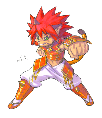
N. Yuki: Each game is indeed a different situation, and I don’t intervene at the same stage of production.
In the case of Chrono Cross [editor’s note: released in 1999 on PlayStation], Mr. Kato, the game director, had made preparatory sketches of the characters, and other explorations had been carried out by the internal teams at Squaresoft. But production was much less advanced than for Solatorobo: the game system was not at all finalized. So I redid the characters and delivered a character design thought out in relation to the scenario, which had been finalized long before. And it was according to the design and the scenario that the game system was then created.
Video game development is a very long process. For me, the only thing that really changes from one project to another is the moment when my services are called upon. The work of character designer itself ultimately remains fairly similar, whatever the games.
Do you have any input on the modeling of the characters?
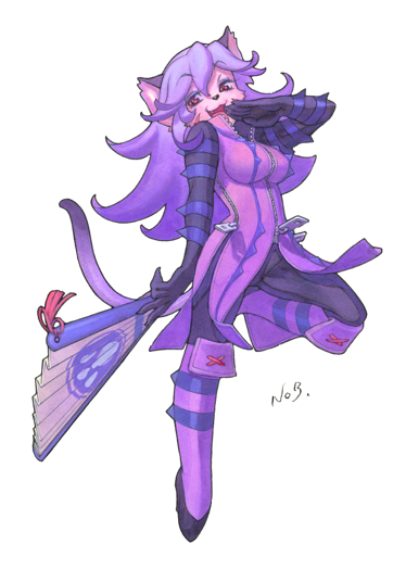
N. Yuki: That’s not possible, and in any case, we can’t change much. In the case of Solatorobo, the polygons don’t have many facets, and given the screen size, we do our best to make it readable. It is difficult to add things to already very simple models so that ergonomics are optimal. If I had allowed myself to say that an element should be added here or there so that it corresponded more to the drawing, that would have disrupted the development of the title, because everything had already been thought out to optimize the console’s resources. We could not afford to detail things too much, unlike what was done in Chrono Cross.
R. Nakata: We showed various modeling examples, but he was not the one who handled it. He was able to comment on it because when he had finished redoing the character designs, they of course no longer matched the models initially created. So the modeling had to be entirely redone from these designs. But he did not supervise it.
In the character designs, the hero is always in red. Why?
(Laughter)
N. Yuki: It’s traditional! It’s Red Force [editor’s note: Japanese superhero] in Toei’s sentai series. Each time, he is the team leader and the main hero. That has shaped the collective unconscious.
R. Nakata: In the case of Solatorobo, the game has a fairly complex scenario and is very science-fiction oriented. However, we did not want to scare children who might play it, and that is why we used the red color code so that the audience understands very quickly who the heroes are. We declined the basic colors: blue, white, and red with a little green and yellow. In other words, even if you look quickly at the illustrations featuring the characters, you know that he is the hero because he wears its colors!
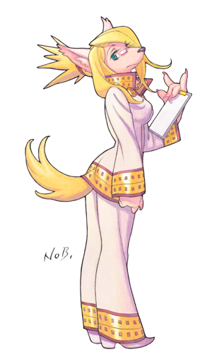
Since the designs were redone, did the characters’ colors change a lot?
R. Nakata: Mr. Yuki was consulted for all the characters, and he changed certain colors to better differentiate them. Initially, some pairs of protagonists were in black and white tones with blue lines. To better distinguish them, he added pink to the female character. Likewise, a certain character was initially all in black, and he asked for certain parts of the costume to be white, judging that it would have more impact with that hue.
N. Yuki: My role was to change the elements that did not seem correct or effective to me. I did not rework everything but simply modified the hues that did not seem adequate to me. When the color codes seemed right to me, I changed nothing.
How much time did you spend on this title?
N. Yuki: Two years! (Laughter.) On the one hand, I had to redraw everything, and that took a certain amount of time. On the other hand, as I was art director on the animation, I also spent a lot of time on that production.
Doesn’t it break your heart to have made superb animations when they are only seen on the DS’s small screen?
N. Yuki: Actually, I don’t think about it too much, because in Japan the animations were distributed on DVD to be seen full screen. As for Europe, we’ll talk to Nintendo about it!
The official character illustrations are made to work individually and as a group. How do you go about creating them?
N. Yuki: It’s true that I have to make sure all the character poses go together once they are all gathered. That is why I always start with the hero’s pose. Thus, the other characters can come into the background more easily. The pose has to work whatever character the hero is placed with. Then each attitude must highlight the particularity of the character compared to the others, their character traits. I started by drawing the three basic heroes, and each corresponds to an archetype and a color. From there, I worked on the other characters and made sure their poses never resembled those three attitudes.
By doing character design, don’t you fear recreating the same poses game after game?
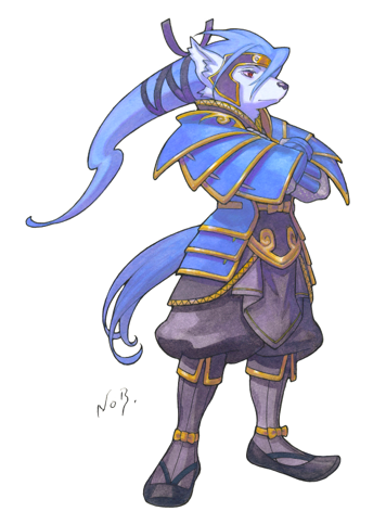
N. Yuki: I try to make sure that doesn’t happen, but it’s true that sometimes I’m drawing and I say to myself: “Ah, I think I’ve already done that!” And then I have to start over.
So, for a video game, a pose equals a precise character.
N. Yuki: Yes, that’s what I aim for. In fact, that is what distinguishes character design for a game and for animation. When I create model sheets [editor’s note: visual identity sheets intended for animators] for animation, the characters are in the most neutral poses possible so that the animator can see all the details of the body in order to draw it from any angle. On the other hand, for a video game, the illustrations are above all meant to present the characters, to make you want to play. So you have to understand who they are at a single glance. That is the main difference between the two media.
On the cover, the hero has a static pose, whereas in the official illustrations, the attitude is much more dynamic. Why did you make that choice?
R. Nakata: I don’t know where you are in the game, but you should know that at some point, the animal heroes transform into humans, a bit like in the case of transformations where a character becomes stronger. However, with the usual illustrations, you can’t realize that, and you might think it is simply a game with animals.
For the cover, we commissioned an illustration, and Mr. Yuki made that image, which we used for the Japanese version. The marketing and communications department then asked for another image so that the dramatic dimension of the game could be seen, and that is why he created this second illustration, which appears on the cover of the European versions.
N. Yuki: It’s true that when I was asked for a cover illustration, I did that because I wanted something joyful and light. But the intention was also to show that the game has a serious scenario.
R. Nakata: In Japan, the emphasis was on adventure and escapism, whereas at Nintendo’s request, in Europe, the communication focuses more on drama and the scenario.
Leave a Reply