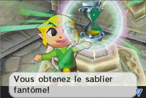
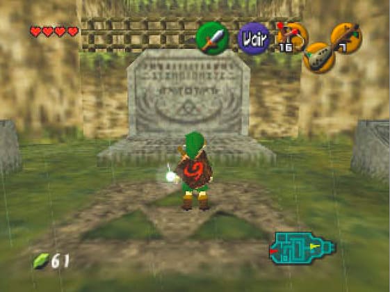
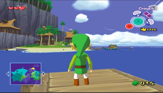
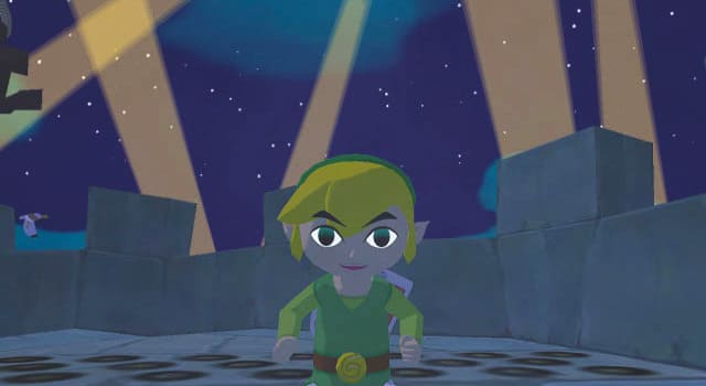
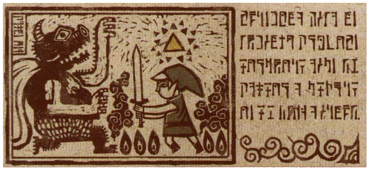
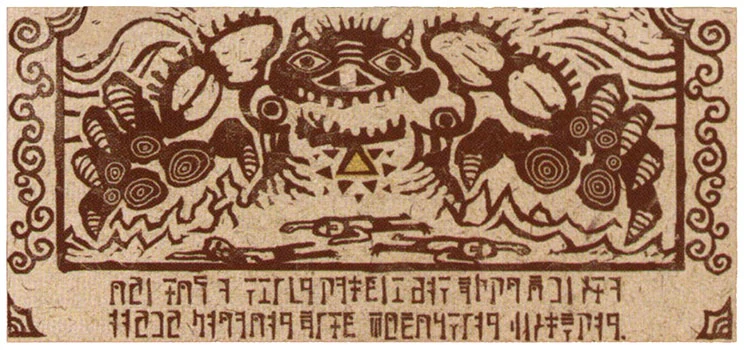
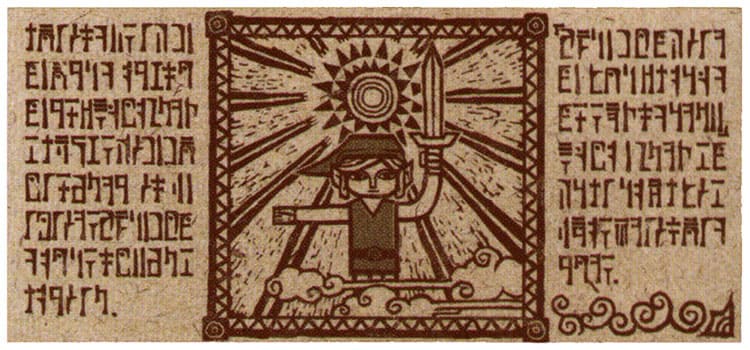
In the earliest video games, the notion of time was not really important. Space Invaders, for instance, was an endless game, where only the player’s death stopped the arrival of a new wave of invaders to be destroyed without any time limit. In Zelda, the notion of time somehow appeared in A Link to the Past. Over the course of the episodes, time took on growing importance in both gameplay and narrative. And it is no accident that the notion appears in the titles Ocarina of Time and Phantom Hourglass…
Day and Night
When video games were still pixel art, it was relatively difficult to create environments that changed over the course of the day. In A Link to the Past, nevertheless, it is at night that atrocious events unfold, throwing the hero into the adventure. Link is indeed awakened in the middle of the night by a telepathic message. In case the notion of night was not clear enough for the player, Link must take a lantern to venture outside. He must save Princess Zelda and take over from his dying uncle, who entrusts him with the essential gear of the hero: a sword and a shield.
In the first Game Boy game, it also seems to be at night that the shipwreck takes place, bringing Link to the mysterious island. The adventure likewise begins with an awakening. But this time, it is Marin who welcomes the hero, not Zelda’s voice.
Since, in the collective imagination, night is always associated with anxiety-inducing elements, it is not surprising that fateful events take place in dark moments.
Subsequently, as console power increased, Ocarina of Time offered the player the ability to switch from day to night through the effect of a simple melody. Thanks to the Sun’s Song, which is deciphered in the Kakariko cemetery, it is possible to switch from day to night instantly. It doesn’t seem like much today, but at the time it was revolutionary and had a magical quality to it. Seeing the world at night was a discovery.
In The Wind Waker, the Sun’s Song is played with the baton but gives the same result. It is very handy because certain creatures are sensitive to daylight, and certain events only take place at night, or vice versa. Thus, one must wait for sunrise to see the drawbridge of Hyrule Castle lower.
The addition of the day-night alternation makes it possible, on the one hand, to make the game a little more immersive by drawing closer to the real world where this cycle exists, and, on the other hand, to add gameplay elements for puzzles.
Transformation
This idea was already in germ in the first Zelda, since Link alternates between the surface world in broad daylight and the caves, which often require using a candle to see in the dark.
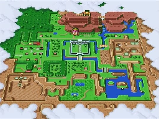
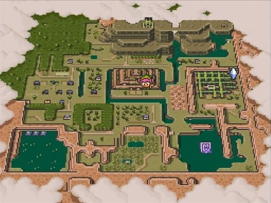
The same opposition between light and darkness is found in A Link to the Past, where the two worlds exist as such and are linked by magic. But to pass from one world to the other, one needs a Magic Mirror and a Moon Pearl so as not to change appearance in the Dark World: it is quite difficult to defend oneself once transformed into a pink rabbit…
The idea of transformation when in darkness is taken up again in Twilight Princess. This time, Link is a wolf and must find a way to free Hyrule from an eternal twilight. When he manages to rid an area of the insects of Darkness, he can regain his human appearance. Once in possession of Excalibur, he can transform into a wolf at will, which has many advantages, as his sense of smell is multiplied tenfold.
Limited Time
If the integration of the day-night cycle into a video game took some time, the notion of limited time, on the other hand, very quickly became popular with gamers. Performing an action within a set time amounts to taking on a small challenge, and we know that challenges are at the heart of many titles. This limited time also makes it possible to create a sense of urgency and to stress the player.
From the very first Zelda, candles have a limited duration, and the necessary actions must be completed before they go out. In A Link to the Past, the final battle requires dexterity and speed from the player, who must constantly relight two torches so that the enemy can be wounded.
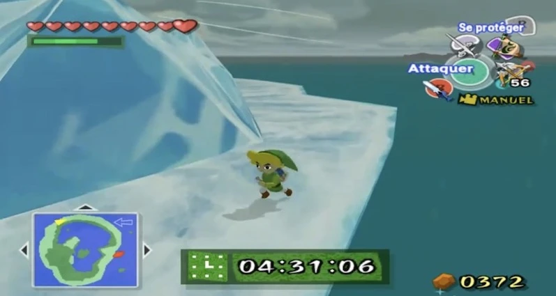
Beyond the light that goes out and gives the game a believable quality, other elements can legitimize limited time. In The Wind Waker, Link must reach a specific area in under five minutes on the Frozen Island, failing which he is transformed into a giant ice block.
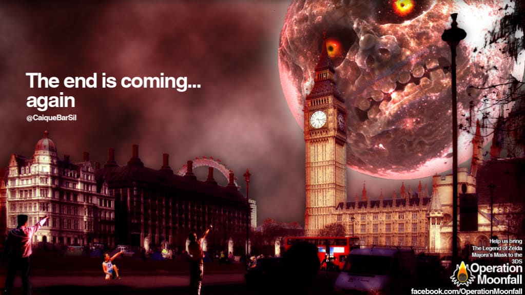
But the two titles that most emphasize the notion of limited time are Majora’s Mask and Phantom Hourglass. The first takes place over three days that repeat until Link manages to thwart Skull Kid’s plans. These seventy-two hours correspond to far less time in the real world, and a clock constantly keeps you informed of the time slipping away.
The alternation of day and night only heightens the sense of urgency and of time passing. Many small mini-games, also timed, increase the player’s stress. As for the various inhabitants of this world, they have an unshakeable schedule, which allows you to choose the right moment to see them once you have crossed paths with them for the first time.
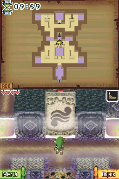
In Phantom Hourglass, the central dungeon is also timed, and Link must collect grains of sand for the magic hourglass that allows him to survive longer in this Temple of the Ocean King. And since you must go through the same levels several times, the stress is even greater: you have to run through the areas already visited so that you then have time to make mistakes and explore the new levels.
Clearly, these game mechanics were perceived by a majority of players as too stressful, and they are less present in the other Zeldas.
Growing Up?
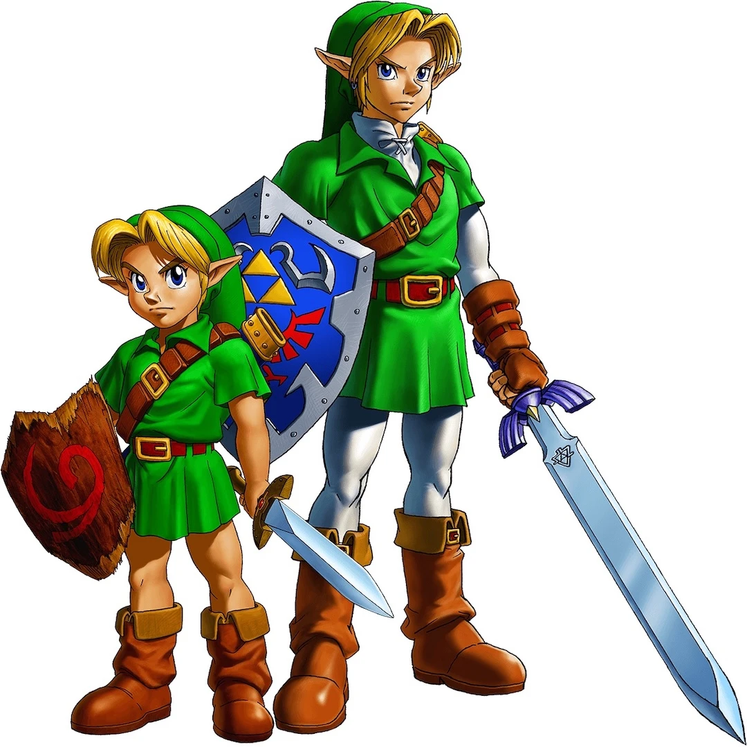
Beyond the alternation of day and night, Ocarina of Timeplays on the chronology of the imaginary world in which the story takes place: Link can indeed become an adult or turn back into a child at will thanks to the Ocarina of Time, which allows him to move forward or backward by seven years
Here too, the game seemed magical to those who discovered it upon its release. For the youngest, who watched Japanese animated series on television, there was the magical girl genre, notably Mahō no Purinsesu Minkī Momo, a little girl who transformed into an adult thanks to a magic formula.
Through Ocarina of Time, one could have the impression of transforming thanks to the interactive nature of the game instead of simply watching the metamorphosis. Older players found another form of satisfaction in it: that of remaining eternally a child if they so wished.
Depending on the location, the small size of child Link becomes an advantage or a disadvantage. At the level of the plot, one discovers with interest what has become of the places traversed a first time through a child’s eyes. This helps give a little more depth to the secondary characters and allows the player to have more empathy for them.
In The Wind Waker, the passage of time is an even more important theme: Link must revive the sages of the past through the young people he encounters. The imaginary world thus acquires a history and an evolution of species, which contrasts with the kingdom of Hyrule, where time is suspended to prevent Ganondorf from seizing the world.
In Spirit Tracks, fans can also see the time elapsed between the two cel-shaded DS games, since one finds descendants of the characters from Wind Waker.
These titles are in some way a celebration of youth and its potential. At the end of the GameCube game, the king agrees to die to leave the future to the children. Moreover, The Wind Waker and Spirit Tracks begin with a symbolic date marking the passage to adulthood: twelve years for the inhabitants of Outset Island, the day of the graduation ceremony in Spirit Tracks.
Ultimately, the relationship to time has become one of the elements that form the essence of Zelda. The series is almost a nostalgic saga about a childhood full of promise in an aging Japan where Aonuma struggles to find an echo among the new generations.
Unfortunately, Miyamoto’s magic garden also seems to have difficulty convincing Western children, who seem more inclined to kill zombies and aliens than to explore the world.
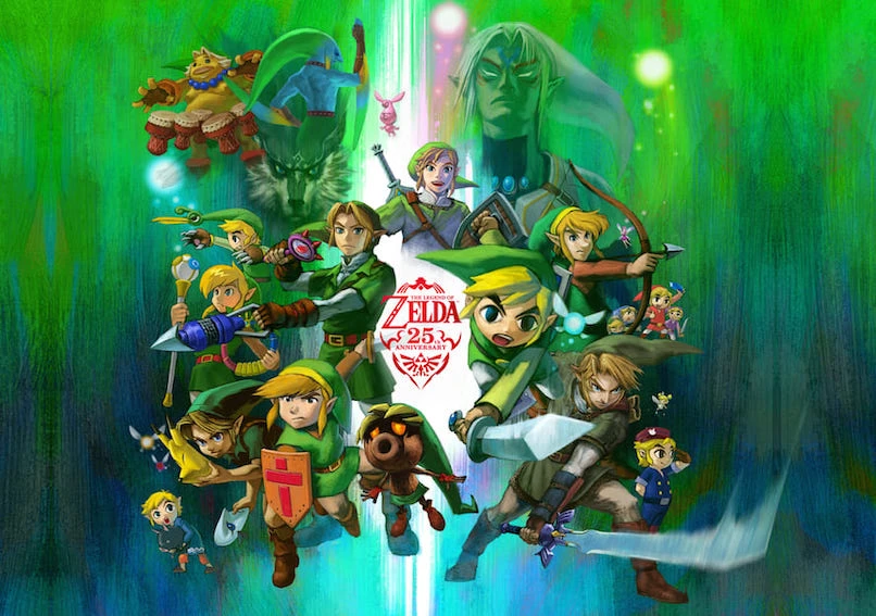
After twenty-five years of existence and many very different installments, one may wonder what constitutes the essence of Zelda. Is it a story with a little green man who isn’t even allowed to be named in the title? Is it a particular form of dungeons and gameplay? Is it a series of sounds that return in every episode? What is it that makes us ultimately replay the same game and enjoy it?
The first documents relating to the video game The Legend of Zelda date from 1985. At the time, there was simply the word “Adventure” on the folder gathering the few sheets detailing the game. Among them were the progression through the adventure and the dungeons, the number of dungeons, the items, and the enemies.
Zelda is directly linked to Mario, which was also an “adventure.” Gameplay elements not used in the plumber’s title were often reused in the action-adventure game. The creators of these two games were nicknamed “the Golden Triangle”: Shigeru Miyamoto, Takashi Tezuka, and Toshihiko Nakago.
They developed Zelda while working on Super Mario Bros. And as with Mario, the documents show that from the outset there was a global vision of the game, giving it coherence, and a direction that did not change along the way.
Dungeons Without Dragons
Miyamoto never bothers with a story, because what interests him above all is gameplay and the pleasure derived from the video game itself. That is why the kidnapping of Princess Peach in Mario or of Zelda in the eponymous series is a mere pretext for adventure.
The RPG side of the first Zelda is negligible, and apart from the archetypal roles (hero with a sword, dungeon, princess) and the setting, ultimately little distinguishes Mario from Zelda. There is so little difference that in Link’s Awakening, when the character is in an underground passage, Link appears in profile view in platforming sections similar to those found in Mario.
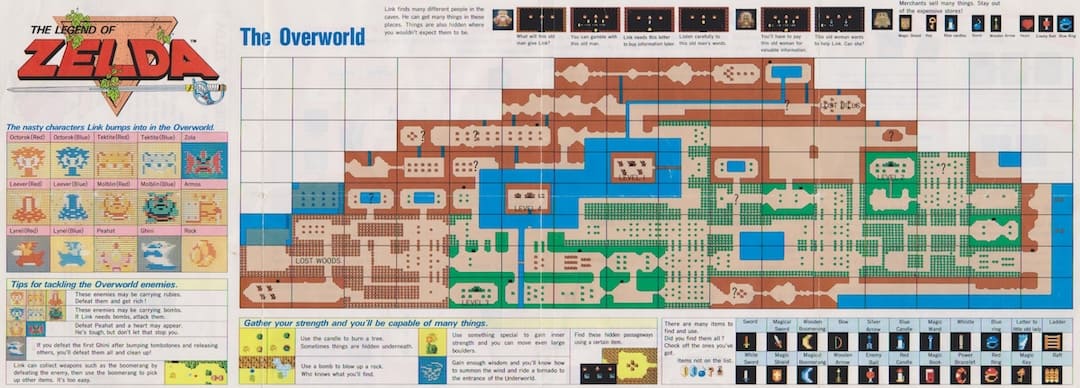
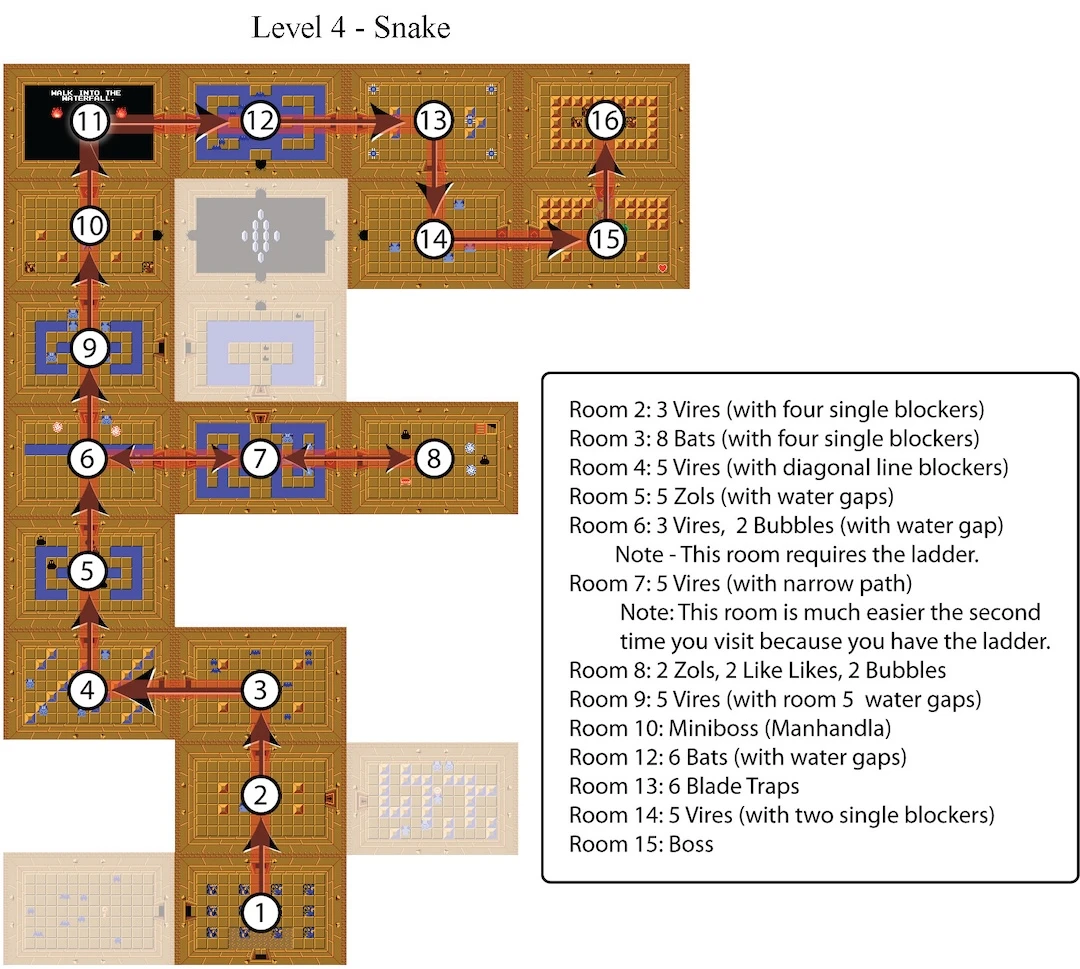
In the first Zelda, when Link has full energy, he can thrust his sword forward to kill enemies, somewhat like Mario throwing fireballs when he temporarily acquires that bonus. You are thrown abruptly into the game and must fend for yourself in a vast world full of enemies, going from cave to cave and killing other enemies… At the limit, the surface world is merely a vast corridor connecting the dungeons, the places where the adventure truly unfolds.
At the time, memory space had to be truly economized, and the team made sure that all the rooms of all the dungeons fit into a single rectangle, with the shapes of the dungeons fitting together like puzzle pieces.
Following an error, since in the end everything fit in less space than expected, the remaining space was devoted to creating a second quest (to be played once the game was finished) with other dungeons and other puzzle shapes. That shows just how much these places are at the heart of the first Zelda.
In Zelda III, moving from the Light World to the Dark World allows you to rediscover the same places in a new light. In Ocarina of Time, the same device is achieved by letting Link explore the same locations sometimes as a child, sometimes as an adult. These games with time have now become part of the essence of the saga.
In the draft of Ocarina of Time, the game almost became a single, unique dungeon: Ganondorf’s. In the manner of Princess Peach’s castle in Mario 64, it would have been possible to move from one room to another and from one universe to another. Link would then never have left the dungeon. Fortunately, the final game is quite different, and exploration plays a significant part in the pleasure associated with this title.
In Majora’s Mask, the entire world became a dungeon that you continually replay until you manage to solve all the puzzles and prevent the moon from crashing down. In an interview, Aonuma specifies: the game is
“like a big dungeon in itself, probably the biggest ever designed for the Zelda series, and it was very difficult to design and balance the progression.”
As for the three cel-shaded Zeldas, they place the dungeon at the center of the imaginary world and the gameplay, since you are invited to go there regularly to progress floor by floor up to the final battle.
Staging the Learning Process
Beyond the omnipresence of these dungeons, each location offers the same type of progression with three recurring items: map, compass, and keys. The player explores the rooms and navigates using the map so as not to miss any rooms. The compass essentially serves to find the boss room, and the keys add a constraint that requires going through the same places several times (something very important in the early episodes to save memory and extend playtime).
Another recurring element: each dungeon offers a new weapon halfway through. The second half of the dungeon allows the player to learn how to use it so as to employ it optimally in the final fight against the boss. It is somewhat as if each dungeon were a new place of playful learning, a giant tutorial for an item that the player masters by the end of the level and can then combine with the other items collected in subsequent dungeons.
As Eiji Aonuma explains, the dungeon can also be considered as a play or a narrative in itself, with its initial situation, a major twist halfway through with the new weapon allowing access to places previously impossible to reach, and a final battle. Learning to handle the new weapon is thus inscribed both in the exploration of space and in a proto-story. From there to saying that the dungeon theatricalizes gameplay…
But those are very grand words that struggle to describe the pleasure of having a new weapon and discovering all the opportunities it offers. It is this particular joy that drives the player forward to find the next dungeon.
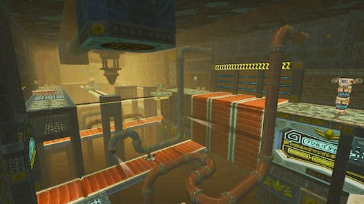
Ultimately, the video game Portal 2 merely gives an FPS and HD veneer to a concept initiated by A Link to the Past in 1991: a succession of rooms in a dungeon/a laboratory, progressive learning, and the joy of solving puzzles.
A Good (Chinese) Villain!
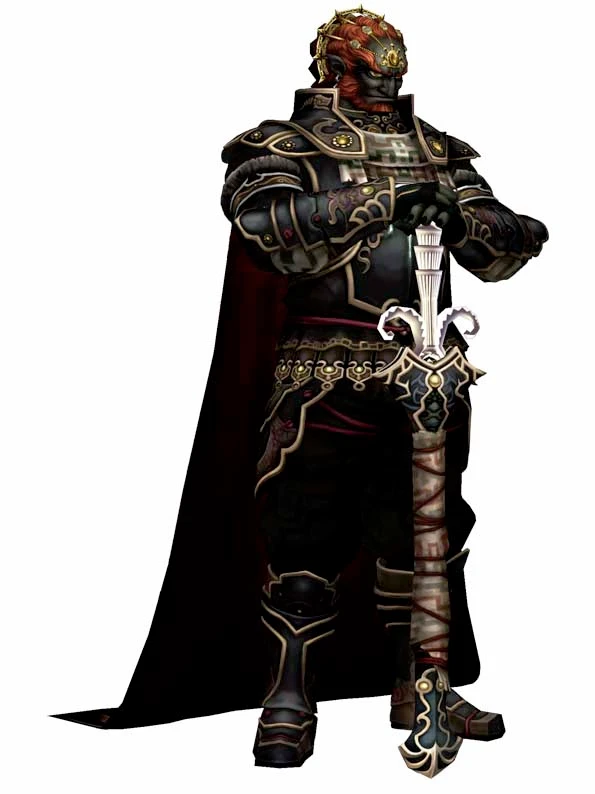
Apart from Link and Zelda, the recurring character of the saga is Ganondorf, an emblematic villain who can take many forms. If some lament always finding the same trio, for Aonuma and the Japanese developers, this group of characters constitutes an essential element of the Zeldas. He says on this subject:
“For me, it’s a little theater in which I tell new stories, I put in new set elements to surprise the audience.”
This recalls in many respects the commedia dell’arte, an Italian theater based on improvisation around archetypal characters who are found in other theatrical forms: Harlequin, Pierrot, and Columbine.
One could almost go so far as to compare the Zelda-Link-Ganondorf trio to the mythical figures that form Greek tragedies. Let us recall that the Greeks base almost all their theater on two cursed families (the Atreids and the Labdacids) whose exploits are played and replayed in different plays featuring the same characters and the same actions. Only the dialogues and the structure of the plays change.
Surprisingly, this seemingly Western trio includes a figure well known from Asian folklore. The first documents from 1985 contain a list of enemies, including the absolute villain who returns in every episode: Ganon. At the time, he was named Hakkai in reference to Cho Hakkai, the porcine general who accompanies the Monkey King in the Chinese legend of the same name (see IG 11, p. 186-189, Multiverse — The Monkey King).
In the novel from which these folkloric characters come, Hakkai bears the Chinese name Zhu Bajie or Pakai (豬八戒 or 豬悟能). He is a fallen heavenly general whose pig form bears witness to his disgrace. He is capable of thirty-six different metamorphoses and loves good food. But he loves women even more.
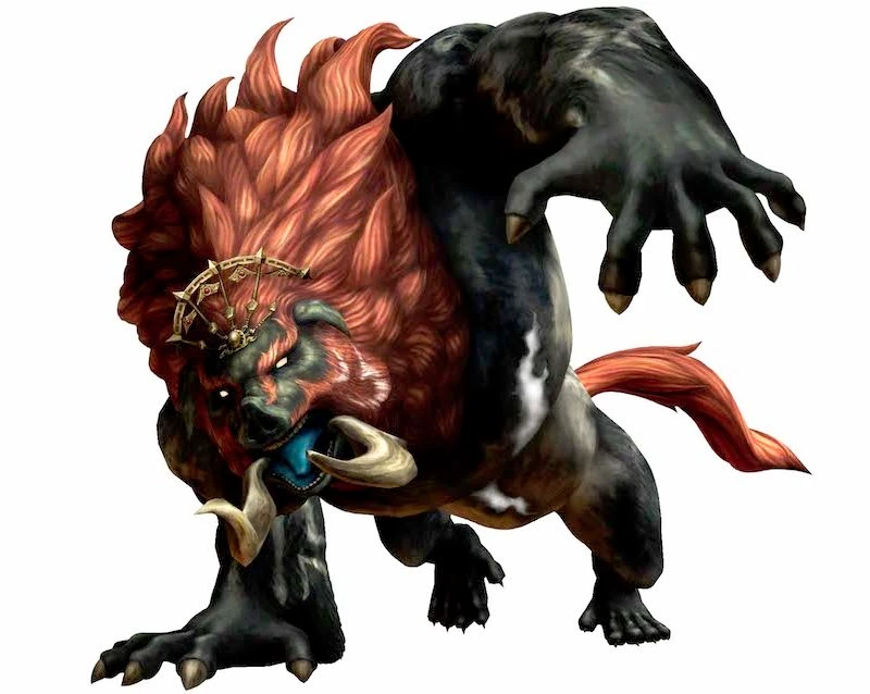
His various characteristics are found in Zelda’s “villain”: he always kidnaps the princess and possesses several appearances, and even several names, since Ganon corresponds to the animal form while Ganondorf would be his name when he has a more human aspect. Moreover, in several Zeldas, he uses a trident, a traditional weapon in legends, which was doubtless chosen because the kind of rake that the porcine general regularly brandishes in images related to the Chinese novel was more difficult to fit into a universe tinged with heroic fantasy.
It is doubtless because of this reference that the character has boar-like features in several episodes. Apart from this nod, there does not seem to be any other link between the video game and the Chinese tale. But it is quite funny to see that in a game taking up the codes of the Western RPG, the emblematic villain is linked to Asian folklore.
A Narrative in the Service of Gameplay
Gameplay, and more particularly the dungeons, are therefore the essence of Zelda. That is why the gallery of characters matters little at the beginning of the saga, and why it is used as archetypal figures similar to those of theater. This rule applies from the very conception of the games. The characters and the plot are created afterward in relation to game design constraints. It was because they needed a cursor to help the player find their way in the 3D environment that the fairy Navi was created in Ocarina of Time.
Likewise, the character of Midna in the video game Twilight Princess was created solely because Miyamoto found it boring for the player to have nothing but a wolf’s back to stare at during a large part of the game. They first placed a form riding on Link in his canine form before making it a talking character interacting with the world.
Similarly, it was because they needed a second character to have cooperative gameplay that they took Zelda and built the story to justify the fact that she is a ghost in Spirit Tracks.
In Ocarina of Time, it was because Miyamoto absolutely wanted Link to appear in the form of a child, even though the design of adult Link had already been made, that the teams developed two Links and found a plot allowing both versions to be played. The story always comes afterward to justify the game design choices.
And yet, over the course of the episodes, a mythology is built, and the narratives are increasingly successful.
Thus Zelda, who gives her name to the game, is at first only a vague pretext. Marin, from Link’s Awakening, has more personality than her and plays a more important and moving role. After this pivotal episode, the plots of the Zeldas become fuller and take on a more epic character or, in any case, manage to stir more emotion.
Princess Zelda becomes more autonomous in Ocarina. In the guise of Sheik, she helps you when you are an adult. In The Wind Waker, she is the tomboy Tetra. Is that why her name evokes the square and no longer only the triangle of the Triforce?
In Spirit Tracks, she has a well-defined personality, and in Twilight, Midna is a character who evolves between the beginning and the end of the story. Even if the narrative is not at the heart of the game, talented authors nevertheless manage to write credible stories and endearing characters. And over the years, that too is part of what makes a good Zelda. The little theater thus offers better dialogue and a more developed plot.
A Narrative in Action
In the majority of Western RPGs, the player begins by creating their character, defining their characteristics and appearance. In the video game as Miyamoto imagines it, there is nothing of the sort, because you go straight into the action and the character is created through interactions with non-player characters (NPCs).
Since the hero is not created by the player, the player discovers him through actions and by embodying him in the world of Hyrule. It is also because of this major inversion that storytelling in Zelda does not resemble that of other titles.
Miyamoto hardly likes cutscenes that interrupt the game and do not integrate with the gameplay. In any case, technically, it would have been difficult to include them in the early installments of the saga.
But over time, he eventually came around to Tezuka’s ideas, and secondary characters take on more importance in defining the hero’s place by contrast. Taking up Tezuka’s ideas, Miyamoto explains in an interview that he was also influenced by the series Twin Peaks (broadcast in Japan in 1991):
“I understood that telling a story interested me less than seeing many characters evolve around the main character and depicting their relationships. A few years ago, the series Twin Peaks was very popular. I watched it and found that the most interesting thing did not lie in the ins and outs of the story, but in the types of characters featured in it. […] I think these strange and unusual characters are interesting in themselves. I am more interested in their presence than in their personal story, in knowing who is whose cousin or whose parents and why they are sworn enemies, or when and where they come from. […] What is important is the role they play and how they contribute to depicting the main character.”
That is why you discover the narrative by playing, you understand the world of Hyrule and its mythology by talking with the characters, and the hero you embody takes shape by contrast with the words of others and with his own actions. And since Link does not speak, the place of dialogue and secondary characters grows in order to create, somewhat despite Miyamoto, an epic narrative.
One can therefore only salute the talent of Toru Osawa for the narrative of Ocarina of Time and all the subsequent scriptwriters for having been able to bring to life this world designed above all to be functional and in the service of the player character. It is therefore a way of creating and telling a story very different from what can be done elsewhere, but this form of storytelling also constitutes the essence of Zelda.
The Pleasure of Reunion
The last element, and not the least, that makes a good Zelda video game lies in the recollection of past episodes. Anyone who has played a Zelda knows that the villain is Ganondorf, that the pieces of the Triforce must be gathered, etc. They know it; there is no surprise at that level. They might even grumble and say that it is broadly the same game over and over again. But this variation on the same theme creates a particular pleasure characteristic of a good Zelda.
Let us take examples from outside video games. What fans of Sherlock Holmes appreciate is not so much the resolution of the cases but finding the same quirks in the character over the course of the stories.
What we like in the series House is not the curing of the patients but the doctor’s quips and his little habits. Umberto Eco theorized this specific pleasure by taking the case of serialized novels and modern TV series.
The serialized novel, founded on the triumph of information, represented the favorite food of a society living amid messages laden with redundancy […] In our contemporary industrial society, on the other hand, the alternation of parameters, the loss of traditions, social mobility, the wearing down of models and principles—everything is inscribed under the sign of an incessant charge of information advancing in brutal jolts, constantly implying readjustments of sensibility, adaptations of psychology, requalifications of intelligence. The narrativity of redundancy thus appears here as a gentle invitation to rest, the only occasion for real relaxation offered to the consumer.
Umberto Eco, De Superman au Surhomme, Paris, Le Livre de poche, 2005, p. 137
In the Zelda video games, we find this “narrativity of redundancy,” this particular pleasure of finding oneself on familiar ground while being surprised. It is somewhat the same thing in the Final Fantasy series, where Moogles necessarily appear, a character named Cid, etc.
The world of Zelda may doubtless seem a little curious compared to the standards of the Western RPG. Isn’t it a little too naive with its twelve-year-old kid who saves the princess from the villain every time?
But what makes its essence is doubtless also what makes it a good video game: the preponderance of gameplay.
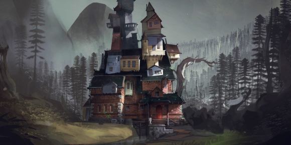
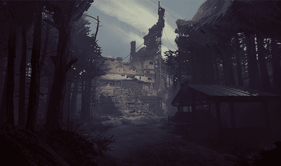
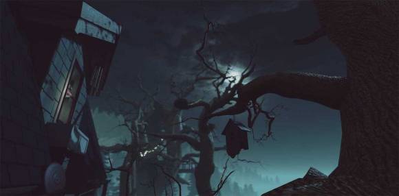
While writing my book on Indie Games, I have the chance to interview Ian Dallas. He answered a lot of questions and some of the answers were not published. Here is a part of the interview dedicated to What Remains of Edith Finch.
Inspirations for What Remains of Edith Finch
Did Dear Esther or Everybody’s Gone to the Rapture inspire you for What Remains of Edith Finch?
Ian Dallas : I think for both games we took a bit of inspiration.
In the case of Dear Esther, I was impressed by how little of what we think of as traditional gameplay you could get away with and still have a coherent, engaging experience.
Because just entering a new world and walking encompassing, looking at things, is already a very rich interaction.
In the case of Everybody’s Gone to the Rapture, I think for me, as a player, I wanted more interactivity.
For players who are more story-focused, I think that game works beautifully, but for me personally, I think that game felt larger and lusher than Dear Esther.
So I found myself wanting more to do as a player than walk around and investigate.
They’re both very interesting, thoughtful games, but I found the more constrained framing device of Dear Esther was a better fit for a world with limited interactivity.
Characters and gameplay
In the game, each room is like a puzzle representing one person. How did you define the objects or the layout of elements to create this personification through the environment?
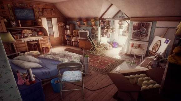
Ian Dallas : In each bedroom, we had three primary goals:
convey a high-level, archetypal sense of this character (e.g., “child star”),
show their name as many places as possible (e.g., “Barbara”),
and give players a sense of what year this is (with technology, photos, calendars, etc.).
Just trying to hit each of those goals was a big challenge.
Each room went through several complete redesigns, often based on playtest feedback with players getting distracted or missing elements.
So, in terms of personification, it wasn’t a primary goal.
It was something that emerged as we spent more and more time in these rooms and tried to find ways of solving our primary goals in ways that were appropriate to that character and time period.
What prompted you to give different gameplay for each character?
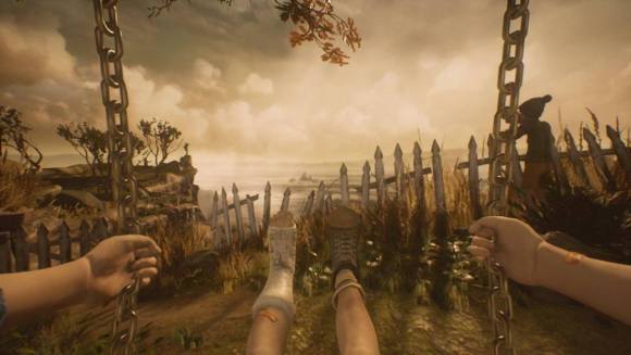
Ian Dallas : Our focus was always on the experience of how it feels to be in a given situation (e.g., being a child on a swing set), rather than focusing on things like the character’s themselves or the overall story.
So, each story began as a basic mechanic that explored some feeling, like flying a kite on a beach.
And it was only after those prototypes started to feel cohesive that we began worrying about any other elements of what it would take to tell that story.
Interfaces in What Remains of Edith Finch
The text is displayed creatively on the screen (i.e., it floats in the air, appears written in a comic strip, takes the shape of a road). How did you get that idea?
Ian Dallas : I think originally it was an idea that was cut from our last game, The Unfinished Swan. We wanted to have a chapter set in an enormous library.
And once we had basic 3D text working, we realized that in addition to being inherently interesting, it was a way for us to solve lots of other problems.
Chiefly, it was a way to encourage players to look in certain directions, to highlight things they might have missed.
It also gave us a chance to add life and movement to the house, which was otherwise fairly static, since it’s been abandoned for many years.
Lastly, in some cases like in Gus’ story, the letters were a way for us to introduce somewhat game-y feeling conceits (pick up all the letters with your kite) but not break the reality of the world.
The moving letters also fit nicely with one of the major themes in the game: the way in which familiar, human elements transition into more monstrous, organic ones.
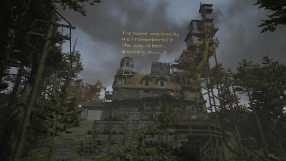
Like the way the Finch house looks fairly normal for the first two floors, but then becomes increasingly ramshackle, or the way the number and size of book stacks in the house hits a tipping point where they start to feel obsessive and surreal.
We’re accustomed to looking at hundreds of letters on a page, and it seems quite ordinary, but as soon as they all start to move, the letters go from being quite human to something more like ants or fireflies.
Emotions in What Remains of Edith Finch
Even though the game represents different deaths, there is a lot of humor. How did you manage to tweak and blend all these feelings?
Ian Dallas : It was important to me that the game not feel depressing because I personally don’t see death as being a sad thing. It’s just a fact of life.
And when players hear that it’s a game about death, the first reaction for many people is that this is going to be something dark or dreary.
At the same time, we wanted to hit a tone that felt respectful, to help players see these characters as human beings and empathize with them.
The tone of the writing bounced around quite a bit during development, particularly for Edith’s VO, which had the least constraints in terms of needing to tell a story.
Ultimately what we found after play testing and hearing players talk about their experience is that players brought a ton of seriousness and gravity with them.
There was no need for us to emphasize that, since the context established enough in the air already, which left us free to have a lighter touch and introduce quite a bit of humor and whimsy.
The ending is surprising because it makes you think about death in an unusual way. Is the game your way of mourning and celebrating the dead?
Ian Dallas : More than anything, the game is my attempt to encourage players to think about death at all.
It’s amazing to me how many people go through life with the sense that they’re never going to die.
Not literally, obviously, everyone knows that someday they’ll die and that their family will die, but when it happens, it still comes as such a huge shock.
By creating 13 very distinct family members and showing players how each of them dies, the hope is that at least one of these characters and perspectives feels familiar enough that it reminds them of something in their own life so that by the end it’s not just a game about a family that died, it’s a reminder that someday each of us is going to die as well.
At a time when entertainment saturates our screens and media compete for our attention, the first pages of a manga take on decisive value. They form the incipit: that threshold which must simultaneously plunge us into a fictional universe and hold us long enough to make us want to keep reading.
The term comes from the Latin expression incipit liber, “here begins the book.” Far from being a simple opening sentence, the incipit is a strategic place, a kind of “door” between reality and fiction. According to Andrea Del Lungo in L’Incipit romanesque (2003), these first lines constitute a narrative object in their own right: they must orient, seduce, and legitimize the story. But if this principle holds for the classical novel, it becomes a matter of survival in manga.
Please or Perish
Manga is indeed a serial art, subject to the merciless logic of weekly rankings and the Japanese publishing market. Where the novelist has many pages to establish atmosphere, the mangaka has only a few spreads. The first chapters function as pilot episodes: if they do not captivate immediately, the series risks cancellation. The incipit is therefore not merely an introduction: it is a promise of longevity.
In a sense, every artist is a kind of Scheherazade. Facing the sultan that is the reader, they must constantly rekindle the desire to read, for a narrative that no longer captivates is a condemned narrative. Storytelling thus becomes a survival strategy. Scheherazade tells stories to reach the morning; the mangaka hooks to keep the series alive. The heroine lasted a thousand and one nights; some authors have exceeded a hundred volumes of manga.
But can one really dissect a manga incipit without ending up repeating the same admiration for the authors’ stratagems? Isn’t that spoiling the pleasure of reading?
It is on this fragile and fascinating terrain that this blog wishes to settle. Leaving behind the paths of “great literature” to explore the graphic and popular narrative arts, we will analyze these mechanisms of immersion. How does a mangaka manage, in about forty pages, to seduce through rhythm and style while establishing the rules of the world and the stakes? How does the incipit become the construction site where a universe and the invitation to enter it are built simultaneously?
Welcome to the analysis of first moments, where everything is at stake.
Current Explorations
For now, I have mainly written down ideas in no particular order about the incipits of several manga: Naruto, My Hero Academia, Kaiju No. 8, All You Need Is Kill, Demon Slayer, Haikyuu, and Food Wars.
My guiding thread is simple: to see how these works inscribe themselves in a tradition in order to subvert it. For Food Wars, it is a gourmet manga that brings older motifs up to date. In Kaiju No. 8, the hero is not an all-powerful warrior; he handles cleanup after battles and becomes a monster himself. In All You Need Is Kill, the hero is caught in a time loop, and it is the same start of the day. As for Haikyuu, we see a subversion of the “best enemy” motif typical of sports manga, etc.
Another angle: the relationship to the father, or at least to the father figure. Naruto is an orphan, but the various masters around him treat him like a son, hence a strict demandingness because they care about him. In My Hero Academia, the hero, also an orphan, must convince All Might that he has value and that he should take him under his wing.
In short, each blog entry will be a reflection on these incipits, rather than an academic analysis. After all, we are in a blog.
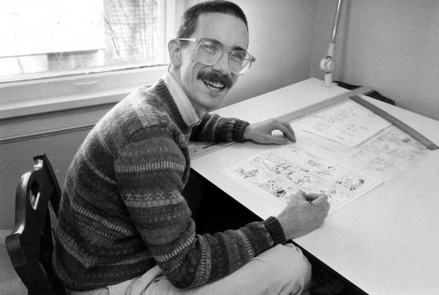
Bill Watterson received the Grand Prix at the Angoulême Comics Festival in 2014. While everyone seems to know his comic strip Calvin & Hobbes, few people know who this reclusive artist is, eager to live anonymously in his native Ohio. Here is his portrait.
Before being published in 1985 in some thirty newspapers, Bill Watterson went through five lean years during which he lived with his parents, did layout work for advertising catalogs, and sent out comic strip projects hoping he wouldn’t be told “no” again.
Between Snoopy and satirical drawing
As a child, Watterson dreamed of being an astronaut or a comic strip artist. As his science grades declined, he convinced himself that cartoonist was the right path. Raised on Snoopy, he always tried to imitate his favorite comics. Later, upon discovering Krazy Kat and Pogo, he understood that comics were not simply a futile art meant to sell newspapers but a medium allowing the artist to convey personal emotions and reflections.
At a comics convention in 1989, he declared:
Peanuts is about the search for acceptance, security, and love, and how hard those self-affirming things are to find. The strip is also about alienation, about ambition, about heroes, about religion, and about the search for meaning and « happiness » in life. For a comic strip, it digs pretty deep.
Nevertheless, he did not study art history and finished his studies with a degree in political science. An admirer of the great editorial cartoonists in daily newspapers, Oliphant or MacNelly, he was quite worried when he began his six-month trial contract at the Cincinnati Post. He sensed that he did not have the political culture and the bite necessary to make a career, and it was almost with relief that he was fired.
Five years of reflection
At that time, most daily newspapers went through syndicates. The term and the function do not really exist in France because the number of newspapers is much smaller than in the United States.
Basically, these syndicates act as artists’ agents: they sell the strips of the cartoonists they manage to as many daily newspapers as possible, driving prices down through economies of scale. In this way, newspapers can get cheap strips, and the syndicates make up for it on the volume sold. Accustomed to this system and to paying a low price for comics, newspaper managers are reluctant to pay top dollar for the creation of a new series.
Watterson then spent the following years putting together comic strip projects and sending them to all the syndicates. At the same time, he survived thanks to small jobs vaguely related to graphic design. Among the series he proposed was Spaceman Spiff, a boastful space explorer who would later become one of Calvin’s fantastical alter egos.
Among the proposals sent, one caught the attention of United Features, which had him sign a contract to develop two secondary characters from In the Doghouse, a rejected project. They were a little boy and his tiger stuffed animal.
Although reluctant to make a comic with a child character, Charles Schulz’s shadow being overwhelming for most artists, Watterson began drawing a month of strips and sent them to the syndicate, which then paid for a plane ticket to see him in an interview. It offered to publish the series if he added Robotman to the cast, a toy for which it held the license. Watterson refused and pitched the duo to other companies.
Universal Press Syndicate then offered him the possibility of publishing the series on the condition that he give up his rights to the characters. Not knowing whether he would have a better chance later and after so many rejections, Watterson signed the contract: Calvin & Hobbes was thus born in 1985.
Early years of fine-tuning
At first, Watterson didn’t really know how to develop his characters. For example, Calvin and his stuffed animal were part of a scout club before the author realized that it didn’t work well and dropped the idea.
The drawings were a bit soft, and the parents lacked personality. Some ideas were a bit clichéd, like the monsters under the bed. But Watterson tried to treat them in a more personal way. Over the strips, Calvin’s character became more assertive, and it became easier to describe the world in which the characters evolve.
Calvin is at once capable of making convoluted reasoning with complicated words unusual in the mouth of a six-year-old child and of responding very naively. The fantastical strips in which he daydreams about dinosaurs or space exploration allow Watterson to escape too and to draw in another style.
Hobbes is inspired by one of the Watterson couple’s three cats. He has animal behavior and at the same time serves as Calvin’s conscience. Both represent aspects of Watterson’s personality. But Calvin is far more turbulent than he ever was, and Hobbes is more reasonable. Calvin’s father does the same job as the artist’s, and both have somewhat similar relationships.
During these years of fine-tuning, Watterson spent his months producing as many pages as possible per day to send to the syndicate, which approved some and rejected others that had to be replaced by other strips. He had to deliver one strip per day, and the Sunday page, which is in color, had to be made two months before its publication. Despite this sustained pace, Watterson was happy to do what he had always dreamed of doing.
The refusal of merchandise
After a few months of publication, more than two hundred daily newspapers bought a license for Calvin & Hobbes, as did Watterson’s local newspaper. He could then feel like a real comic strip artist.
Unfortunately, that happiness did not last. Very quickly, the syndicate that held the exploitation rights to the characters asked the artist to sign contracts for merchandise. Mugs or T-shirts bearing his heroes’ likenesses could earn him a lot of money. But just as he had refused to include Robotman in his series, Watterson declined all merchandise offers.
Nevertheless, as Calvin & Hobbes became popular, the pressure on Watterson to sign merchandising contracts grew stronger. The author then bitterly regretted having given up his rights to the syndicate, which could very well replace him and entrust the development of the series to another cartoonist if he decided to resign.
Official Stamp and one of the few ‘official merch’
Feeling cornered, Watterson became increasingly stressed, and certain strips reflected his struggle to keep his rights. Of course, the whole thing was transformed into humorous fiction, but the anger and anxiety were very much there.
Watterson eventually issued an ultimatum: he had suffered too much to finally be published. He wanted to recover his rights to the comic strip, and if the syndicate refused, he would resign, because there would be no point in drawing characters that no longer belonged to him and would end up on a coaster. Universal gave in. Watterson recovered his rights and continued the series.
Demanding More
Having been morally exhausted by the quarrel with his syndicate, Watterson took leaves of absence in 1992 and 1994, to the great dismay of the newspapers, which had to publish already-published strips. Some cartoonists criticized him, believing he had gotten a big head. But the syndicates then became aware that they should probably grant more breaks to their authors to prevent burnout. The number of vacation days was therefore increased.
Furthermore, Watterson demanded to be able to draw the famous Sunday color pages as he wished. Previously, these strips were cut in a strict way because each newspaper had its specific layout, and the panels had to be rearranged in another order while preserving the meaning and humor of the comic. This required extra work from the authors and harmed their creativity.
Once again, Watterson won, and he could then make the panels the size and shape he wanted in these Sunday pages. He could truly express the fertile imagination of his little rascal in that half-page of the newspaper.
Subsequently, Calvin & Hobbes became even more personal, and the dialogues between the kid and his stuffed animal seemed to echo Watterson’s pessimism regarding ecology or mass (a)culture via television. The cartoonist also took advantage of his freedom of expression to mock contemporary art through a series of snowmen.
But after ten years spent drawing, Watterson stopped his series at the height of its glory.
Silence is golden
Leaving comics behind for painting, Watterson paints for himself and his friends. In 2012, a portrait of Petey Otterloop, a character from the comic strip Cul de Sac, was sold at auction to help research on Parkinson’s disease, which affects the author Richard Thompson. It brought in only $13,000, whereas an original Sunday color page sold for $203,150 in 2011.
Portrait of Petey Otterloop from Cul de Sac
Recently, for the DVD cover of a documentary devoted to him, Watterson made a new drawing. It is also for him a way of celebrating the end of an era with a still-powerful print press and its comics syndicates.
In a 2014 interview, he was very pessimistic about editorial cartooning, comics, and new means of distribution. For him, the connection between reader and comic strip character is definitively lost, corrupted by marketing and mass culture that consumes everything like a bag of chips.
That would be my guess. I can’t really picture the average person going to the trouble of curating his own little comic section, much less reading a new and unfamiliar strip for months to build up a relationship with it. There’s so much other content available—instantly and all for free—that there’s no reason to stick around if you’re not immediately enthralled. We consume everything like potato chips now. In this environment, I suspect the cartoonist’s connection with readers is likely to be superficial and fleeting, unless he taps into some fervent special interest niche. And that audience, almost by definition, will be tiny. It’s a very different world from the days when everyone in America knew who Popeye, Dick Tracy or Charlie Brown was.
By awarding its Grand Prix to Bill Watterson, the Angoulême Festival jury surely did not realize it was paying tribute to the author who currently has the least faith in the comics medium…
The terms manga or anime generally suggest the same stereotype: a character with huge eyes and stylized features. This visual aspect has precise origins. Let’s travel back in time to understand the visual influences between manga, comics, and Japanese woodblock prints.
There are two surprising threads of influence. The first concerns Japanese Woodblock prints, Art Nouveau, and manga. Three eras, three artistic expressions that link the West and the East by multiple flows of influences.
This visual dialogue linking Asia, Europe and America reveals that there is no ex nihilo creation: art always conveys the vision of a previous artwork.
Therefore, I propose a short journey wavering between Japan and the West, from the Edo period to the present day, to discover the currents of influence linking printmaking, comics, 1920s cartoons, Art Nouveau and contemporary comics.
Visual Influences: Woodblock Prints and manga
The Edo period (1603-1867) forms two centuries of relative calm, during which numerous artistic innovations appeared. They result from the rise of a middle class eager for pleasure and refinement.
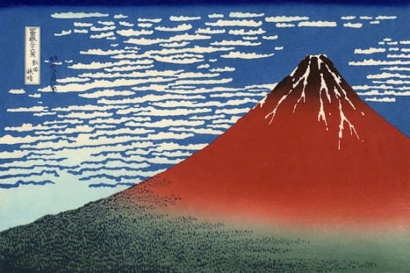
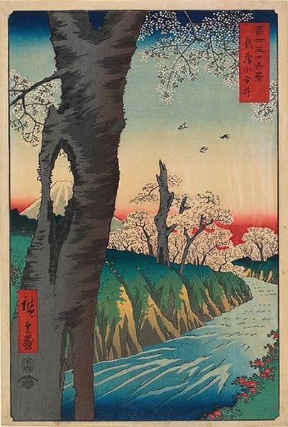
In parallel of the traditional schools of painting, the woodblock prints flourished. It is also known as the Ukiyo-e, the Japanese more poetic terms meaning “pictures of the floating world.”
The nobility experienced and fancied of the older styles of painting. On the contrary, the Ukiyo-e drawed its inspiration and its subjects from the world of pleasure (geisha and kabuki), daily life, nature, mythology. They often ludicrously pastiched famous paintings.
Japanese woodblock prints and painting are part of a non-mimetic conception of reality.
While vanishing points and linear perspective are crucial in the Western arts, Japanese art relies on flat spaces and arabesques in a single plane of depth, not to represent reality, but to evoke it.
The intention is to suggest and give a poetic representation, not to produce a photorealistic snapshot of reality.
This lack of concern for imitating nature undoubtedly explains why Japanese prints were disregarded at first.
Perceived as being uniform, the faces all look alike for an audience not used to a foreign artform.
Similarly, people used to criticize manga for its lack of variety and “realism.”
There is no obligation of prima facies in Japanese pictures, since nature should not be duplicated but evoked.
The caricatural aspects of the manga may derive from the woodblock prints and, more precisely from the Toba-e style.
Heir to the latter type of pictures, the kibyōshi (with the yellow cover) are collections of illustrations decorated with text that constitute little stories.
They were very popular at the beginning of the 19th century. Some think they are the manga’s close ancestor.
Thus, Japanese comic books and cartoons inherit a pictorial tradition based on non linear perspective, linework width and areas of flat color.
One can compare the use of screentones in manga print magazines to the use of color blocks in woodblock prints.
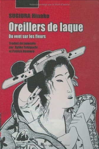
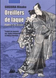
Hinako Sugiura explored the graphic relationship between Ukiyo-e and modern manga.
In Asaginu (“Morning Silk”) published in Garo magazine in 1981, she imitated the graphic style of Japanese printmaking in the Edo period.
This mangaka also tried to reproduce the graphic style and kibyōshi format in Hanageshiki Kitsune Kōdan (“stories of foxes in the time of contemplation of flowers,” which can also mean : “so as not to be intoxicated”).
Another similarity between woodblock prints and manga is their remarkable availability. Thanks to the woodcut technique, Ukiyo-e was accessible to all whereas traditional paintings were not.
In manga and woodblock prints, there is a version for the general public, usualy made of low grade paper.
When a Ukiyo-e print is popular, there is more lavish formats with a very thick paper allowing embossing and special colors (gold, silver, copper or mica dust).
Nowadays, the most successful manga series benefit from a deluxe edition with new color pages.
Hokusai and Manga
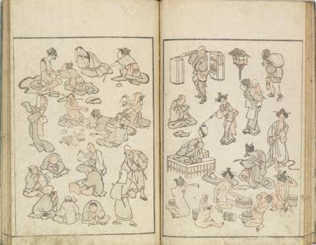
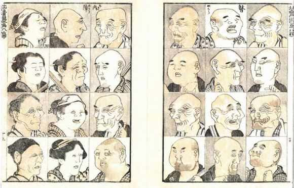
Among the Ukiyo-e‘s most influential artists, Hokusai is known as the “Old Drawing Madman.” He was a collaborator of writers, friends, and illustrators of poets, visionary of magnificent landscapes.
He drew from all schools, even studying Dutch painting, to acquire the brush’s best mastery. Among his many creations, there is, of course, the Manga.
Hokusai’s Manga
It was initially meant to be a series of sketches allowing his Nagoya admirers to grasp his painting technique.
After the first volume’s success, the drawings collected to lead to thirteen volumes of sketches or four thousand plates retracing the master’s pictorial journey.
Manga is composed of two words: “ga,” drawing and “man,” at the whim of the idea through the brush. One can translate manga as “quick sketches.”
Hokusai may be the artist who spread the word manga, but his work has little to do with comics in its current form.
Most people consider Osamu Tezuka as the modern manga father, and he is himself heir to the European and American cartoons.
Mirrored and followed by generations of Japanese cartoonists, Tezuka’s style gives manga and anime their aesthetics so far removed from woodblock prints.
Visual Influences: Ukiyo-e, Japonisme, and manga
During the Meiji period (1868-1912) and the Belle Époque (early 19th century), the Ukiyo-e stirred significant interest among the European public and artists.
Besides exoticism, the Japanese artform revealed a divergent apprehension of the world through drawing.
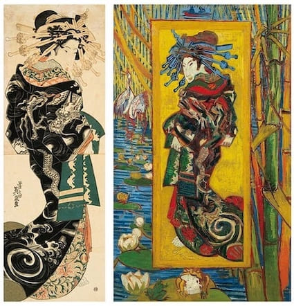
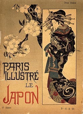
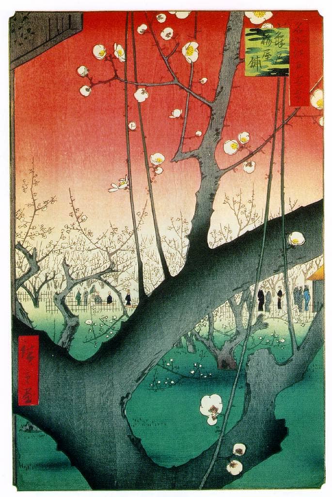
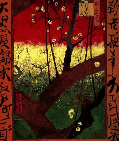
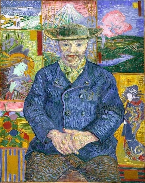
Japanese woodblock print was a revelation for many artists such as
Van Gogh (who copied many prints of Hokusai and Hiroshige),
Manet,
Gauguin,
Degas,
Toulouse-Lautrec,
the Nabis
Ukiyo-e brought new blood to an art bogged down in the dull repetition of the styles of past centuries.
Thus, western art turned to the East to find a second wind, just as it was inspired by African art to renew itself after the First World War.
Japonisme
The French word “Japonisme” refers to the late 19th century’s artistic movement, inspired by Japanese woodblock prints, motifs, and art forms.
The Japanese influence manifested in the painting formats: square or rectangular in height (close to the Japanese kakemono).
It was also noticeable in the techniques they used. They emphasized lines, curves, and irregular shapes.
Global composition and decorative aesthetics take precedence over the search for detail. The artists rejected the linear perspective in favor of the use of flat areas of color.
For example, Gauguin’s “Cloisonnisme” consists of defining color areas with a line, which brings this technique closer to Japanese woodblock printing and stained glass.
The visual aesthetic of Samurai Champloo introduction is a reminder of this Japanese technique.
Japonisme encompasses several artistic movements such as Art Nouveau, a reflection of the European Belle Époque.
As it was the case for Ukiyo-e, Art Nouveau manifests the rise of the middle class and the social will to make art available to all.
Art Nouveau’s various expressions vary according to national particularities and artists’ temperaments.
But they are all characterized by natural theme, plant stylization, decorative composition.
They wanted to blend industrial craftmanship and visual arts.
This art movement had multiple names (Modern Style, Jugendstil) and it erased the boundaries between fine arts and liberal arts. It included ceramics, furniture, jewelry, posters, sculpture, architecture, and painting.
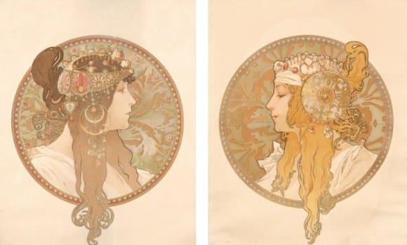
For the Japanese, Art Nouveau most representative artist seems to be Mucha, to whom a significant retrospective was devoted to Tokyo in 1983.
As early as 1900, artists redesigned several of his posters for the covers of Japanese art magazines.
Curiously, Alphonse Mucha appears to them as an artist representative of Western art, when in reality Ukiyo-e indirectly inspired him.
Mucha’s influence on Japanese artists may be linked by the exuberance of his arabesques, his slender curves reminiscent of the curvilinear lines of his prints.
The Belle Époque Europeans’ fascination for Ukiyo-e paralleled the Japanese’s admiration for Mucha and Art Nouveau.
According to legends, Mucha became instantaneously famous thanks to an impromptu commission for a poster for the famous comedian Sarah Bernhardt, which he produced overnight.
Mostly known for his poster and billboard skills, Mucha was also a successful illustrator.
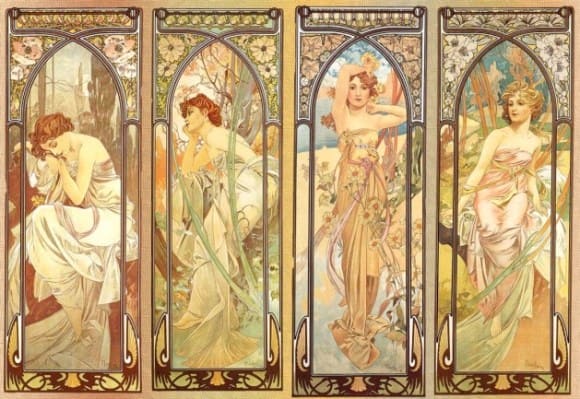
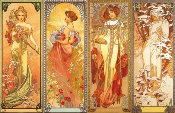
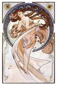
A large part of his work consists of vertical rectangular panels, allowing him to depict full-length portraits of woman, the central subject of his work.
Part of a decorative pattern, the lush flora sensually wraps around the female body.
Languorous, radiant, and curvaceous, the woman, adorned with luxurious and charged jewels, drapes herself in an ornamental folds dress.
A complex hairstyle frames her face with profuse and intricate curls. A thicker contour line highlights her silhouette departing it from the plant motifs.
There is often an arch or halo that frames her body.
Less constraining than posters, the series of decorative panels for folding screens allow Mucha to give free rein to his imagination.
These paintings, coupled in pairs of two or four, usually represent personifications of notions such as the Four Seasons, Flowers, Arts, Fruits.
Besides all these works, Mucha has made theatre sets and jewelry in collaboration with Fouquet, furniture, and all kinds of decorations. Like other artists of that time, Mucha wanted to create a “total work of art.”
Mucha, manga and anime
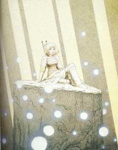
Difficult to use in manga because of the entangled decorative details, Mucha-like style appears mainly in illustrations and advertising material.
It is not surprising since Mucha’s drawings were often intended to advertise products or plays. Images inspired by this European artist are frequent in illustrations for both animation and manga.
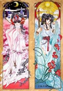
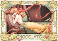
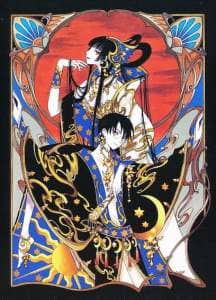
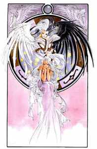
Clamp is probably one of the most inspired by Mucha. They use Art Nouveau frames and Mucha-style compositions in most of their illustrations of RG Veda, X, and Rayearth.
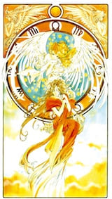
Mucha inspires Kosuke Fujishima for his Ah My Goddess! illustrations as his heroines wear dresses with many folds, and their long curly hairstyle rival Mucha’s women’s one.
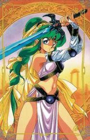
Just as Klimt had a beneficial influence on the heroic fantasy world of Simon Bisley (Slaine, 1989), Mucha is a source of inspiration for Lodoss Wars‘ heroic fantasy world, Mikimoto’sElver Z, and many others.
Mucha’s influence is so apparent that you only have to put the images aside.
Some Mucha-style illustrations turn out to be mere duplications of the artist’s paintings.
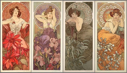
A series of portraits of Sailor Moon‘s heroines, sitting in a simplified “Art Nouveau” frame, resume the poses of the women in Mucha’s Precious Stones series.
Some illustrations shift from the vegetal patterns to other variations on the “Art Nouveau” frame.
Masakazu Katsura and Clamp notably use decorative eerie shapes for the various structures highlighting the characters.
Visual Influences: Fleischer, Disney, Tezuka
Before continuing, let’s go back to the beginning of modern manga in the post-war era.
Tezuka, who laid the foundations for Japanese comics and cartoons, genuinely admired the pioneers of animation movie.
People often mention Walt Disney as one of the artists who influenced Tezuka.
But they forget the Fleischer brothers, whose contribution in the technical, graphic and narrative field is much more significant than Disney.
On the visual level, the character’s shapes shows an evident influence of Western cartoons on Tezuka.
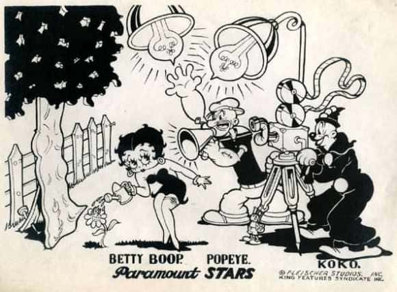
If you think of a disproportionate head and huge eyes, when imagining manga characters, you get the Fleischers’ influence.
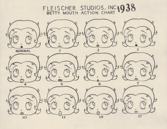
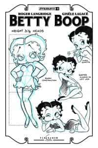
This way of portraying the characters’ features like those of a baby derives partly from the foremost character of Fleischer productions in the 30s: Betty Boop.
The famous pin-up girl is not only one of the first leading female character, but she is also one of the first animated characters intended for an adult audience.
Sexual innuendos were numerous in the early versions of the cartoon, and the “boop-oop a doop” suggested activities that were not allowed on screen during this era.
The Lolitas in Japanese anime and manga are indirectly linked to this charming character with a woman’s body and a childish face.
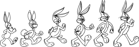
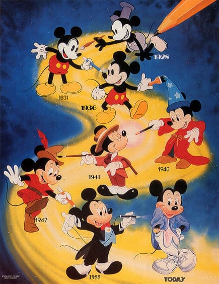
The influence of the childlike morphology in adult characters (or neoteny) is visible in almost all the cartoons.
The success of Mickey and Bugs Bunny grow as their facial features became rounder and their eyes larger.
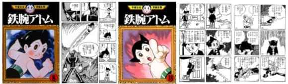
Influenced of the Fleischer brothers, Tezuka drew characters with childlike faces.
And the many mangakas inspired by Tezuka’s graphic style contribute to stereotyping this way of drawing in Japanese comics and anime.
These visual aspects, which the general public holds purely Japanese, came from Western cartoons’ specific features.
This way of drawing has a double advantage. By focusing on the face and eyes, it allows greater expressivity.
The manga and anime mainly center on the characters; this design highlights the protagonists all the more.
On the other hand, the character’s childlike aspect arouses sympathy from the audience. Psychologists speculated that adults show reflexes of affection and protection towards beings with juvenile features.
It is not by chance that manga and anime characters can turn into SD (Super Deformed) or Chibi versions. This stylization makes them more baby-like.
Visual Influences: manga, comics, and bande dessinée
Japanese manga and animation have a remarkable influence on many Western artists.
The broadcast of many Japanese anime television series in the 1960s and 1970s created a large potential market for manga. A 1990s series such as Robotech was adapted into comics by American cartoonists.
In France, publishers adapted popular anime series adapted in bandes dessinées (Goldorak, Albator or Captain Flam).
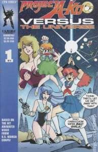
There are also several adaptations of anime into comics such as Dirty Pair(started in 1989) and Adam Warren’s Bubblegum Crisis, or Project A-Ko and Cyber City, distributed by a publisher specializing in adaptation, CPM Comics.
These comics rely more or less on the primary Japanese graphic design, but they are original works drawn by Americans. Moreover, Bubblegum Crisis and Dirty Pair are initially anime that do not exist as manga.
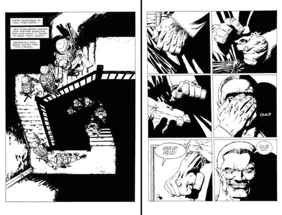
One of the most famous American comic artists influenced by manga is Frank Miller, creator of Sin City (1993).
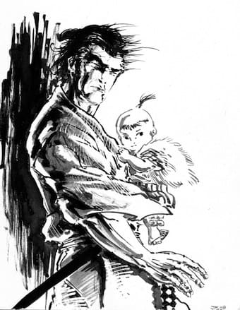
He is a Lone Wolf and Cub enthusiast. Known as Kozure Okami in Japan, this manga is created by Kazuo Koike and Gôseki Kojima.
Miller created covers for the American version of the manga and he wrote the preface. He also drew inspiration from it for his comic book, Ronin (1989). Thanks to him, American publishers and audience started to show interest for manga.
There is also a cross-influence of animation and manga on American artists.
The series translated are the ones the American or European publishers thought were best suited for the domestic audience. It explains why the most popular Japanese artists are not the same in the US and other countries.
As early as 1996, the American magazine Wizard featured two articles on the influence of manga and anime on comics industry less than six months apart.
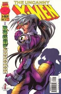
They interviewed several artists on their passion for manga and anime: Joe Madureira (Uncanny X-Men), J. Scott Campbell (GEN 13), Billy Tucci (Shi), Humberto Ramos (Impulse), Art Adams (Godzilla), Brian Pulido (Lady Death), and the critic, Scott McCloud.
It is no great surprise that the main Japanese works that inspired them are Akira for anime and Ghost in the Shell for manga.
As in Europe, Masamune Shirow is very popular. Among the other Japanese artists mentioned, there are Katsura (Video Girl Ai), Fujishima (Ah my Goddess!), Sonoda (Gunsmith Cats). Only two comics artists mentioned Tezuka and Go Nagai.
Among the anime, they praised Ninja Scroll and other series from Mad House studios (Gunnm, Wicked City).
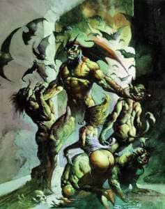
This interest for Japanese masters lead to several collaboration and homage. For example, Frazetta and Bisley draw new covers for the US version of Devilman, a manga by Go Nagai.
As an fan of Katsuya Terada (Blood, Sayukiden), Mike Mignola entrusted the Japanese artist with the monsters’ design for the film adaptation of Hellboy.
Devilman by Bisley
Given the anime and manga growth in the US, there should be an increased influence between Japanese and Americans.
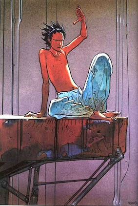
In France, Jorodowki and Moebius served as ambassadors for manga and anime in the 80s and 90s. The creator of Arzach answered to several interviews about Japanese comics.
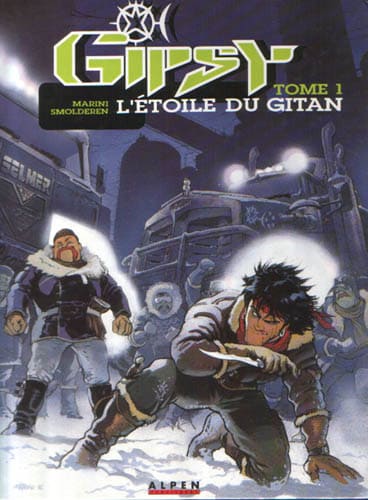
As in the USA, Otomo and Shirow are the two most famous artists. Among the French professionals inspired by manga, there is Enrico MARINI (La Colombe de la Place Rouge, Gipsy). Vatine’s Aquablue series borrows from manga the speed lines, and some mecha are reminiscent of Patlabor.
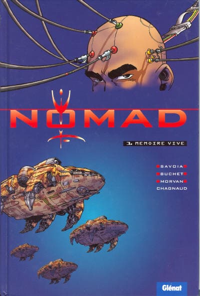
The French publisher Glénat released two comics whose graphics evoke manga: HK (1996) and Nomad (1994). The publisher is the first to introduce the idea of French manga or Manfra.
Casterman sought to mix French-Belgian bande dessinée and Japanese comics, by publishing series made by Western artists but first published as manga by Kodansha. For example, the publisher released Baru’s L’Autoroute du Soleil in 1995.
On the other hand, the former monthly magazine Yoko published amateur comics inspired by manga and anime graphics.
In the sixties, the French publishers feared the concurrence of American comics and later dreaded Japanese media. Nowadays, it is no longer the case.
Many companies seem to consider it as an easy profit source. The word manga unravels the cord of all purses. A French banking company even used an advertising visual inspired by Dragon Ball and Saint Seiya.
What about the influence of Western comics on manga?
It is obvious in comic books, SF, and fantasy. For example, Masakazu Katsura is a big fan of Batman, and in his manga Video Girl Ai, the characters go to see a Batman movie.
Tetsuo par Moebius
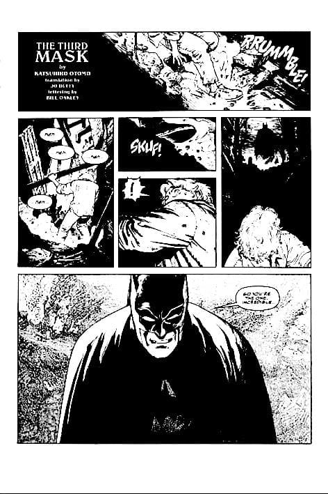
Slaine‘s hero made a cameo in Gunnm. There are also various adaptations of American superheroes by mangaka, such as Batman by Otomo or Spiderman by Ikegami.
Thus the manga brings a second breath to the French-Belgian bande dessinée and comics. It is a genuine way to make narratives and has a new visual style.
In a sense, manga influence on comics is almost comparable to that of the woodblock prints on European art at the end of the 19th century.
Conversely, comics is a source of inspiration for the manga, which sometimes gets bogged down in sterile stereotypes.
So, as you can see, the influence between manga, comics, and bande dessinée artists should increase.
Some may worried about the risk of standardization of comics, whether it is to the benefit of manga or any other comics. It would be a shame since the variety of style makes comics more interesting. But a talented artist could always break a genre’s boundaries and create a personal style.
More than the visual influence, I believe that manga has a significant impact on the narrative and the way to create lasting series.
Besides the art style, manga led new inspirations for designing layouts and panels, and the way of conveying a narrative.
If you have read so far and enjoyed the article, buy me a coffee 🙂
What is the link between Ghost in the Shell, spiders, and modern robots? Biomimicry, i.e., technological design inspired by nature. Here’s how a manga creator got ahead of robot production companies.
Most western science fiction series are lazy as they opt for photo-realism. For the mechanic’s design, most SF series only adds a slight modification to existing objects.
Speed and firepower seem to be the only difference between the Second World War tanks and future versions. But the design remains mostly unchanged.
In contrast, Ghost in the Shell’s world is full of graphic invention and ingenious design for the future’s weapons and vehicles.
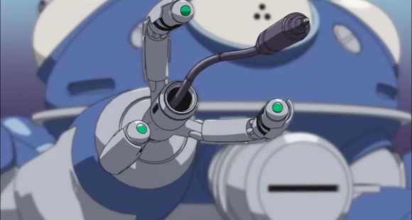
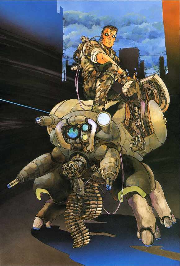
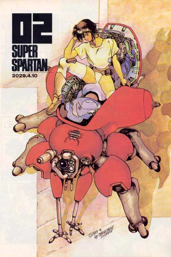
The most striking example is the Tachikoma, an intelligent tank with the shape of a spider.
In a sense, Masamune Shirow used biomimicry before it was fashionable.
Biomimicry and reproduction of living things
What is biomimicry? Biomimicry is the imitation of animals and plants’ shape to resolve a defined challenge. In other words, it is the transposition of living beings’ skills into the field of technology.
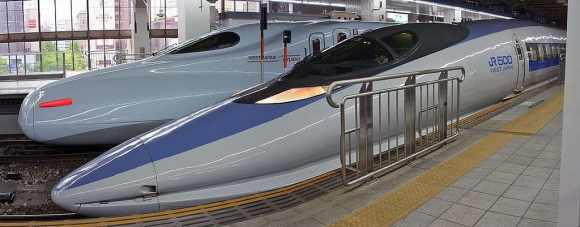
The Shinkansen (Bullet train) is thus inspired by the kingfisher’s beak to limit friction, increase speed, and reduce noise.
The bird is very effective at diving with minimum friction.
Engineer Eiji Nakatsu also took inspiration in the owl to minimize the sound of the Shinkansen 500 Series. The feathers of this silent night hunter reduce noise.
Shinkansen 500
But what does this have to do with Ghost in the Shell? Well, animals and insects inspired the manga creator for the design of all the gears and mechanic assets shown in this science fiction series.
Tachikoma: the intelligent spider tanks
The shape of jumping spiders inspires the intelligent tanks in Ghost in the Shell.
Say Hello!
Instead of being a mini truck on mechanical tracks, these individual tanks are the perfect combination of an exoskeleton and an armored shell.
In the manga, they are called Fuchikoma. They serve as both a combat vehicle and a robotic bodyguard serving as logistical support for humans and cyborgs.
Their thermoptic camouflage is similar to the heroine’s one, Major Kusanagi.
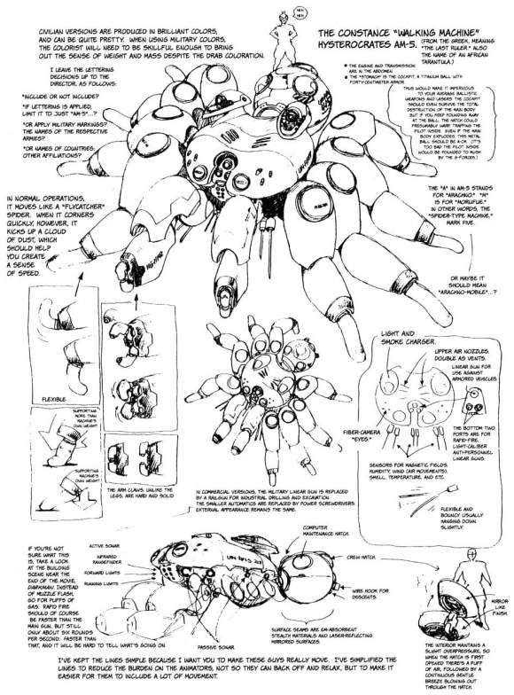
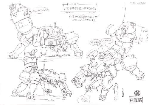
Like spiders, Tachikoma’s body has two sections. The front part has eight legs, two of which are smaller and serve as the equivalent of human hands.
The legs feature retractable wheels and three rhinoceros-like toes/nails.
The hind part is the receptacle where the human/cyborg pilot manages the vehicle. The human/cyborg pilot is half crouched or lying down depending on the type of tank.
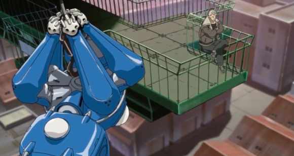
In spiders, this rear part provides silk. Some species use it to weave webs, but others use it as a lasso to catch prey from a distance or as a parachute to travel further.
In the manga, cable replaces silk to move upwards.
Several episodes of Ghost in the Shell Stand Alone Complex 2nd Gig highlight the Tachikoma’s features.
Tachikoma suspended by its “silk thread”Fil de “soie” lancé par le Tachikoma
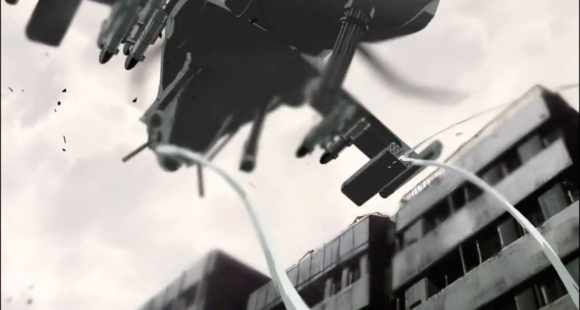
The heroine’s tank holds a helicopter with its “silk thread” for the time it takes for a sniper to get rid of the human agent flying it.
The idea of a spider armor was already there in Appleseed, but the design seemed very massive.
Le nom du tank – Hysterocrate – désigne une vraie araignée géante
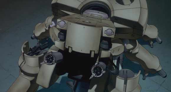
It is slightly reminiscent of the giant spider tank that appears at the end of Mamoru Oshii’s Ghost in the Shell.
Le tank du film de Mamoru Oshii
Tachikoma and “esprit de corps”
In the Ghost in the Shell Stand Alone Complex (GITS SAC), arthropod tanks are named Tachikoma (due to a rights issue).
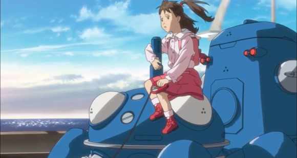
They have an AI and a juvenile personality that permeates through the childlike way they express themselves.
Tachikoma helping a girl to find her lost dog
In the manga and its adaptations, there are comical allusions to Isaac Asimov and robots’ revolt.
At the end of each GITS SAC episode, mini humorous sequences feature the Tachikomas — some parody animal documentaries.
More than a mass destruction weapon, the Tachikomas are learning creatures.
They regularly synchronize and share their “memories” to enhance their machine learning.
These characters are incredibly endearing. Their candid personalities serve as a counterpoint to the somewhat tangled plot.
Throughout the episodes, the Tachikomas develop a personality and come to become autonomous and “conscious”.
At the end GITS SAC first season, they sacrifice themselves to save Major Kusanagi and Batō.
In the second season, they save Japan from a nuclear attack by renouncing their consciousness.
Thus these Spider Tank shows “esprit de corps”, incredible loyalty to their pilot.
In the other Ghost in the Shell series, the arthropod tanks have other assets and different names:
Fuchikoma in themanga
Logikoma in GITS Arise
Tachikoma in GITS SAC
Uchikoma in GITS SAC 2nd GIG
But in all cases, the spider design is kept to make them fast, maneuverable, and resistant even in urban combat.
For the moment, no army seems ready to invest in single-passenger spider armored vehicles.
But some companies are selling quadruped robots to serve as logistical support as the Logikoma (but they are not as cheerful).
SPOT le robot quadrupède de Boston Dynamics
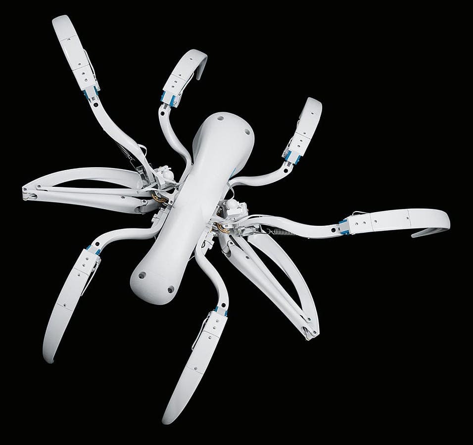
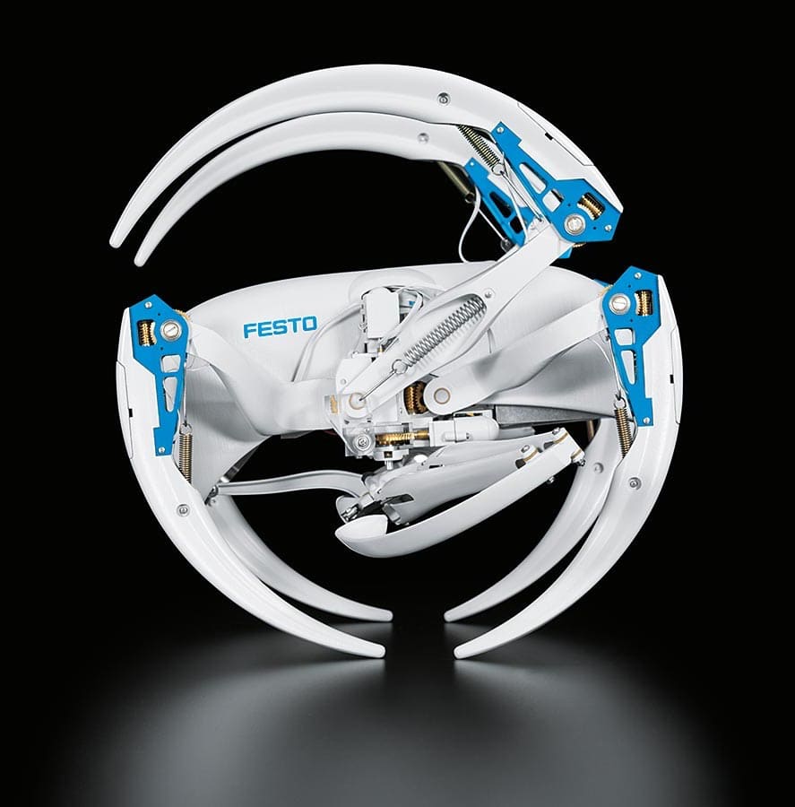
Other companies as Festo present models of spider robots that can roll on themselves instead of moving around with a silk thread.
Miniature and giant wasps
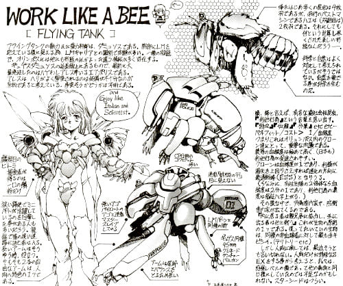
In addition to spiders, Masamune Shirow has a passion for Hymenoptera: bees, wasps, and other flying insects.
In the Appleseed series’ design notes, he produced many winged exoskeletons. These appear in the Appleseed Data Book and Appleseed Hypernotes.
Design de tank abeille dans Appleseed
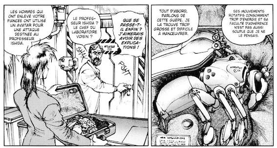
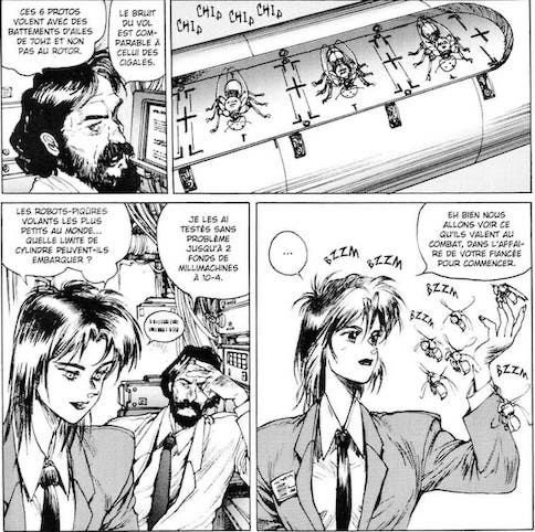
Readers can see Masamune Shirow’s obsession with wasps in a chapter of Ghost in the Shell 1.5, which deals with miniature robots that serve as support and access to restricted spaces.
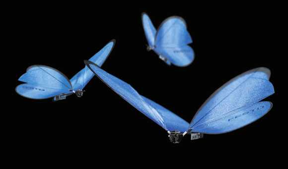
The idea may have seemed far-fetched in the 1990s, but today some companies are building bees robots to pollinate plants.
In contrast, others offer butterfly robots as a technical demo. Bees robots also appear in a Black Mirror episode.
Butterflies Robots by Festo
After Ghost in the Shell’s end, Masamune Shirow imagined a universe where these insects become the dominant species: Neuro Hard.
Here again, many sketches and long explanations show that the author is passionate about the insects’ world.
Unfortunately, insects don’t fascinate his readers even though he adds pretty women in the pictures.
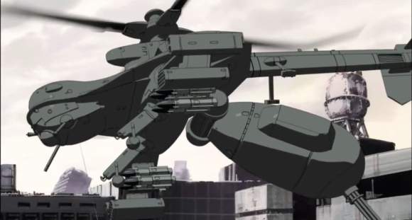
In GITS SAC, wasps appear in the form of a helicopter in the second episode.
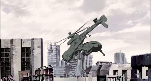
Episode 4 of GITS SAC 2nd GIG features a fight between Tachikoma spider tanks and anti-tank helicopters called Jigabachi.
Their name is a reference to a type of wasp that has spiders as prey. It is why the title of the episode is “natural enemy”.
The Jigabachi helicopter has a movable hind part that can fold up as when the insect is about to bite its enemy.
An anti-tank machine gun replaces the venomous sting.
Other insects and animal forms
In addition to spiders and Hymenoptera, other insects make their appearance in Ghost in the Shell.
GITS SAC episode 2 features a scorpio-shaped tank that turns against the army.
Tank scorpion dans GITS SAC
Is it a terrorist hacking or something else?
I won’t tell you anything about it, but the mecha is very impressive, according to the Tachikoma escorting him.
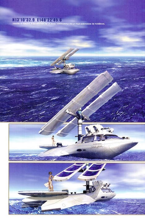
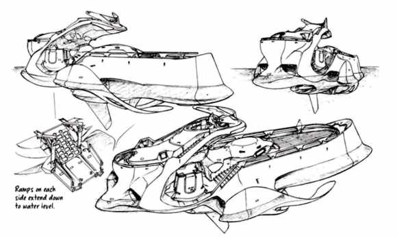
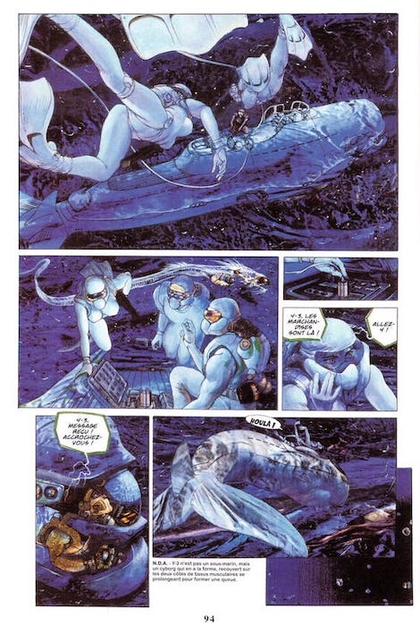
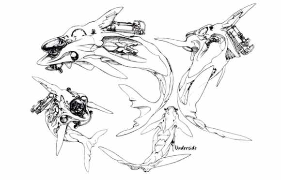
In Masamune Shirow’s manga, watercraft take on the forms of marine mammals. Whales and dolphins inspire submarines and other propulsion devices.
In the animated adaptations, these devices are rarely seen. In the film GITS Innocence, there are various ships with “fins” and a fast underwater vehicle.
GITS Innocence
In the real world, marine animals’ biomimicry is much more common than insect shapes for military vehicles. In addition to swimming and diving suits that limit friction like shark skin, dolphin-shaped robots are produced.
The military has long attempted to train marine mammals to detect or install underwater mines. Several armies are currently developing dolphin-like robots for this type of task.
GITS Innocence
At the end of the 1980s, the Ghost in the Shell series provided innovative design ideas. They are now being put into practice by robotics companies.
Apart from these numerous biomimetic designs, Masamune Shirow is nevertheless keen to pay tribute to science fiction masters.
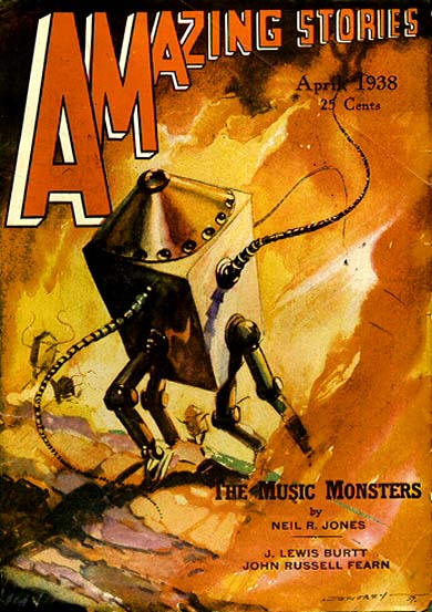
He makes a nod to Professor Jameson and his minimalist box-on-legs design.
He is the hero of a series of science fiction novels created by Neil Ronald Jones (1909 – 1988). The first story published in 1931 tells the adventures of a human whose brain is transferred to a machine by aliens.
Translated into Japanese, the novel featured illustrations that impressed Masamune Shirow enough to use it for the design of one character: the CEO of a company specialized in the production of organs for transplantation.
The humorous contrast between the boxed brain and his business involving growing compatible human organs in pigs is striking.
As a result, the innovative design is not always useful to make an interesting character. But it is an incredible way to help us innovatively fantasy the future.
If you’ve read so far and enjoyed the article, support this blog and buy me a coffee 🙂
On March 1, 2024, Akira Toriyama set off to explore new horizons far from this world. Known primarily for Dragon Ball Z in France, the artist revolutionized manga and video games in Japan in the 1980s. For Generation X, he will remain the magician who re-enchanted everyday life.
Osamu Tezuka is generally presented as the father of modern comic books in Japan, having launched the “story manga” in 1947 with New Treasure Island (Shin Takarajima). But for the generation of contemporary creators who grew up with Arale (Dr. Slump) and Son Goku (Dragon Ball), the king of pop culture remains Akira Toriyama. Indeed, he not only managed to create an unprecedented graphic style but also popularized an incredibly effective formula for action narratives.
Moreover, the book DRAGON BALL 30th Anniversary Super History Book (2016) is full of testimonials from artists explaining how the saga marked their childhood and gave them the desire to make manga. It is not for nothing that Eiichirō Oda (One Piece) and Masashi Kishimoto (Naruto) took the time to make a public announcement expressing their sadness and distress at the unexpected passing of their spiritual master.
Similarly in France, a large number of manfra creators (manga designed by French people), including Tony Valente (Radiant), Balak and Sanlaville (Lastman), were influenced by the broadcast of Dragon Ball Z on “Club Dorothée” before discovering the original works in comic book form.
But Toriyama’s work should not be reduced to incredibly dynamic and rhythmic fight scenes between super warriors. The artist’s genius consists in remaining an outsider who defied established conventions.
Telling the Story as It Comes
Paradoxically, two of the biggest commercial successes of Weekly Shōnen Jump magazine were created by creative talents who did not really know manga. Toriyama worked in advertising and had stopped reading comics after elementary school, while his first editor, Kazuhiko Torishima, wanted to pursue literature and did not even know the magazine before being employed there.
After several failures, the duo managed to win over the public with Dr. Slump, a comedy series featuring the lecherous inventor Senbei Norimaki, whose many creations draw on both science fiction and Japanese folklore. But very quickly Arale, a little robot girl designed by the eccentric professor, became the mascot of young readers. Her naive character and superhuman strength made it possible to create particularly memorable visual gags.
Toriyama and Torishima then followed the direction given by the readers, and the eponymous hero became a secondary character. In the same way, the character Vegeta was supposed to die quickly in Dragon Ball, but his popularity with the audience made him one of the pillars of the narrative. This creation on the fly allowed the characters to take on a life of their own, because they were then carried by the readers.
This providential improvisation also occurred at the graphic level. In Dragon Ball, certain elements that became iconic were the result of a search for efficiency. For example, during the transformation into a “Super Saiyan,” the brown-haired characters become blond, which spares the assistant from inking the hair and saves time.
The change in the hero’s silhouette was also a pragmatic response to creative problems. Toriyama needed a body with adult proportions to make the fights more realistic and captivating.
That is why Son Goku is one of the first shōnen manga heroes to completely change appearance. This transition from a childlike appearance to an adult silhouette can later be found in Naruto.
However, one should not believe that Toriyama constantly gives in to the demands of his editors or readership. He long refused to make a sequel to Dragon Ball before agreeing to work on the film Dragon Ball Z: Battle of Gods (2013), in which he ridicules his heroes and makes his own cat the God of Destruction.
The success of the feature film made it possible to launch an official sequel in animated and manga form, which he supervised in order to preserve the ever-so-slightly zany side. Even when the universe is in danger, there are Super Saiyans (“super vegetable” in Japanese backslang) and humans named after underwear to save us.
The Toriyama Style
Unlike other manga authors who have a precise idea of their narrative and the conventions to follow, Toriyama improvises by incorporating elements from the zeitgeist and his personal tastes. In this way, he engages in a dialogue with the contemporary audience, creates strong bonds of complicity, and crafts his own narrative motifs that the current generation takes up.
He also stands out for his very precise graphic style and his punchy layouts, linked to his first job at an advertising agency. Torishima had moreover initially decided to work with Toriyama because he produced very clean pages and had a personal way of drawing sound effects.
His attention to detail can be seen in the drawing of the many fantastical vehicles that populate his universe. These became so popular that they were turned into model kits, and he was entrusted with the industrial design of an electric car (QVOLT).
As a good graphic designer, visual aesthetics bend to the demands of the narrative. In the humor series Dr. Slump, the round and cute characters make the scatological gags and parodies even more absurd, whereas in the second part of Dragon Ball, where the fights become more epic, the lines harden. The characters become more angular to accentuate the dynamism of the movements. These are laid out in a rhythmic way inspired by the choreography of fights in Jackie Chan films, of which he was a fan.
In a typical sequence, after a wide shot to establish the setting, the frame tightens on the character in the following panels to show the action. It may be a medium shot, where concentric speed lines highlight the character’s face and hand, sometimes with an insert or close-up so that the action is clear.
One panel then shows the impact in a wide shot, and in the next panel the framing is even wider in order to show the characters witnessing the scene and watching a cloud from the explosion rise in the distance.
This wide shot emphasizes the power of the attack through the damage produced. By showing the action several times from different angles, Toriyama makes the fight clearer and reinforces the impression of power.
This type of paneling of action inspires not only contemporary manga authors but also video game creators. Admittedly, the many Dragon Ball adaptations into fighting games or adventure games help increase the visibility of these characters on that medium, but it also inspires all the creatives in the sector.
Thus, in paying tribute to Toriyama on Twitter, Masahiro Sakurai, creator of the game Smash Bros., explains that he wanted to model the characters’ gestures in the game on those of the Dragon Ball heroes.
A Pillar of Role-Playing Games in Japan
Toriyama first made his fortune with Dr. Slump and its gags that transform the schoolchildren of Penguin Village into explorers of the absurd. The success was such that he appeared on the list of the wealthiest people in Japan in 1983.
But this popularity made him a little uncomfortable. He preferred to live peacefully in Nagoya, far from the big cities. That is why he fairly quickly limited his media appearances and used a self-caricature to represent himself instead of a photograph.
The success of Dr. Slump rests partly on the surprising creatures he designs. The sun wears sunglasses, dinosaurs rub shoulders with extraterrestrials, and heroes parodying Hollywood films talk to excrement…
Even the poop emoji on smartphones comes from the colorful universe of Toriyama’s manga. Yes, the poop emoji is a nod to the talking stools of this colorful world, which hosts the entirety of Toriyama’s manga and is simply referred to as “The World.”
This proliferation of absurd creatures continued into video games, a sector then in full expansion in Japan. He is best known for his work as a character and monster designer on the Dragon Quest video game series since 1986.
It was the first successful role-playing game in Japan, which led to the creation of a genre specific to the archipelago (JRPG, or Japanese role-playing game). The series is so popular that new installments are only launched on weekends to prevent people from taking a day off to go play. The game’s mascot, a slime, is today synonymous with RPG in Japan.
Toriyama later worked on the design of Chrono Trigger, a cult game that brought together Square (Final Fantasy) and Enix (Dragon Quest), the two rival JRPG studios. He also helped the creator of Final Fantasylaunch his video game studio by participating in the development of the Blue Dragon series.
His influence in video games is such that many creators publicly expressed their mourning. Hiroshi Matsuyama, president of CyberConnect2 (Naruto Shippuden, .hack//), even decided to close the video game studio for a day.
As can be seen, Akira Toriyama was the most influential creator of the late 20th century in Japan. His drawings were everywhere, on every medium. Today, his work continues without him. Many artists pastiche his style, keeping Arale and Son Goku alive, while the many shōnen manga heroes created at the beginning of the 21st century take up the torch to pass it on to the next generation.
Monkey D. Luffy and Naruto thus perpetuate the legacy of Toriyama, the other god of manga.
What unites Fullmetal Alchemist, Evangelion, and Persona 5? What is the connection to SEGA’s old video game Nights into Dreams? The answers are linked to the concepts of the collective unconscious and the shadow self.
Less well known to the general public than Sigmund Freud and his psychoanalysis, Carl Gustav Jung and his analytical psychology have deeply influenced Japanese creators. Is it because of his use of myths and the I Ching, the Chinese “Book of Changes”? One thing is certain: his concepts of Animus and Anima, masculine and feminine archetypes, can recall the Yin and Yang of Taoism and other elements of Asian cosmogony.
For Jung, aesthetic productions are conscious projections of material from what he calls the collective unconscious, the shared imagination of all humanity, from which archetypes of thought (the tree of life, the wise old man, etc.) originate. He notably studied folk tales and alchemical allegories as representations of psychic mechanisms.
Carl Jung theorized the idea of the “Persona,” which designates the social mask that everyone wears and that changes depending on the different people with whom one interacts. He designates as “the Shadow” the elements that are repressed and kept apart from consciousness. The latter corresponds to an archetype often represented as a negative double of the hero.
These different concepts are at the heart of several key series from the 1990s, which continue to influence pop culture production today.
Exploring the Psyche
Released on the Sega Saturn in 1996, Nights into Dreams is an action game in which two teenagers, Elliot Edwards and Claris Sinclair, must prevent the destruction of Nightopia (the world of dreams) and its counterpart, the real world.
The developers specified that the two characters relate to Jung’s Animus and Anima. Nights, the character the player controls, is a representation of the Shadow, flying through Elliot and Claris’s dreams to gather the energy needed to defeat the evil ruler of the dream world.
Its appearance deliberately evokes the fool, the king’s jester (or joker in English), which is linked to an archetype identified by Jung: the trickster. Present in many folklores, this liminal and equivocal character serves as a mediator between the divine and human worlds.
That same year saw the release of the first installment of the Persona video game series developed by Atlus. The games take up the concept of Persona to make it both a game mechanic and a narrative element: the protagonists can move through a parallel world where they use a different personality that materializes in the form of a character.
In Persona 5, the high school hero becomes Joker by unleashing his Shadow in the alternate universe corresponding to the psychic world. With his companions, he forms the group known as the Phantom Thieves of Hearts. He can thus enter individuals’ psyches to fight their shadow self and thereby change their real-world behavior. The developers thus take up the trickster archetype that served as the model for Nights.
Confronting One’s Shadow
In the case of Neon Genesis Evangelion (1995), the animated series by Studio Gainax blends science fiction, Kabbalah, and analytical psychology. The hero is regularly confronted with his double (his Shadow) in an empty train car that symbolizes his psyche, while the final episodes show him in the midst of analysis as he faces his desires and fears.
Director Hideaki Anno himself underwent therapy and had paid tribute to the pioneers of psychology in the series Gunbuster (1988) through naming: the robot pilot from Russia is named Jung Freud.
In Fullmetal Alchemist, each protagonist who has broken the taboos of alchemical practice finds themselves facing a mysterious bodiless being who guards the gate to the alternate world. This being always greets them with the same speech, which ends with “I am you,” and can represent the negative version of the character: their Shadow.
In a way, this theme of the alter ego that one must learn to control is at the heart of many series. In Naruto (1999-2014), the hero can negotiate with the nine-tailed demon imprisoned within him, and in Bleach (2001-2016), Ichigo is confronted with his negative twin, Zangetsu.
By taking up Carl Jung’s ideas, Japanese creators help perpetuate the archetypes of the collective imagination, which partly explains the appeal of these fictions to non-Asian audiences.
If Tetsuya Nomura moved from art direction to game creation, Yoshitaka Amano and Akihiko Yoshida remained faithful to the art of drawing and pursued careers outside Square Enix. Specializing in RPGs, Yoshida brings his delicate style to the world of Ivalice in the Tactics games and in Final Fantasy XII.
Known for his ochre color palette that recalls old paintings and illuminations, Akihiko Yoshida began as a graphic designer in video games at a time when this type of subtle camaïeu was not really technically possible. He then worked in small studios making RPGs on NES and PC, such as Zeliard(1987) and Faria: A World of Mystery and Danger! (1989) for Game Arts.
Yoshida admits that before working in video games, he knew nothing about role-playing games. His ignorance allowed him to develop his own style for creating monsters and creatures, instead of borrowing from what had been done in novels and other games.
He then did the graphics for Musashi no Bouken (1990) for Quest Corporation. It was in this company that he crossed paths with game designer Yasumi Matsuno and art director Hiroshi Minagawa. The trio became known to players through two titles on Super Nintendo: Ogre Battle: The March of the Black Queen (1993) and Tactics Ogre: Let Us Cling Together (1995). Yoshida handled character design, illustrations, and backgrounds. On this occasion, he notably created the tarot cards with which he refined his style, blending slightly faded colors that evoke the Middle Ages with characters whose features are inspired by manga.
Matsuno, for his part, is a great admirer of Katsuhiro Ôtomo, creator of the manga Akira, himself inspired by Western graphic arts and the comics of Mœbius. Admittedly, the fantasy universes created by Matsuno have little connection to the science fiction worlds of Ôtomo, but the two illustrators share the same attention to characters in order to create a style distinct from the other designs fashionable in contemporary anime and manga.
Since Yasumi Matsuno’s universe aims to be closer to the medieval-fantasy of Western RPGs, Akihiko Yoshida creates characters with slightly more realistic features than those of other Japanese games of the time. Unlike Tetsuya Nomura’s character designs, which can blend perfectly into the audiovisual landscape of the 1990s, Yoshida’s seem to have escaped from an old grimoire.
The Faces of Ivalice
Following the success of Tactics Ogre, the trio of Yoshida, Matsuno, and Minagawa left Quest to join Square under the tutelage of Hironobu Sakaguchi, who was then in search of something new for gameplay.
Alongside the development of Final Fantasy VII, which became the new model for Japanese RPGs, with Tetsuya Nomura’s style and an unprecedented blend of cyberpunk and magic, Final Fantasy Tactics was released the same year and offered a universe that appeared more classical, but with robots and relics from a more advanced civilization. If the characters of Final Fantasy VII became icons for many players of the time, those of Tactics sparked the enthusiasm of a handful of fans discovering the title as an import in its American version.
The critical and commercial success of Final Fantasy Tactics allowed the trio greater freedom within Square. They then developed the RPG Vagrant Story, whose architecture is very strongly inspired by the medieval towns of the Bordeaux region. Even though the game does not explicitly take place in the world of Ivalice, many players and Square tend to include it in the same fictional world.
Before this game, Akihiko Yoshida had mostly conformed to the conventions then in place, with a “cute” look that particularly suited the pixel characters of the early Nintendo consoles. Moreover, when he was in charge of character design for the remake of Final Fantasy III (2006) and the art direction of the retro game Final Fantasy: The 4 Heroes of Light (2009) for the DS, he returned to a more kawaii art direction.
But with Vagrant Story and development on PlayStation, he benefited from greater freedom of expression and resources to do what he wanted. The characters with more realistic features also fit better into the ruined world of this RPG. The ochre and earth tones add a mineral dimension that reinforces the sinister atmosphere
Ivalice returns in Final Fantasy XII, whose development began just after the release of Vagrant Story. This time, the architecture is inspired both by the buildings of ancient Roman cities and by the Mediterranean rim, Turkey, and India. This influence can also be seen in the Final Fantasy Advance titles, which move away from the European medieval-fantasy of the first game in the series.
So that the heroes of Final Fantasy XII, Vaan and Ashe, would fit better into the continuity of the main saga’s installments, Yoshida used brighter colors that are not usually part of his preferred repertoire. But for the PSP remakes of Final Fantasy Tactics (2007) and Tactics Ogre (2010), he could not only return to his style but also add animated sequences and new illustrations.
False Farewells to Square Enix
The semi-open world of Final Fantasy XII and the success of the MMORPG Final Fantasy XIpushed Square to entrust the art direction and concept art creation of Final Fantasy XIV to Akihiko Yoshida, while Kazuya Takahashi and Keiichi Baba respectively handled the game’s backgrounds and character modeling, with Yoshitaka Amano once again taking care of the logo. This decision was also linked to the fact that Yoshida’s style was perceived as more Western and likely to appeal to an international audience.
Unfortunately, Square Enix’s second MMORPG had a catastrophic launch, and Naoki Yoshida was dispatched to relaunch the game. Akihiko Yoshida remained at the head of art direction. Final Fantasy XIV: A Realm Reborn was released in 2013 after an incredibly short development period. The game did more than simply save the company’s face; it became one of the biggest successes in its history.
However, Akihiko Yoshida left Square Enix that same year. Over the years, he had held increasingly important positions of responsibility and no longer had the time to draw as he wished. After 18 years of loyal service, he withdrew from the company that had allowed him to present his style around the world.
Becoming independent again, Akihiko Yoshida collaborated with his former colleague Yasumi Matsuno on Unsung Story: Tale of the Guardians, a tactical RPG project. But above all, he joined CyDesignation, a graphic design studio led by his former mentor Hideo Minaba, who had left Square Enix shortly before him. Within this structure, he worked on various game projects for his last employer, notably several Final Fantasy XIV expansions such as Heavensward (2015), Stormblood (2017), and Shadowbringers (2019), where the superb Viera appear.
But he is above all known for two new series, still at Square Enix: Bravely Default (2012) and NieR: Automata (2017). He was still at Square Enix when the first game was released, and he continued to collaborate on the series for the sequel, Bravely Second: End Layer (2015), as a freelancer. For Yoko Taro’s game, he trades heroic fantasy for science fiction, but retains his delicate style and his female characters with subtle charm. Through Shadowbringers, the universes of NieR: Automata and Final Fantasy XIV intersect during a special mission.
Thanks to his regained independence, Akihiko Yoshida takes part in the development of several mobile games such as Lost Order (2017), but also in the creation of the animated film Maquia (2018) as character designer.
How does he manage to find inspiration for so many different projects? He collects illustration books and tries to incorporate everything around him into his drawings. Thus, the Judges’ armor in Final Fantasy XII and Final Fantasy Tactics Advance actually comes from the plastic protections worn by mountain bikers.
In a bonus video at the end of the Final Fantasy XII DVDs, he admits that when he has no idea, he starts by drawing the character from behind. Curiously, starting from that side allows him to unlock his imagination to design the protagonists.
Despite advances in computer hardware, he continues to use pencil, with computer coloring, playing with faded hues that evoke nostalgia for a bygone world. An admirer of Yôji Shinkawa, character designer of the Metal Gear Solid games, who has developed an iconic style and exhibits outside of video games, Akihiko Yoshida aspires above all to create personal universes far from the fashions of his time.
I had the chance to discuss with the Czech artist Jakub Dvorský while writing my book on Indie Games. He created his first Point & Click video game alone. He later founded his indie game studio, Amanita Design. It produces fabulous games such as Samorost, Machinarium, Botanicula, CHUCHEL, Pilgrims.
Founded in 2003, Amanita Design was a “one-person studio” at first. It became a company of a dozen people.It is famous for its surreal hand-crafted visuals and light-hearted humor.
From student to managing an indie game studio
Is it challenging to manage people when you’re used to working alone?
Jakub Dvorský: Indeed, I started alone, but that’s a long time ago, and since then, the studio is growing slowly but steadily.
I began to collaborate with a couple of friends, and then a few new people came in, etc.
Currently, we are about 25 people, but we still operate basically like a bunch of friends. We have several small teams that are almost entirely independent and self-reliant.
We just help each other, share ideas, know-how, and experiences.
What is the biggest mistake you’ve made as a manager? What have you learned from managing people for a few years?
Jakub Dvorský: I’ve certainly made a lot of mistakes, and it’s hard to assess which are the most painful.
I’m a hothead, so not always the best when communicating with my colleagues.
Especially troublesome is sometimes solving problems remotely with texting – it creates a lot of misunderstandings. It’s easy to insult somebody accidentally, etc.
Nowadays I prefer meeting my colleagues regularly or even better working with them at the same place in our office. It’s just faster, more efficient, and also much more enjoyable.
Is the studio producing other stuff beside games to no rely solely on video games?
Jakub Dvorský: Actually, we only make games now and want to keep it that way in the future.
What changed, however, is that we make several games simultaneously.
Amanita currently serves as a sort of creative hub for talented people with a similar artistic vision, and I hope this model proves sustainable in the long-term.
Are you still using the technology of your first game, or have you been developing your game engine?
Jakub Dvorský: It was Flash actually, and we are still using that software, at least for some of our games. But it evolved a lot since the old times.
We also use our own custom-made engine for Machinarium and Unity for a couple of upcoming games.
Our games are not based on technology, so Unity seems to be quite perfect for our needs, but yeah, it’s not easy to adapt.
Especially making complex hand-made animations is tricky in Unity.
For one of our upcoming games, we still use Flash as an animation tool and convert it to Unity with our own tools.
The first game has hand-drawn visual assets. What kind of software do you use today?
Jakub Dvorský: For final graphics, we use mostly Adobe Photoshop. For designing and concept arts it’s mostly pencil and paper 🙂
Game visual identity and music
How important is it to have a genuine visual identity?
Jakub Dvorský: Visual style and strong atmosphere are essential for us.
We develop a brand-new art style that evolves from the previous projects for each new game, but it’s always unique.
Our general visual style is heavily influenced by the tradition of Eastern European animated movies and illustrations.
How much have the music and sound design evolved from the first Samorost?
Jakub Dvorský: The audio is equally important for us as the visuals because together, it creates the atmosphere and the feeling, but it also helps us with the narration and other aspects of the game.
We always set a bit different approach for each game, so it fits the overall tone the best.
Samorost 3 is extremely hi-fi, from background atmospheres and little sound effects to more dramatic music pieces.
We’ve spent a lot of time and energy to make everything sound perfect, almost like in big-budget movies.
On the other hand, the audio in games like Botanicula or CHUCHEL is more punk, unpolished, and funny because it fits the game better.
Music is often the last thing you put in a game. Is this the case with Amanita Design?
Jakub Dvorský: It’s not indeed. We always work with a musician and sound designer since the very beginning of the development.
They can still influence the game and impact not only its audio but also game-design, story, or anything else.
Do you focus more on the sounds useful for gameplay or ambient music for the world’s atmosphere?
Jakub Dvorský: I think both categories are essential, and it’s tricky to make it sounds right.
You want to make a rich world full of life (sounds), but you don’t want to disturb players from the necessary actions, and you don’t want to create too much unpleasant noise.
So, it’s always about finding the right balance.
To see it, we discussed everything internally a lot, changed so many things so often, and tested the audio on various speakers, from cheap plastic trash and mobile phones to professional studio speakers.
Related article : Interview with Eric Chahi on being indie
Delivering new games in the indie scene
Is it more challenging to make a new game after a success or a setback? How the pressure affects your work?
Jakub Dvorský: I believe we don’t feel too much under pressure because it’s not our primary goal to make the most money.
We always make what we think, making artistically, and focus on making it the best possible.
Of course, we try to outdo ourselves in every way, which makes sense for a specific project, but I think we take it fairly easy.
It’s important not to take it too seriously because after all it’s just fun, and if we would be too stressed out, I’m sure the players would feel it in the game as well.
How has the indie scene changed since your debut in the video game market?
Jakub Dvorský: A lot. It’s a thousand times bigger, the competition is huge, and the quality level is still going up fast.
There are great experimental and artistic projects but also lots of commercial crap, stolen ideas, and copycats.
It’s exciting and scary at the same time.
Is it difficult for Amanita Designto stay visible since there is so much video game?
Jakub Dvorský: Yes, it’s tough and one of the biggest problems of any indie game or studio.
Marketing is more important than ever, and the ways to promote your game efficiently are continually changing.
Media and the indie scene
Machinarium had received media exposure thanks to IGF. Was it essential for the sales of the game?
Jakub Dvorský: IGF definitely helped. It’s a great recognition that makes any game much more visible directly to enthusiastic players but even more importantly to gaming media, publishers, platform holders, and other developers.
Do you think that video game press helps you to sell games or to make your games visible?
Jakub Dvorský: Yes, the press helped us probably quite a lot in the past, but the situation is different nowadays.
Firstly, it’s harder to convince the media to pay attention to your non-blockbuster game, and secondly, news has a lesser impact than it used to have.
How do Amanita Design manage the reviews of journalists, bloggers, YouTubers?
Jakub Dvorský: Getting reviews has become much more difficult.
There are so many big games to cover that it’s quite rare to see an indie game get reviewed on some of the biggest gaming sites.
It’s essential to stay in touch with people who care about your games, keep them updated, and develop a positive relationship.
Mass press release distribution just doesn’t work anymore.
What kind of relationship do you have with your consumers/players?
Jakub Dvorský: One of the coolest things about our games is that anyone can enjoy them.
It doesn’t matter if you’re 5, 15, 40 or 60 years old. We receive e-mails from parents playing with their kids, seniors as well as school kids.
It doesn’t even matter if you’re a PC gamer or a casual mobile games player. As long as you’re open to visually striking games with puzzles, there’s a good chance you’re going to like our games.
We’ve also got some of the nicest fans in the games industry. The community has been incredibly polite and supportive. We’re trying our best to maintain this relationship.
Confidentialité et cookies : ce site utilise des cookies. En continuant à utiliser ce site Web, vous acceptez leur utilisation. Pour en savoir plus, notamment sur la façon de contrôler les cookies, consultez : Politique relative aux cookies.