Writing about trivialities

Manga, video game and minor art

Blog

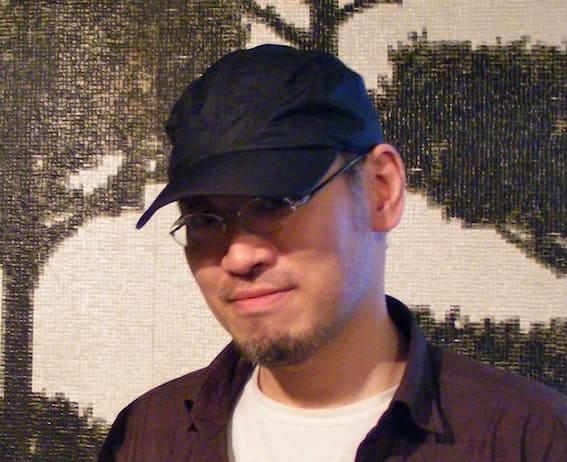
  • Meet the Protoculture Addicts: Miyako Matsuda

    Long before social media clashes and the rise of the internet, small groups of passionate fans dedicated themselves to spreading their love for Japanese animation. This is the story of how Quebecers, writing in their unique English, influenced Parisians and helped shape the anime and manga landscape in France.

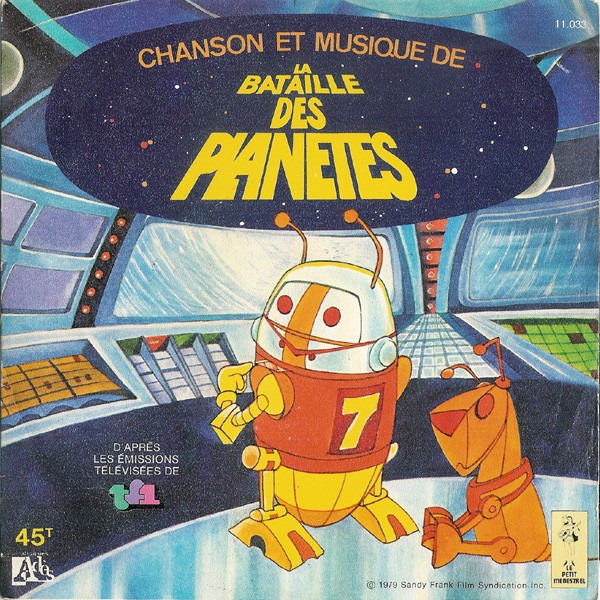
    For young people nostalgic for the ’80s they didn’t experience, here’s some context. Japanese animation had been airing in the United States and France since the 1960s, though few recognized it as Japanese. In the late 1970s, following the 1977 release of  Star Wars, many Western companies began buying Japanese sci-fi series, adapting them for local audiences. For instance, the 105-episode Kagaku Ninja-tai Gatchaman (1972) was re-edited into 85 episodes for Western broadcast, with scenes deemed too violent removed and new segments featuring a robot character (7-Zark-7) added to evoke Star Wars‘ R2-D2.
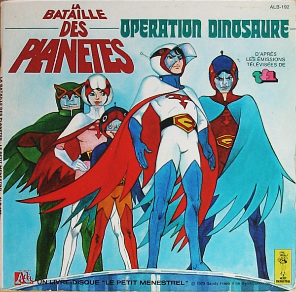
    The U.S.-produced version by Sandy Frank Entertainment aired on France’s TF1 in 1979 under the title La Bataille des Planètes, intended to rival Antenne 2’s Goldorak, which had been running since 1978.

    The Robotech Effect

    Similarly, Karl Macek, on behalf of Harmony Gold USA, re-edited multiple Japanese sci-fi series, transforming Chôjikû Yôsai Macross (36 episodes, 1982), ChôJikû Kidan Southern Cross (23 episodes, 1984), and Kikô Sôseiki Mospeada (25 episodes, 1983) into the unified Robotech, which aired in the United States in 1985. This version reached France’s La Cinq channel on May 25, 1987, through the program Youpi! L’école est finie. By then, American and Canadian audiences had already embraced the saga’s unique blend of space battles, romance, political drama, and intimate tragedy.
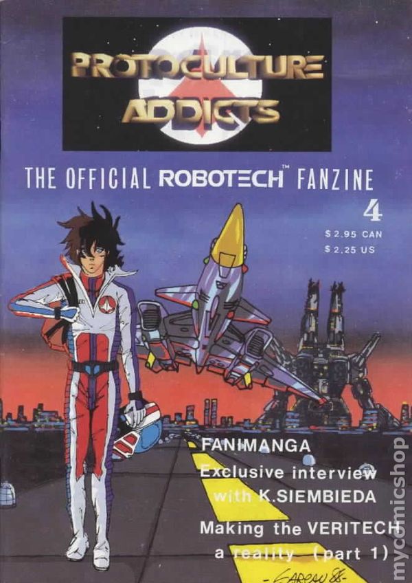
    To unify these three series, the American editors revised dialogues and added a new mythology in which “protoculture” became a coveted energy source for humans and extraterrestrials alike. The term “protoculture” inspired the name of a Canadian fanzine that became Robotech‘s official fan magazine in North America. 

    Over time, this fanzine evolved into a broader publication covering Japanese pop culture, including anime, manga, and various related merchandise. It quickly became an indispensable resource for European fans, connecting enthusiasts across continents. In one 1992 issue, Philippe Lhoste—an editor at AnimeLand, a Paris-based fanzine established in 1991—even contributed an article on France.

    To learn more about Protoculture Addicts, visit the blog of one of its founders, Claude J. Pelletier, who provides a retrospective of the fanzine here and shares a roundtable discussion on its pioneering role in pop culture here.
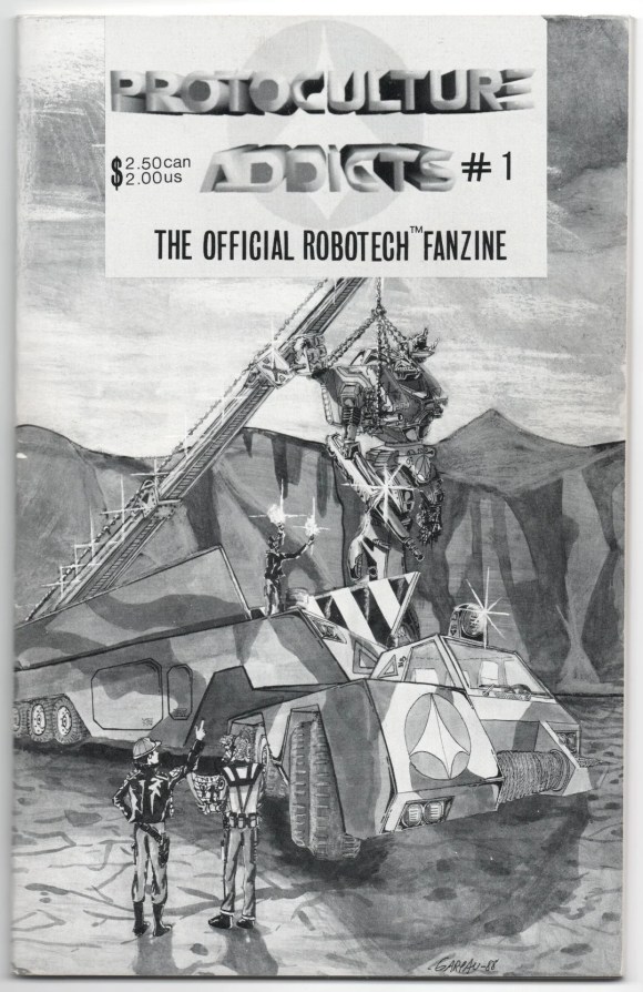
    Eager for more firsthand insights, I reached out to Claude and his wife Miyako, who graciously agreed to answer my barrage of questions — some insightful, some less so. Thanks to them, I now present exclusive reflections from two people who helped transform the cultural landscape of France.

    Here are Miyako Matsuda’s reflections on this pivotal era in the 1980s. (To read the testimony from Claude J. Pelletier, you’ll have to wait or read it in French here.)

    Manga and Anime in Japan

    Miyako Matsuda: My decision, I think, was quite personal. My parents wanted me to stay in a farming village to get married and have children, like everyone else. We only live once and I wanted to see the world outside Japan.

    Miyako Matsuda: My parents bought a TV set when I was 6 years old, and in 1966, we could watch anime shows. I could look at lots of cartoons in newspapers. Dr. Osamu Tezuka’s Tetsuwan Atom (Astroboy) was already on the air and I started watching (when I was 6). In a small farming village, there was a movie theatre. I was 17 years old when I finally could go to a movie theatre, so most of the anime/movie viewings came from TV. Fortunately, Japanese TV showed many American/European films (mostly dubbed).
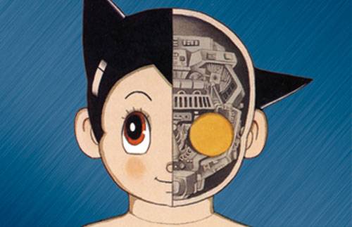
    Miyako Matsuda: Everyone was watching TV and we, little kids, all talked about anime shows we watched on TV at school. Even teachers loved the science fiction shows in the 1960s during the space age.

    Miyako Matsuda: I could read lots of comic books and magazines because older girls were buying them and I could read them after they read, such as Weekly Margaret magazine. It was certainly a big window for little kids to learn about other countries and history. I might be a big reader but I know there were more girls who were reading much more than me (their parents were well-off people to buy those books.).

    Miyako Matsuda: I was surrounded by older kids who were buying weekly manga magazines and I could borrow quite a few of them all the time to read many Shojo Girls manga titles. In the 1960s, lots of stories took place in the USA & Europe (for girls to dream like Princess Sissy type manga with romantic themes & costumes. Japanese TV stations were showing Popeye, Tom & Jerry and many American animation (dubbed in Japanese) titles. Most of the occasions for me were at the bookstores, TV, and older Kids’ houses to watch & read comics.

    Miyako Matsuda: In the 1970s’ during the economic boom in Japan, the Year 24 Group manga artists gave us young girls “dreams”, I think, to escape from our society of Japanese conformity. The Rose of Versailles and The Clan of Poe are the biggest influential titles, I think. We learned so much about European history, thanks to their manga titles & their works!
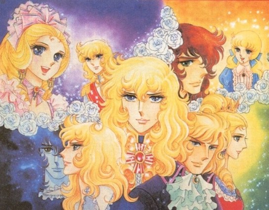
    Miyako Matsuda: I still like Shojo Girls’ manga genre, but today, I’m not sure if young Japanese readers like historical theme-based manga. Publishers have to make money, therefore if there is not enough demand, they won’t touch those titles. 

    Back in the 1970’s, I really loved manga works by Ms Kumi Morikawa who brought more complicated European history in Italy, etc., with her beautiful artwork!

    Miyako Matsuda: Riyoko Ikeda’s works like Eroica, Catherine The Great or To the End of Heaven (Ten no Hate made), etc., are really really LONG. I do hope those titles will be translated in the Future. (If not, fan-based translation??). To me, she is a National Treasure of manga!
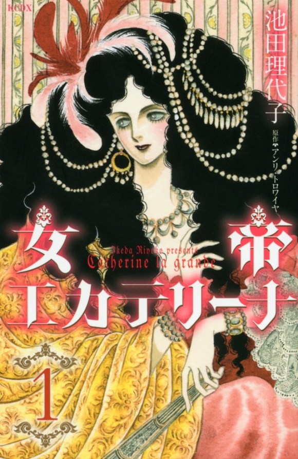
    Japan and US

    Miyako Matsuda: Yes, Japan was occupied for 7 years after the War, and since Japan had to surrender (under the “Unconditional Surrender” agreement) after the total devastation (atomic bombs, carpet bombing) people were desperate, just to survive. 

    We can’t deny that the atomic bombing made young people in those days anti-USA and became communists, not knowing the reality of China & USSR, etc. Mr. Hayao Miyazaki was a cartoonist for a communist newspaper, Aka-Hata (“the Red Flag”), when he was young and the creator of Gen of Hiroshima, Mr Keiji Nakazawa, couldn’t come to the US until the end of the Cold War, etc. 

    I’m not sure how those creators were feeling… and the fact that those creators still make films based on World War II even today, they really want “peace”. The sad fact is that we can’t defend ourselves without arms, and history seems to repeat itself. 

    Miyako Matsuda: I don’t know if young Japanese girls think of Europe as Dreamland. After the World War II, Europe was in a difficult place as well. Now, since most young people have a good life with education & entertainment. Fortunately, I was born 15 years after the war, therefore I didn’t experience “hunger” as my parents did during the war, and we kids could eat American food for school lunch programs, which was provided by the US Department of Agriculture. 

    Miyako Matsuda: You see, the public & people have the right to be “wrong” in democracy, but people have NO right under authoritarian regimes like Russia & China. People should realize that! 

    Entrepreneurship

    Miyako Matsuda: No, I didn’t work for any anime company. I worked at Eclipse Comics in the US as a retouch artist /inker during the 1980s, and really enjoyed it until this company went bankrupt. 

    Miyako Matsuda: For Protoculture Addicts, I’m Claude’s wife, so I tried to help and write articles as much as I could. My sources of information were Japanese anime magazines, especially Animage which provided me with lots of information. This is 2024, and I’m not sure if any manga authors/anime creators know about this magazine which ended the publication in 2008.

    Miyako Matsuda: Yes, I did translations but, since I’m NOT a native English speaker, (I’m trying to learn English, joining the fan club of Sherlock Holmes, etc.) I need to team up with someone who’s a native English speaker. When I was in the US, I had some anime-fan friends who helped me (to do some anime show translations like the Urusei Yatsura series). 

    To be a translator and to make a living is very difficult and I do admire people who are real professionals. Many translators usually have jobs like teaching at school, etc., to pay the bills first, I think. Now, the computer seems to translate almost everything (with AI’s help), I don’t know if the working conditions for translators will improve unless they have a day job to pay the bills.

  • Ghost in the Shell  and the Tachikoma – Biomimicry and Mecha design

    Ghost in the Shell and the Tachikoma – Biomimicry and Mecha design

    What is the link between Ghost in the Shell, spiders, and modern robots? Biomimicry, i.e., technological design inspired by nature. Here’s how a manga creator got ahead of robot production companies.

    Most western science fiction series are lazy as they opt for photo-realism. For the mechanic’s design, most SF series only adds a slight modification to existing objects.

    Speed and firepower seem to be the only difference between the Second World War tanks and future versions. But the design remains mostly unchanged.

    In contrast, Ghost in the Shell’s world is full of graphic invention and ingenious design for the future’s weapons and vehicles.

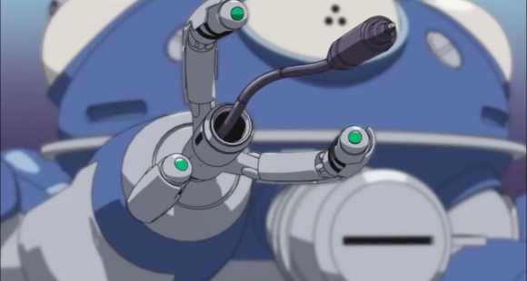
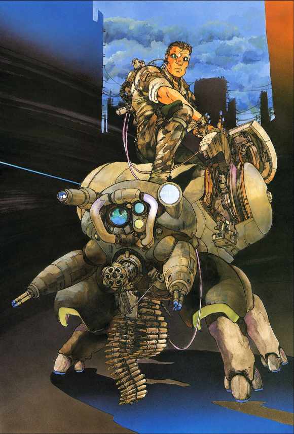
    The most striking example is the Tachikoma, an intelligent tank with the shape of a spider.

    In a sense, Masamune Shirow used biomimicry before it was fashionable.

    Biomimicry and reproduction of living things

    What is biomimicry? Biomimicry is the imitation of animals and plants’ shape to resolve a defined challenge. In other words, it is the transposition of living beings’ skills into the field of technology.

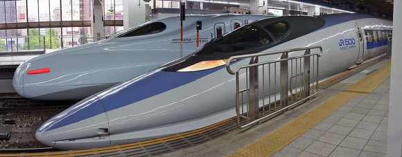
    The Shinkansen (Bullet train) is thus inspired by the kingfisher’s beak to limit friction, increase speed, and reduce noise.

    The bird is very effective at diving with minimum friction.

    Engineer Eiji Nakatsu also took inspiration in the owl to minimize the sound of the Shinkansen 500 Series. The feathers of this silent night hunter reduce noise.

    Shinkansen 500

    But what does this have to do with Ghost in the Shell? Well, animals and insects inspired the manga creator for the design of all the gears and mechanic assets shown in this science fiction series.

    Tachikoma: the intelligent spider tanks

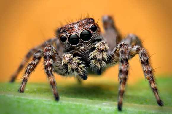
    The shape of jumping spiders inspires the intelligent tanks in Ghost in the Shell.

    Say Hello!

    Instead of being a mini truck on mechanical tracks, these individual tanks are the perfect combination of an exoskeleton and an armored shell.

    In the manga, they are called Fuchikoma. They serve as both a combat vehicle and a robotic bodyguard serving as logistical support for humans and cyborgs. 

    Their thermoptic camouflage is similar to the heroine’s one, Major Kusanagi.

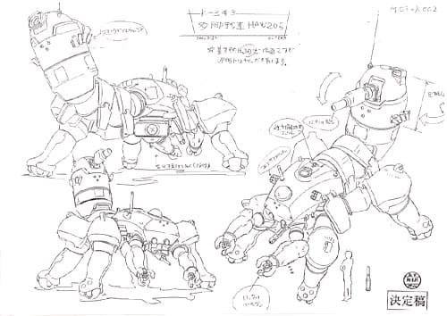
    Like spiders, Tachikoma’s body has two sections. The front part has eight legs, two of which are smaller and serve as the equivalent of human hands. 

    The legs feature retractable wheels and three rhinoceros-like toes/nails.
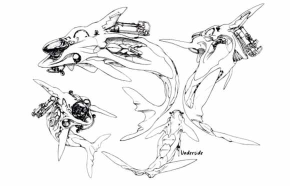
    The hind part is the receptacle where the human/cyborg pilot manages the vehicle. The human/cyborg pilot is half crouched or lying down depending on the type of tank.

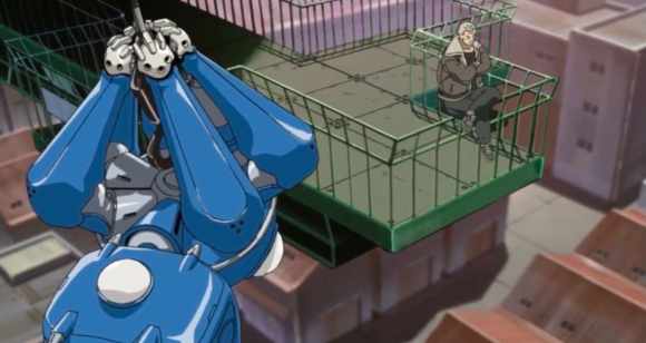
    In spiders, this rear part provides silk. Some species use it to weave webs, but others use it as a lasso to catch prey from a distance or as a parachute to travel further.

    In the manga, cable replaces silk to move upwards. 
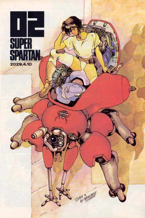
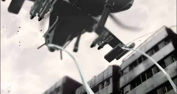
    Several episodes of Ghost in the Shell Stand Alone Complex 2nd Gig highlight the Tachikoma’s features. 
    Tachikoma suspended by its “silk thread”
    Fil de “soie” lancé par le Tachikoma

    The heroine’s tank holds a helicopter with its “silk thread” for the time it takes for a sniper to get rid of the human agent flying it.

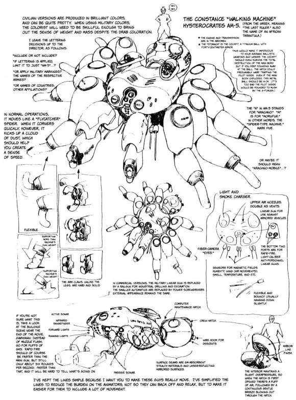
    The idea of a spider armor was already there in Appleseed, but the design seemed very massive. 

    Le nom du tank – Hysterocrate – désigne une vraie araignée géante

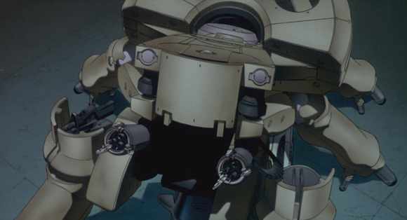
    It is slightly reminiscent of the giant spider tank that appears at the end of Mamoru Oshii’s Ghost in the Shell.

    Le tank du film de Mamoru Oshii

    Tachikoma and “esprit de corps”

    In the Ghost in the Shell Stand Alone Complex (GITS SAC), arthropod tanks are named Tachikoma (due to a rights issue). 

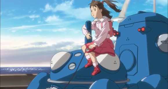
    They have an AI and a juvenile personality that permeates through the childlike way they express themselves.

    Tachikoma helping a girl to find her lost dog

    In the manga and its adaptations, there are comical allusions to Isaac Asimov and robots’ revolt.

    At the end of each GITS SAC episode, mini humorous sequences feature the Tachikomas — some parody animal documentaries.

    More than a mass destruction weapon, the Tachikomas are learning creatures. 

    They regularly synchronize and share their “memories” to enhance their machine learning.

    These characters are incredibly endearing. Their candid personalities serve as a counterpoint to the somewhat tangled plot.

    Throughout the episodes, the Tachikomas develop a personality and come to become autonomous and “conscious”.

    At the end GITS SAC first season, they sacrifice themselves to save Major Kusanagi and Batō. 

    In the second season, they save Japan from a nuclear attack by renouncing their consciousness.

    Thus these Spider Tank shows “esprit de corps”, incredible loyalty to their pilot.

    In the other Ghost in the Shell series, the arthropod tanks have other assets and different names:

    • Fuchikoma in themanga
    • Logikoma in GITS Arise
    • Tachikoma in GITS SAC
    • Uchikoma in GITS SAC 2nd GIG

    But in all cases, the spider design is kept to make them fast, maneuverable, and resistant even in urban combat.

    For the moment, no army seems ready to invest in single-passenger spider armored vehicles.

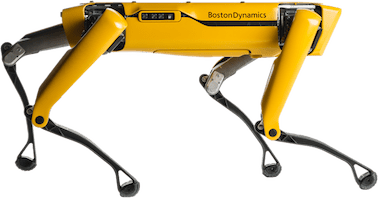
    But some companies are selling quadruped robots to serve as logistical support as the Logikoma (but they are not as cheerful).

    SPOT le robot quadrupède de Boston Dynamics

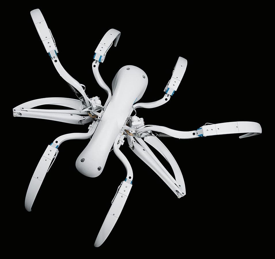
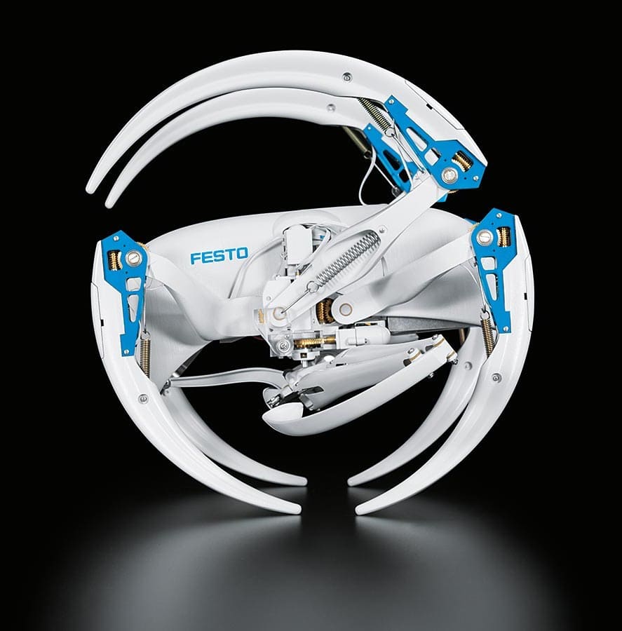
    Other companies as Festo present models of spider robots that can roll on themselves instead of moving around with a silk thread.

    Miniature and giant wasps

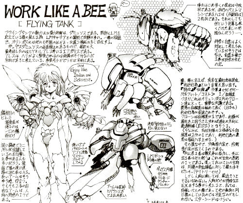
    In addition to spiders, Masamune Shirow has a passion for Hymenoptera: bees, wasps, and other flying insects. 

    In the Appleseed series’ design notes, he produced many winged exoskeletons. These appear in the Appleseed Data Book and Appleseed Hypernotes.

    Design de tank abeille dans Appleseed

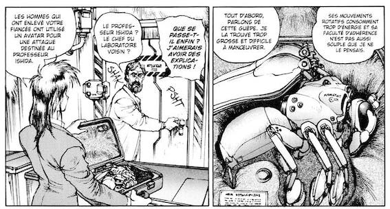
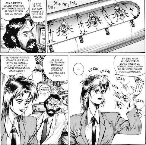
    Readers can see Masamune Shirow’s obsession with wasps in a chapter of Ghost in the Shell 1.5, which deals with miniature robots that serve as support and access to restricted spaces.

    The idea may have seemed far-fetched in the 1990s, but today some companies are building bees robots to pollinate plants. 

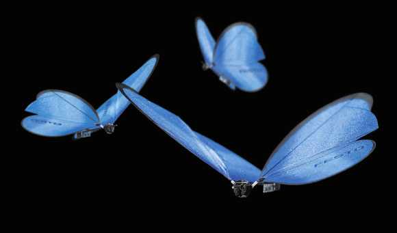
    In contrast, others offer butterfly robots as a technical demo. Bees robots also appear in a Black Mirror episode.

    Butterflies Robots by Festo

    After Ghost in the Shell’s end, Masamune Shirow imagined a universe where these insects become the dominant species: Neuro Hard. 

    Here again, many sketches and long explanations show that the author is passionate about the insects’ world.

    Unfortunately, insects don’t fascinate his readers even though he adds pretty women in the pictures.

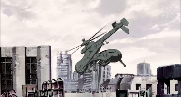
    In GITS SAC, wasps appear in the form of a helicopter in the second episode. 

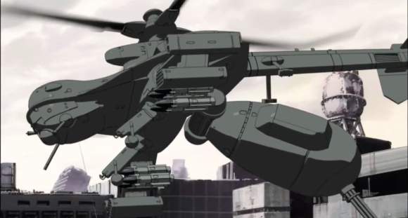
    Episode 4 of GITS SAC 2nd GIG features a fight between Tachikoma spider tanks and anti-tank helicopters called Jigabachi. 

    Their name is a reference to a type of wasp that has spiders as prey. It is why the title of the episode is “natural enemy”.

    The Jigabachi helicopter has a movable hind part that can fold up as when the insect is about to bite its enemy. 

    An anti-tank machine gun replaces the venomous sting.

    Other insects and animal forms

    In addition to spiders and Hymenoptera, other insects make their appearance in Ghost in the Shell. 

    GITS SAC episode 2 features a scorpio-shaped tank that turns against the army. 

    Tank scorpion dans GITS SAC

    Is it a terrorist hacking or something else? 

    I won’t tell you anything about it, but the mecha is very impressive, according to the Tachikoma escorting him.

    In Masamune Shirow’s manga, watercraft take on the forms of marine mammals. Whales and dolphins inspire submarines and other propulsion devices.

    In the animated adaptations, these devices are rarely seen. In the film GITS Innocence, there are various ships with “fins” and a fast underwater vehicle.

    GITS Innocence

    In the real world, marine animals’ biomimicry is much more common than insect shapes for military vehicles. In addition to swimming and diving suits that limit friction like shark skin, dolphin-shaped robots are produced.

    The military has long attempted to train marine mammals to detect or install underwater mines. Several armies are currently developing dolphin-like robots for this type of task.

    GITS Innocence

    At the end of the 1980s, the Ghost in the Shell series provided innovative design ideas. They are now being put into practice by robotics companies. 

    Apart from these numerous biomimetic designs, Masamune Shirow is nevertheless keen to pay tribute to science fiction masters. 

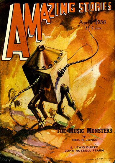
    He makes a nod to Professor Jameson and his minimalist box-on-legs design.

    He is the hero of a series of science fiction novels created by Neil Ronald Jones (1909 – 1988). The first story published in 1931 tells the adventures of a human whose brain is transferred to a machine by aliens.

    Translated into Japanese, the novel featured illustrations that impressed Masamune Shirow enough to use it for the design of one character: the CEO of a company specialized in the production of organs for transplantation.

    The humorous contrast between the boxed brain and his business involving growing compatible human organs in pigs is striking.

    As a result, the innovative design is not always useful to make an interesting character. But it is an incredible way to help us innovatively fantasy the future.

    If you’ve read so far and enjoyed the article, support this blog and  buy me a coffee 🙂

  • Interview – Eiji Aonuma

    The other father of Zelda

    At 47, Eiji Aonuma, producer of the Zelda series, is a pillar of Nintendo. After starting on a Super Famicom game (Marvelous: Mouhitotsu no Takarajima), he worked on the dungeons in Ocarina of Time, including the Zora dungeon, which remains his favorite. He was then entrusted with directing the saga, and he is currently working on the new Zelda Wii with Shigeru Miyamoto. Often laughing at our somewhat off-topic questions, he nevertheless answered all our queries with humility and sincerity.

    Zelda is a very difficult game to make because the episodes are always very dense in terms of content. The previous game took us three years to make. Spirit Tracks took us two because the train concept alone required a year to define! The idea of the train was there from the start. Initially, the plan was to draw the tracks with the stylus and have the locomotive follow the line thus created. But that wasn’t a good idea. Drawing a straight line on the DS is quite difficult, and players could go anywhere from the start. They wouldn’t necessarily have known where to go; they wouldn’t have been guided. They would have had too much freedom, and it was then very complicated to create a story. It took us a year to work out the concept of the erased tracks that must be recovered as the adventure progresses.

    It’s an artistic choice rather than a practical or game design choice. There are things you can do on a home console that you can’t do on a handheld. When developing a game for a home console, it’s important that the graphics be very polished. The machines are more powerful, the screens bigger, and the staging possibilities more elaborate. That’s why Twilight Princess was more cinematic and the character design more realistic. For the DS versions of Zelda games, you have to take screen readability into account. If we had adopted realistic graphics, that would have hurt the game. Everything would have had to be to scale, and we would therefore have had to make it so the player could explore towns at the right proportion. But Link would have been very small and hard to control. So we favored the cute cel-shading style, because it allows for great variations in scale without shocking players. You can make characters as big as houses or gigantic scenery without hurting graphic coherence.

    Not at all! It’s above all about adapting to the platform’s constraints to make controls easier.

    For me, being tired would mean I’m always doing the same thing. But creating a Zelda isn’t repeating yourself. We have great freedom because of the title’s popularity. We are obliged to reinvent ourselves each time so as not to disappoint fans. It’s a kind of intellectual challenge: we must always do better, always be innovative. Would you have imagined that one day there would be a train in Zelda? As long as I have the freedom to create in this universe, I can’t get tired. People often say to me: “What? Another Zelda?” Yes, another one, because I take great pleasure in doing new things in this universe. For me, it’s a little theater in which I tell new stories, I put in new set elements to surprise the audience. It’s a container in which the content is renewed each time, and that’s what’s fun!

    Indeed, the flow of a Zelda is always the same. That’s part of the creation rules: you start with a small character who gains great powers and ends up facing the super boss in order to solve all the problems, and it stops there. The formula works, but it’s true that with Mr. Miyamoto, we said to ourselves that it was time to change a little. I can tell you that the next Zelda on Wii will have a flow a little different from what we’re used to seeing.

    It’s true that open worlds are very fashionable right now, but that’s not the direction we think we’ll take. I believe we need to be able to commit to games where freedom is total. Players are happy to be able to do whatever they want, but the gaming experience wouldn’t be the one we want them to live. We build our games so that players feel very specific emotions. We want them to feel involved, and at Nintendo, we have a tradition of evolving the game’s difficulty by designing tiered levels. It’s a know-how to accompany the player by modulating difficulty. Unfortunately, I can’t tell you much more about the next opus, because it’s a project that hasn’t been presented. We’re not going to choose either going in a certain order or broadening the player’s freedoms. We’re going to develop something else to renew the next Zelda.

    That’s a very broad question (laughs). I can tell you how we design the stages of a dungeon. It’s actually very simple. You’re at the beginning and you have to reach the end, that is, the confrontation with the boss. In terms of planning, we see that Link is here and he must finish there. We then ask ourselves how he can get there. After performing several actions, he gets closer to the boss room, but he can’t enter it. He must then take another path and discover a new item allowing him to access other rooms and face the boss. There, the dungeon is finished! That’s the angle we work from: how are we going to arrange the player’s path to bring them from the beginning to the end? It then has to be well paced, interesting, and well balanced. You know, in Japan, we have a way of telling stories in four acts. There is a beginning, a progression, a twist, and an epilogue. The beginning corresponds to entering the dungeon. The progression is when you reach a place you cannot cross. The twist coincides with obtaining an item that unlocks the levels. Finally, the epilogue is the final confrontation with the boss.

    I only worked on the dungeons in Ocarina of Time. For the other titles, I had a higher position and there were people dedicated to creating those dungeons. But in my entire career, the most difficult dungeon to make was probably Majora’s Mask, because it’s a game where you are limited in time. There are only three days to save the world, and if you don’t succeed, you have to go back in time and start over. That opus is like a big dungeon in itself, probably the biggest ever designed for the Zelda series, and it was very difficult to design and balance the progression.

    The time dimension is always very interesting to use, especially for the player, because in limited time, they feel more alert. But there’s no point in doing the same thing again. We’ll find another way to maneuver time in a future episode.

    It’s hard to know what we could do in the next ones because we’ve taken so many directions! (Laughs.) Time is a universal and very comfortable element: everyone knows that after morning comes afternoon, then evening. It’s a rule we all know and that makes a game’s flow easier. It’s an inevitable thing that at the same time allows you to gradation a duration and add rules that will seem natural to a game. We can’t do away with this notion, even if it’s difficult to do something new compared to what we’ve already done.

    The particularity I bring to the Zelda universe is the scenario, quite simply! (Laughs.) Mr. Miyamoto is not someone who is interested in stories. For him, if the game is fun, there’s no need for dialogue or scenario. Remember, in the very first episode, you were put there and you had to fend for yourself! There wasn’t a single line of dialogue. You had to explore the world in search of dungeons without any help. I brought more dialogue and more construction in the narrative flow.

    Zeldas evolve, and we may not develop dialogue or plots even more. Maybe we’ll return to our roots! I don’t know.

    There is a timeline where all the episodes are placed relative to each other. But only two people know it: the Zelda director and me! If we ever made it public, players would try to fit the episodes chronologically in order to discover what happens in the next opus. There would be no more suspense! We use the timeline as a reference, but it’s not an absolute rule that prevents us from doing things either. We don’t say to ourselves that we’re going to make a Zelda between this one and that one. The approach is the reverse. Once the episode is made, we decide its place in the chronology.

    You think that we, the creators at Nintendo, are very prominent? You think it’s a respectable profession? (Laughs.) Actually, it’s hard to answer your question because, if that’s the case, I don’t feel it. As for knowing whether I could claim to have a prestigious position in another company, I admit I’ve never thought about it! I don’t have the impression that our profession is fabulous or hyper respectable. Of course, I’m very proud of what I do. I’m very happy to make games and that people all over the world are waiting for the next Zelda. It fills me with joy, but I’ve never told myself that my profession was shameful or respectable. I’ve never operated with those values! I’ve always been a good employee who does his best to make fun games, and that’s how I see my work. I don’t do it for social esteem. I do this job because it interests me and I give it my all because I love it, quite simply! I also don’t see where I could go, because I am “the person” who makes video games.

    My answer may seem strange to you, but it’s the same for Mr. Miyamoto. He’s someone who is fully into his work and thinks of nothing else. He doesn’t reason by saying: “I’m going to take a pile of money and I’m going to do lots of great things.” He has no self-confidence at all and doesn’t even realize that he’s a wonderful person. If you tell him he’s great, he replies that no, he’s just an office employee. It’s a very healthy and very refreshing attitude that pulls us all upward. I just live to create things that are always more fun, more exciting. Mr. Miyamoto is someone who is proud of his work, and he is right to be. And it’s under his influence that I am like this too. I think it’s a very healthy way of doing things.

    Of course, blank page syndrome happens to me often, and as I get older, it happens more and more (laughs)! But I do my best to make it happen as little as possible.

    And then, you know, I’m surrounded by a staff of very competent and very dynamic people who have a lot of personality. We send each other ideas. They circulate and that’s how they evolve. It’s also thanks to all these people that it works well!

    Interview originally published in IG Magazine 6 at the release of The Legend of Zelda: Spirit Tracks (2009)

  • Nobuteru Yuki, Art Director and Character Designer

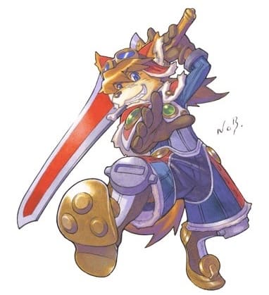
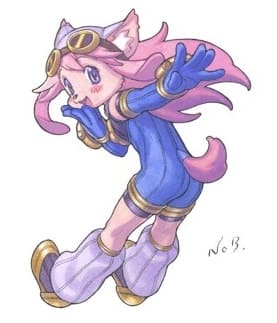
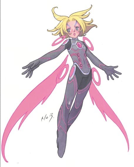
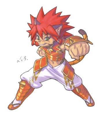
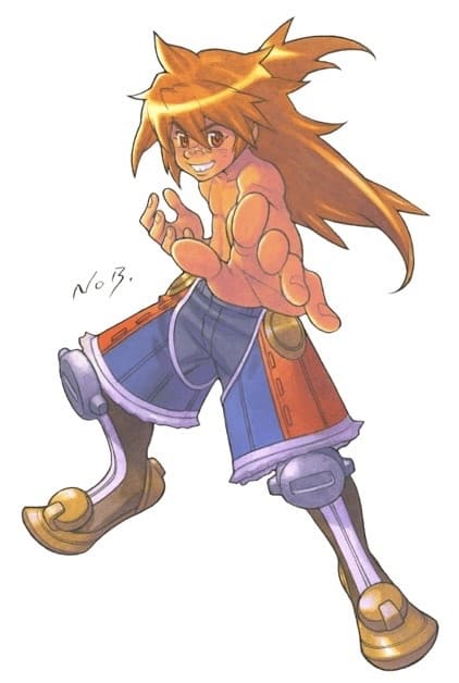
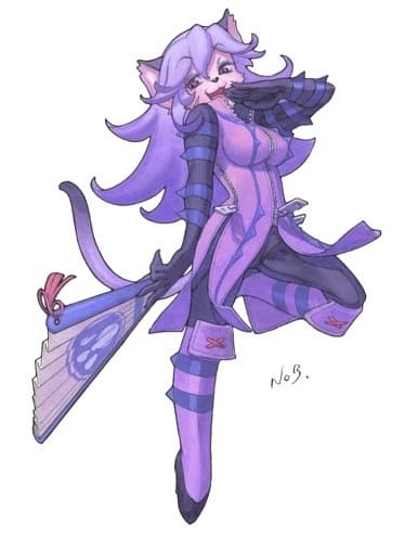
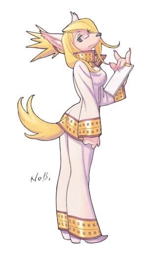
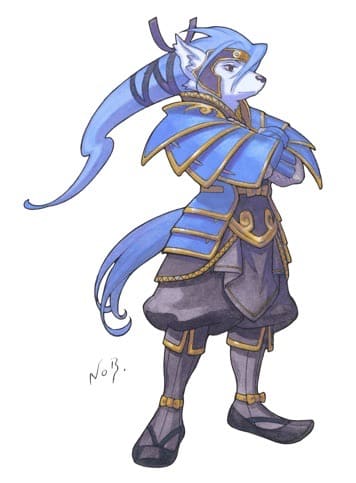
    We already spoke about character designer Nobuteru Yuki during the interview with the CEO of CyberConnect2 in IG 11. Renowned in the world of animation, he also did the character design for Tail Concerto and other video games. Namco Bandai called on him for Solatorobo, an action/RPG on DS that takes us into a fantastical world. Mr. Nakata (producer) and Mr. Yuki spoke to us at length about the design work on this title.

    Character design and video game

    R. Nakata: Actually, they were two independent decisions. On the one hand, we asked Nobuteru Yuki to work on the character design. On the other, it was the production unit that asked to work with Madhouse for the animated cutscenes. These decisions were moreover made by different people.

    Nobuteru Yuki: As a designer, I can tell you how I feel. A huge number of things have changed between yesterday and today. The main difference comes from the way the story is highlighted. Before, people mainly used designs that recalled fashionable manga or anime. It was very stylized. Today, we tend to see titles with a realistic graphic style that is quite far from what I am used to doing. Some companies like Namco Bandai continue to collaborate with famous manga artists and character designers to make series like Tales of. But most publishers prefer to release titles with photorealistic graphics. My feeling is that it is nevertheless more difficult to tell stories with realistic graphics. As a Japanese person, I have less desire to go on an adventure with a character that corresponds to reality than with a stylized hero who reminds me of a manga. In my character design, I continue to give a fantastical, stylized look closer to manga. Young people today probably find this style a bit dated, but I think it is important to detach oneself from what already exists by offering something more fantastic and different in terms of visual identity.

    Nobuteru Yuki: Actually, as a user, I quite like this type of game with those realistic aspects. On the other hand, from a developer’s point of view, I find it really unfortunate that it is not possible to dig deeper into the visual identity of titles so that they stand out more from one another. Let’s take an example: place a Metal Gear character in a Resident Evil: no one would be shocked. Yet they are two games from competing publishers. I find it really sad that everything looks the same. What I regret most is the standardization at the graphic level.

    Nobuteru Yuki: I still play, but it’s true that compared to before, I do so much less because the internet takes up a huge amount of my time.

    Career in video games

    Nobuteru Yuki: I didn’t do much to work in it. In reality, it was Squaresoft who approached me to handle the character design for Seiken Densetsu 3.

    Nobuteru Yuki: If you’re thinking of Brandish [editor’s note: action/RPG released in 1994 on Super Nintendo], I only did illustrations for the covers and marketing images. I did not take part in creating the game.

    Nobuteru Yuki: When Squaresoft approached me, I had already moved somewhat away from animation. After Record of Lodoss War, I had paused my activity as a character designer to draw my own manga. I think that is what attracted the people at Squaresoft. They knew Lodoss, but for Seiken Densetsu 3, I was able to use the style I have in my manga [editor’s note: Vaelber Saga, published in France by Kraken in 1995].

    Nobuteru Yuki: I don’t really know. It’s true that when I was doing my manga, I was a little sad and felt lonely. I would say to myself: “Why do I have to do this very painful thing alone?” Even if I had assistants, I found it a very difficult and solitary job. I then really missed the atmosphere of animation, where many of us were drawing and laughing in the same office. So I think I prefer teamwork!

    Tail Concerto and Solatorobo

    Nobuteru Yuki: I am obviously a big fan of Miyazaki, but my main inspiration for this kind of character comes from Osamu Tezuka. Moreover, I didn’t absolutely want to do animal men; it was rather one of the constraints of the commission.

    How did you decide on the art direction for Solatorobo?

    R. Nakata: As you can see, there were many prototypes, and the team didn’t know which style to settle on. [Editor’s note: the producer spreads out on the table numerous explorations with styles ranging from Clone Wars to the Franco-Belgian line to the most kawaii manga.] The designs and production were well advanced, but the visual identity still was not. It took us some time before we realized that we were in a dead end and that we had to call on outside opinion. Among all these designs, this one was the most satisfying, but we were only 70% convinced. So we had to find someone capable of convincing everyone 100%. Mr. Yuki therefore started from this base to rework all the designs.

    Does that mean there was essentially a sorting and finishing job?

    So my role should not be exaggerated, because the game was already very advanced. I contented myself with refining the elements and delivering the final versions for each character. I also directed the production of the animation.

    Nobuteru Yuki: Each game is indeed a different situation, and I don’t intervene at the same stage of production.

    In the case of Chrono Cross [editor’s note: released in 1999 on PlayStation], Mr. Kato, the game director, had made preparatory sketches of the characters, and other explorations had been carried out by the internal teams at Squaresoft. But production was much less advanced than for Solatorobo: the game system was not at all finalized. So I redid the characters and delivered a character design thought out in relation to the scenario, which had been finalized long before. And it was according to the design and the scenario that the game system was then created.

    Video game development is a very long process. For me, the only thing that really changes from one project to another is the moment when my services are called upon. The work of character designer itself ultimately remains fairly similar, whatever the games.

    Nobuteru Yuki: That’s not possible, and in any case, we can’t change much. In the case of Solatorobo, the polygons don’t have many facets, and given the screen size, we do our best to make it readable. It is difficult to add things to already very simple models so that ergonomics are optimal. If I had allowed myself to say that an element should be added here or there so that it corresponded more to the drawing, that would have disrupted the development of the title, because everything had already been thought out to optimize the console’s resources. We could not afford to detail things too much, unlike what was done in Chrono Cross.

    R. Nakata: We showed various modeling examples, but he was not the one who handled it. He was able to comment on it because when he had finished redoing the character designs, they of course no longer matched the models initially created. So the modeling had to be entirely redone from these designs. But he did not supervise it.

    (Laughter)

    Nobuteru Yuki: It’s traditional! It’s Red Force [editor’s note: Japanese superhero] in Toei’s sentai series. Each time, he is the team leader and the main hero. That has shaped the collective unconscious.

    R. Nakata: In the case of Solatorobo, the game has a fairly complex scenario and is very science-fiction oriented. However, we did not want to scare children who might play it, and that is why we used the red color code so that the audience understands very quickly who the heroes are. We declined the basic colors: blue, white, and red with a little green and yellow. In other words, even if you look quickly at the illustrations featuring the characters, you know that he is the hero because he wears its colors!

    R. Nakata: Mr. Yuki was consulted for all the characters, and he changed certain colors to better differentiate them. Initially, some pairs of protagonists were in black and white tones with blue lines. To better distinguish them, he added pink to the female character. Likewise, a certain character was initially all in black, and he asked for certain parts of the costume to be white, judging that it would have more impact with that hue.

    Nobuteru Yuki: My role was to change the elements that did not seem correct or effective to me. I did not rework everything but simply modified the hues that did not seem adequate to me. When the color codes seemed right to me, I changed nothing.

    Nobuteru Yuki: Two years! (Laughter.) On the one hand, I had to redraw everything, and that took a certain amount of time. On the other hand, as I was art director on the animation, I also spent a lot of time on that production.

    Nobuteru Yuki: Actually, I don’t think about it too much, because in Japan the animations were distributed on DVD to be seen full screen. As for Europe, we’ll talk to Nintendo about it!

    Nobuteru Yuki: It’s true that I have to make sure all the character poses go together once they are all gathered. That is why I always start with the hero’s pose. Thus, the other characters can come into the background more easily. The pose has to work whatever character the hero is placed with. Then each attitude must highlight the particularity of the character compared to the others, their character traits. I started by drawing the three basic heroes, and each corresponds to an archetype and a color. From there, I worked on the other characters and made sure their poses never resembled those three attitudes.

    Nobuteru Yuki: I try to make sure that doesn’t happen, but it’s true that sometimes I’m drawing and I say to myself: “Ah, I think I’ve already done that!” And then I have to start over.

    Nobuteru Yuki: Yes, that’s what I aim for. In fact, that is what distinguishes character design for a game and for animation. When I create model sheets [editor’s note: visual identity sheets intended for animators] for animation, the characters are in the most neutral poses possible so that the animator can see all the details of the body in order to draw it from any angle. On the other hand, for a video game, the illustrations are above all meant to present the characters, to make you want to play. So you have to understand who they are at a single glance. That is the main difference between the two media.

    R. Nakata: I don’t know where you are in the game, but you should know that at some point, the animal heroes transform into humans, a bit like in the case of transformations where a character becomes stronger. However, with the usual illustrations, you can’t realize that, and you might think it is simply a game with animals.

    For the cover, we commissioned an illustration, and Mr. Yuki made that image, which we used for the Japanese version. The marketing and communications department then asked for another image so that the dramatic dimension of the game could be seen, and that is why he created this second illustration, which appears on the cover of the European versions.

    Nobuteru Yuki: It’s true that when I was asked for a cover illustration, I did that because I wanted something joyful and light. But the intention was also to show that the game has a serious scenario.

    R. Nakata: In Japan, the emphasis was on adventure and escapism, whereas at Nintendo’s request, in Europe, the communication focuses more on drama and the scenario.

  • Masamune Shirow: Portrait of the Manga Artist Behind Ghost in the Shell and Appleseed

    Ghost in the Shell is 25 years old, and this manga has not aged a day. Dense, rhythmic, intelligent, and gripping, it remains a window onto our near future. Unfortunately, the general public knows little about this major work of Japanese science fiction. Many have only seen the films or series adapted from it (out of laziness?). Likewise, Masamune Shirow, the original author is less well known than Mamoru Oshii, the filmmaker who adapted the work into a feature film. To try to restore the balance, here is a portrait of one of Japan’s most discreet manga artists.

    What do we know about Shirow’s life? Nothing. There is no official photograph, and few personal details are available. Moreover, Masamune Shirow is a pseudonym, and despite all the rumors circulating online, his real name is unknown. He generally represents himself as an octopus and has released only a few sketches of himself at work. Sparing with interviews, the manga artist prefers to let his work speak for itself.

    Everything we know fits in a pocket handkerchief. Born on November 23, 1961, in Kobe, he made his debut in drawing during his university studies in Fine Arts in a fanzine titled Atlas. Later, he became a drawing teacher before he could truly make a living from his manga. He did not read much manga during his childhood and was instead influenced by Studio Nue animation (Yamato, Macross) and the Gundam series. Later, he discovered the manga of Katsuhiro Otomo (Akira) and Fujihiko Hosono (Crusher Joe). Passionate about the latest technical innovations and research, he spends a great deal of time reading to keep informed, which gives rise to rather dense footnotes in his manga. And that is about all. As a result, one has to look for more information in his works.

    At a high level, technology is equivalent to magic

    Masamune Shirow shares with Isaac Asimov and Terry Pratchett the idea that at a very high level, technology can seem magical to ordinary people. Only the discourse surrounding the action changes. This is doubtless why he titled his first manga Black Magic M66. Published in a fanzine during his university years in 1983, this one-shot contains in germ his entire universe: utopia and political intrigue in a cyberpunk world, the difficult coexistence between humans and artificial creations, mythological references, and above all action with a heroine who hits far harder than the men.

    The plot features Duna Typhon, a female bioroid with very extensive powers who prefigures Deunan from Appleseed, with whom she shares the same initial and very little diplomacy. The action takes place on Venus, where the supercomputer Nemesis governs the living through its official representative, Zeus. With this series of mythological references, any reader familiar with Greek myths knows that this world is off to a rather bad start. Nemesis is indeed the goddess of vengeance among the Greeks. As for Typhon, he is one of the Titans who rebelled against Zeus. In this kind of draft of Appleseed, one senses that Masamune Shirow does not yet know where to place the emphasis or how to balance the different narrative threads (the police investigation, the overarching plot about the place of the living on Venus, etc.). In 1987, the animated version of this manga moreover focused on only part of the story in order to make it a coherent whole for a one-hour OVA. Even though he took part in developing the project by producing many preparatory drawings, Shirow was hardly pleased with the result and would be somewhat reluctant to collaborate on other projects afterward.

    One thing is certain: this manga, however imperfect, allowed Masamune Shirow to meet the head of Seishinsha at a convention where he was selling his fanzine. Subsequently, this publishing house would publish almost all of the manga artist’s works without going through prepublication in a manga magazine, as is the practice everywhere else in Japan. These rather exceptional working conditions allowed the author to refine his drawing and develop a truly coherent futuristic universe.

    Appleseed: The Seed in the Collective Imagination

    In 1985, Seishinsha published Appleseed directly as a bound volume, and the work won an award for science fiction comics. It was on this occasion that a second major element would change Shirow’s life and the reception of manga in the West. (If that’s not a teaser, what is?)

    But let’s go back a little and change countries. Toren Smith (1960–2013) was a Canadian comic book lover who moved to California to make a living from his passion by writing for various publishers. There he met another science fiction writer who introduced him to manga. Enthusiastic, Smith flew to Osaka for a science fiction convention: Daikon. There, normally, Evangelion fans hold their breath because they know that the opening short film of Daikon IV allowed a group of otaku to found Studio Gainax. Unfortunately, Smith did not have the chance to attend that historic moment. However, he did attend Daikon V and made a much more important encounter for the dissemination of manga outside Japan. Indeed, it was at this convention that Masamune Shirow received the award for best science fiction manga for Appleseed, a work that Smith would promote and translate for the USA. The Canadian was so sure of the manga’s quality that he founded his own company to translate and promote Japanese comics: Studio Proteus. Of the ten works that marked the beginnings of manga in the USA, he co-translated nine. Among them was Appleseed.

    (It was through this translation that I myself discovered Masamune Shirow. At the time, this manga was sold at a prohibitive price in a comic book shop in Paris.)

    It would take many years before France in turn benefited from a translation. But in the meantime, Masamune Shirow’s manga was read and assimilated by a whole generation of artists fascinated by the testosterone-fueled heroine Deunan Knute. The exoskeletons allowing soldiers and terrorists to confront each other in breathless action scenes also entered the collective imagination. It must be said that this manga was right in tune with the trend of the moment: in 1986, James Cameron released Aliens with a heroine who is not afraid of weapons and who fights the alien queen in a giant robot machine in the final scene. No wonder the director was a fan of Shirow and later promoted the film Ghost in the Shell.

    Ghost in the Shell: The Consecration

    If the four volumes of Appleseed allowed Masamune Shirow to refine his line and leave his position as an art teacher, the work nonetheless remained unknown to the general public. It also bears witness to an era when the Berlin Wall had not yet fallen and when computer terrorism was still a distant fiction, since the internet was in its infancy.

    In Japan, the success of Appleseed attracted the attention of major publishers, and in 1989 Kodansha signed with Shirow for a series of pages in Young Magazine, one of its manga magazines aimed at seinen readers. It was during this period that the author created the first pages of Ghost in the Shell. In this work, the artist offers a more complex and more ambiguous world where political intrigues go hand in hand with technological manipulation, multinational corporations, and terrorism. Mythological references are more discreet, and explanatory notes on the universe punctuate almost every page.

    Of course, the heroine Kusanagi is even more powerful and sexier than her predecessors. This cyborg commands Section 9 and investigates the less glamorous aspects of the futuristic universe imagined by the author. Here again, the work perfectly matches its era and anticipates the doubtless less optimistic atmosphere of Japan struck in 1995 by the sarin gas attack in the Tokyo subway and the great Kobe earthquake that destroyed Shirow’s house. 1995 was also the year of the release of the film Ghost in the Shell and the American translation of the manga by Studio Proteus at Dark Horse.

    I will not dwell on the creation and reception of the film because I have already written an article on it: the legacy of Mamoru Oshii’s film.

    But it is clear that the film largely contributed to the success and fame of the manga even though it departs from the original atmosphere. Subsequently, Masamune Shirow invested himself in the creation of the series Ghost in the Shell: Stand Alone Complex, far more faithful to the initial work. There we find the atmosphere of GITS: Human Error Processor, grouping investigations by Section 9. He was notably responsible for the design of the Tachikoma, tanks with astonishing intellectual capacities. Moreover, it was on this occasion that he worked more closely with Production IG, for whom he subsequently developed the concepts for the science fiction animated series Ghost Hound (2007) and Real Drive (2008).

    Ghost in the Shell: The Burden of Success

    The problem with the enormous success of the Ghost in the Shell film is that it gives a very distorted view of Shirow’s work, and one can well understand the disappointment or disbelief of fans of the feature film when they read what the publisher titled Ghost in the Shell 2. Gone is Kusanagi’s usual body, as she takes over various female bodies, each more buxom than the last, for an investigation linked to both terrorism and industrial espionage. The whole thing ends in an almost mystical way with an encounter between the former major and another version of herself. Disorienting even for Masamune Shirow fans, the manga above all bears witness to a desire to create color illustration.

    Having started with oil painting at university, Shirow switched to acrylics for his manga and quickly became passionate about digital illustration. He experimented with several types of coloring on his Mac, leading to digital publications with hues that are almost too vibrant. In fact, there were two versions of GITS: Man Machine Interface (Ghost in the Shell 2 in France), one of which is more “restful” for the eyes…

    Ghost in the Shell also eclipses Shirow’s other works released in the late 1990s, such as Dominion Tank Police 2 (1995), the sequel to the 1985 comic that was a kind of lighter, more comedic counterpart to Appleseed. Likewise, few people know Orion (1991). According to Masamune Shirow, this manga is to Ghost in the Shell what Black Magic M66 is to Appleseed. He defines it as a lighthearted manga, a comedy based on Japanese mythology and the Cthulhu mythos developed by H.P. Lovecraft. The whole thing is complicated by the fact that Shirow uses kanji that mean two or even three things at once…

    Admittedly, Dominion and Orion remain minor works, but their limited commercial success compared to Ghost in the Shell may also have pushed publishers to ask the author for even more GITS, while in the meantime he had begun to take more pleasure in creating illustrations than manga.

    From Manga Artist to Artist

    Indeed, alongside the development of his manga, Masamune Shirow produced more and more illustrations for video games, novels, calendars, and artbooks. There he could more freely indulge his passion for muscular female bodies and machines without having to tie it all together with a storyline… In the artbook project Exon Depot, there were already three wordless manga, a kind of preamble to a Shirow who would gather his footnotes and dialogue elsewhere.

    It must be said that the author seems more interested in creating a coherent futuristic universe than in producing manga set within it. Thus the world of Appleseed is shown in a volume containing only sketches and technical explanations (Data Book). Similarly, in Ghost in the Shell, certain chapters serve only to better show the futuristic world in which the adventures of Section 9 take place. This is the case for the chapter devoted to the creation of cyborgs and the one on the machine revolt. Outside his manga, Masamune Shirow also tried to build a science fiction universe through Neuro Hard. This project comprises about ten eight-page color chapters published in Dragon magazine between 1992 and 1994. There are manga pages, various sketches, and a great deal of scientific explanation in the form of notes. The whole thing takes place in 2300 on a planet where bees have evolved differently and where they coexist with humanoid aliens. The idea was to create a world for other manga artists to tell stories in.

    But since the early 2000s, Masamune Shirow seems to have abandoned comics for erotic illustrations featuring women with glistening bodies in contortionist poses. Moreover, for GITS Arise, the manga is drawn by another artist. By the way, Western publications have misleading dates, and GITS 1.5, published in 2006 by Glénat, collects stories originally created between 1991 and 1995…

    If the artist’s pin-ups are not enough to fuel your science fiction imagination, you will have to make do with the animated versions. Between the various GITS and the animated versions of Appleseed, Shirow’s cyberpunk news comes mainly through his adaptations, which fortunately are increasingly faithful to the original works.

    From Exoskeletons to the Cyborg Body

    So what remains of Masamune Shirow now that he no longer makes manga? Many women and mecha. That is the most obvious answer, but if you dig deeper, you realize that if Shirow makes his main characters women, it is not really because he is a feminist but rather for convenience. In an interview published at the end of the French version of Black Magic M66, he explains that these heroines are more symbols, signs, than individuals with real personalities. No wonder Mamoru Oshii later had difficulty understanding Kusanagi’s psyche… Deunan and her sisters are thus icons of this new attitude toward biotechnological creations. They share the same love of machines and a curiosity for all new developments. Incidentally, it seems that it is more pleasant to draw female bodies all day long than muscular men. Moreover, the heroines’ bodies take on a lot more volume over time. If Duna could pass for an anorexic version of Jane Birkin, Kusanagi has both muscles and very prominent female attributes. As for Deunan, she can be seen filling out in every way over the four volumes of Appleseed. His mastery of color goes hand in hand with this sexualization of bodies, and the shift from acrylics to digital painting above all allows him to create variations on flesh tones with a series of illustrations devoted to oiled female bodies…

    When it comes to mecha, Masamune’s love of technology is blatant. He spends almost more time thinking about and drawing robots, weapons, and vehicles than his characters. Unlike other manga artists who often entrust background elements to assistants, he works alone and draws all the objects, vehicles, and mecha himself. The Appleseed Data Book, the explanatory mini-strips, Neuro Hard, and the numerous footnotes all bear witness to his taste for scientific explanation and anticipation. Between the first exoskeletons of Appleseed and the Tachikomas of Ghost in the Shell, he reflects on the different techniques for reproducing movement, the pilot’s position in the armor-vehicle, and the form of artificial intelligence in the machine to compensate for the pilot’s shortcomings.

    One may wonder to what extent the cyborg bodies are not simply “exoskeletons” for the Kusanagi of GITS: Man Machine Interface. Her “ghost” is somewhere in cyberspace, and she takes possession of multiple empty shells scattered around the world, or she hacks into a cyborg’s body to move around. A variant of this idea is found in the two GITS TV series, where the Tachikomas possess a unique artificial intelligence resulting from the experience of all the tank-robots. They can then “back themselves up” somewhere in cyberspace and “live” even if all the tanks in the real world are dismantled. This development of the Tachikomas as characters partly picks up on a chapter of the Ghost in the Shell manga in which Kusanagi hacks into a Fuchikoma to push the other intelligent tanks to revolt against humans. For her, it is a test of the machines’ loyalty toward the human agents who manipulate them.

    Masamune Shirow’s enthusiasm for the notion of exoskeletons obviously led him to take an interest in insects, the natural prototypes of living entities with exoskeletons. But the animal that fascinated him most seems to be the spider. He thus spends part of his leisure time photographing them and seems particularly attached to the jumping spider, a variety that does not weave a web but is capable of jumping as far as fifty times its own length and possesses a lightning-fast venom for its prey. Spiders are moreover the models for the Fuchikomas and especially the Tachikomas. One recognizes the bulging body part where the pilot sits, the multiple legs, and the “eyes” that can evoke those of a spider. Another similar element: the Tachikomas can project a cable over a distance that brings to mind the silk of arthropods. In Neuro Hard, Masamune Shirow is more interested in bees, whose society is organized in a very different way from that of humans.

  • Interview Ilya Kushinov – The Russian Artist That Conquered Japanese Animation

    Born in Russia in 1990, Ilya Kuvshinov is an illustrator and character designer now based in Tokyo. Trained in architecture in Moscow, he first worked in the video game industry before devoting himself fully to animation after moving to Japan around 2015.

    He rose to international prominence as character designer for Ghost in the Shell: SAC_2045 and the film The Wonderland (2019). His style, both precise and cinematic, blends delicate figures with compositions inspired by manga and Japanese animation. This visual signature has earned him a massive following on social media, with several million followers on Instagram, as well as the publication of acclaimed illustration collections such as Momentary and Eternal.

    Beyond character design, Kuvshinov also works as a key animator and storyboard artist on series such as Dead Dead Demon’s Dededede Destruction and Scott Pilgrim Takes Off, confirming a cross-disciplinary practice that spans from illustration to animated direction.

    From Architecture to Concept Art: A Hands-On Artistic Education

    Ilya Kushinov: I studied on Architecture faculty in Art College from 11 to 17 years – there we had not only drawing and painting classes, but also sculpture, architecture, composition and illustration. It’s called college, but it was more like normal middle and highschool + art education, so half of the day we had normal classes like History, Math, English language etc, and other half of the day we were studying art-related disciplines. After that I studied in Art University on Architecture faculty (from 18 till 22 years old) for 4 more years, we also had drawing, painting, sculpture and architecture classes there.

    Ilya Kushinov: No, we haven’t any digital tools classes.

    Ilya Kushinov: I actually decided to go to Architecture classes because people said there were the best teachers on Architecture (laughing). I love architecture, but in Russia right now we don’t need any unique buildings too much, just your normal condos that looked the same, so I decided to try myself in video company as concept artist.

    Kushinov: Well, I really love games! At the times I got my first job as concept artist for mmo game, I just started learning digital tools, so my first job really helped me with the experience I needed in the field. I actually had offers to work on comics, but at the time I started to work on Motion-Comics as tge director, and I loved that job a lot.

    Kushinov: Well, ChromatiQ is just a normal comics. You can simply say, it’s about “what would it be if our world is actually a video game?” haha.

    Kushinov: Well, firstly it was your normal Instagram with food, cats, friends and normal life. But in 2013 I started do illustrations every and upload it to social networks, and instagram was just one of those platformsz

    Kushinov: I think it’s about consistency. I was doing illustrations every day, so my pages were like entertainment channels, where you can see something everyday.

    Kushinov: Well, the word (kronprinz – Deutsh) means crown prince, for me it meant my respect to all the awesome artists before me and gratitude for all their experience that helping us to learn faster and with more efficiency. I came up with it when I were young, and someday just decided to use my own name.

    Influences, Daily Practice and Visual Signature

    Kushinov: Both! I love works of great amount of japanese illustrators, animators and directors.

    Kushinov: Some illustrators are Renji Murata (awesome mix of realistic and anime-style, Ao no Rokugo is great), Shigenori Soejima (I love Persona series and his design), Katsuya Terada (all-around cool artist), Yoshitaka Amano, ; animators Masashi Ando, Hiroyuki Okiura, Hiroyuki Imaishi, Yoshifumi Kondou, Tetsuya Nishio, Mutsumi Inomata and many more; directors Keiichi Hara, Hideaki Anno, Hayao Miyazaki, Koji Morimoto, Masaaki Yuasa, Satoshi Kon, Takeshi Koike, Mitsuo Iso, and more-more more.

    I usually just doing my best trying to analyze their works and the way of thinking, learning a lot in process. It’s usually really hard to say what exactly I love in their works and point that out, so, uhh, that’s it haha.

    In modern days we have all the resources to self-educate ourselves without paying tons of money to go to the colleges. Just use all that awesome resources, have a goal, and practice a lot!

    Hmm. Not sure about why I chose the 2-hours rule actually, it just made sense to use all my free tome before going to bed on self-improving. About the energy – I think it’s more about motivation than energy – I just REALLY wanted to work in Japan haha. Thinking back about these days – 10 hours of work, then 2 hours of practice drawing and 2 hours to draw an illustration – that was kind of tight schedule.

    Both. First you learn something new, than you practice it till you do it automatically.

    Nothing better than paper and pencil, honestly.

    Deleter paper, Mitsubishi UNI 2B pencil.

    For me, short hair is a symbol of strength, energy, courage and independence.

    Eyes is the soul’s mirror. Well, the face overall as well.

    My wife sometimes helping me out with references for difficult gestures.

    I believe somebody brought VHS ordered from America.

    -More than! I believe the friend of a family maybe bought it on a trip or something.

    Yes, didn’t understood a word, haha.

    When I moved to Moscow, in age 13 I found Anime fan-club where there were people with connections to order magazines and DVDs from US and Japan.

    It was actually in official store in Russia. It was Tenjo Tenge.

    I am not really sure about market, but there’s a lot of people who love anime and manga in Russia.

    Oh god! Did you have a Russian version of it? It hasn’t been translated in French.

    I believe we had US version on English!

    First movie is the main favourite I think. Other than animations I also love PS1 game one.

    It’s about the stories, yes. I am big fan of japanese literature as well, there’s just something unique in the way the characters develops and main ideas that deeply resonates with me.

    It’s hard to say, I love a lot of western movies, TV-series, game and literature as well, and recently there’s more and more really good stories there as well, like SUITS.

    Anime:

    1 Ghost in the Shell (1995)

    2 Paprika

    3 Urusei Yatsura – Beautiful Dreamer

    (That’s actually a good example of which stories I am into, from previous question)

    Manga:

    1 Sing “Yesterday” For Me

    2 Oyasumi Pun Pun

    3 Ranma 1/2

    I would not categorize Japanese animation as whole – there’s a lot of approaches, different creators, different ideas and goals. There’s something for everyone.

    I can lucid dream! I practiced it a lot. I can totally say if I am in reality or dreaming in any given moment.

    Sometimes happiness and freedom can’t live together.

    Sure! Back in university times I was really into Persona series (3 and 4). Those games made me treasure my time and take responsibility for my decisions.

    Well, there’s not so many Persona fans in the west comparably to Japan, and it’s a LOT of money to localize the game for the western audiences, so sometimes publishers just need to lower the game’s age rating so it could sell better.

    Of course not. There’s a lot of buzz in the western internet because of censorship – western fans want to experience the game as it was intended by creator.

    I hope not.

    Inside Japanese Animation: Collaborations, Techniques and Transmission

    All my favourite creators live there. I wanted to work with them, learn from them, be of any help.

    Yes, producer of The Wonderland contacted me via company which published my art book called MOMENTARY.

    Yes, the difference is really big. I originally paint my illustrations in pretty big size, so usually when I upload it to internet you can see much less details on your phone screen. In the book however, there’s full-size prints as they were intended. And yes, we carefully check the prints for colors to be as closer to original as we can.

    We talk with exhibition’s producer a lot and decide where to put this and that, so it’s a teamwork mostly. 

    I was really worried at first, but I talked to the animators and directors and they said “If you can draw, that means you already half-way there.”, so I calmed down.

    There’s big differences, yes. For example, two many details on the character for 2d animation, and it would be really difficult to animate. On the other hand, you can put a lot of details and textures on a character for 3d animation, but there’s a lot of things that would be really difficult to animate – like kimono, long hair, etc.

    I usually just show the photos of clothes to let modellers to know what kind of texture I am looking for.

    Actually I worked on The Wonderland and GITS:SAC_2045 at the same period of time, so you can say I worked with 3 directors at the same time (laughs). All 3 of them are really great, and I enjoyed every minute of my time working with them.

    Sure, we talked a lot about how they want it to see. And yes, there were moments in both The Wonderland and GITS:SAC_2045 where I was given complete freedom, that’s why there Purin in GITS and Mayuko in Wonderland.

    Directors was: “Design this character as you want!” so I was “Sure, short haircut and glasses, here we go!”

    Well, it’s not my characters in case of copyrights, I was just hired to design them; but sure, I would love to have more Purin everywhere.

    Character design is a static pictures, and even if those are in different angles, different poses and with different emotions, it was still hard to imagine how character should move and act, so for The Wonderland director Hara showed us movie My Girl to get the idea of how Akane should move.

    Teamwork and communication is the most important.

    We really need help now, there’s just not enough hands. If you love anime and want to be a part of industry, please come here to learn a language and work with us!

    We live in exciting times! If you passionate about something and have a dreams about working on it, you are totally needed. Believe in yourself and never give up!

  • The Opening of Demon Slayer: An In Medias Res Beginning

    To Hook the Reader from the First Chapter of Demon Slayer, the Manga Author Uses an Old Formula That Still Works Wonderfully: In Medias Res. Here’s What This Narrative Technique Consists Of.

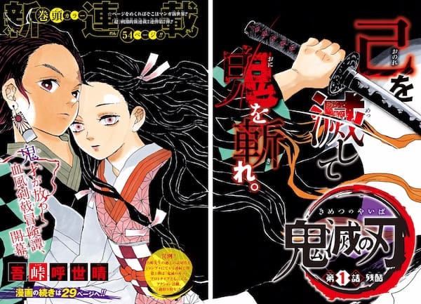
    The final chapter of Demon Slayer (Kimetsu no Yaiba) was published in Weekly Shōnen Jump on May 18, 2020, bringing to an end an excellent shōnen manga that had kept its audience on the edge of their seats since 2016 across 23 volumes.

    But before becoming a bestseller in bookstores, it had to be capable of sparking an enthusiasm and anticipation that would push readers to come back every week for four years.

    In Medias Res

    To achieve this, Koyoharu Gotōge uses the technique known in the West as in medias res. The first description of this way of creating suspense dates back to the Ars Poetica of Horace, a poet of ancient Rome.

    He describes how The Odyssey begins “in the middle of the story” by showing the hero in a miserable position before describing all the events that led him to the situation presented in the first chapter.

    For a more contemporary example in pop culture, let’s take John Wick (David Leitch and Chad Stahelski, 2014). The first seconds of the film show the hero painfully dragging himself out of a car: he is gravely wounded and collapses to the ground.

    Will he survive? What did he do to be at death’s door? The rest of the film picks up the thread of events chronologically.

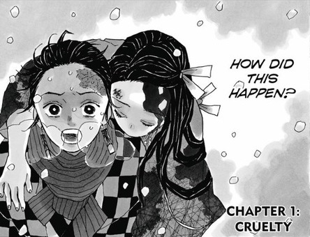
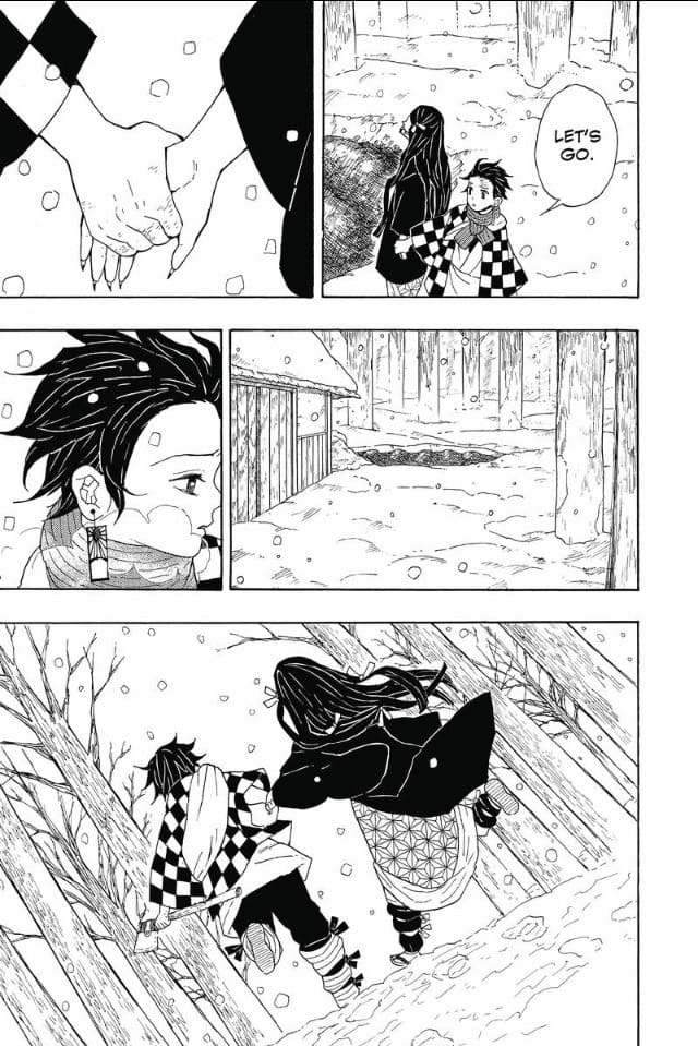
    In Demon Slayer, the incipit or first page shows a teenager in a kimono carrying his unconscious sister on his back. He speaks to her and promises to save her, not to let her die.

    How did it come to this?

    You have to turn the page, and there too the narrative follows the course of events by returning to the starting point.

    This way of telling actions in non-chronological order allows the story to show a dramatic situation from the very first page, which grabs the reader’s attention and leads them to ask questions that the narrative answers as it goes along.

    What’s more, Demon Slayer plays on the reader’s expectations by referencing several manga genres.

    Chambara?

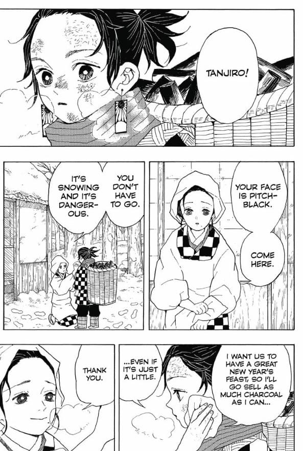
    Tanjirō Kamado is a teenager living in the forest in the mountains with his family. He goes into town to sell charcoal while his brothers and sisters, still too young, stay with his mother. He hopes to return with enough to celebrate the New Year.

    In three pages, a large part of the background is established efficiently. The clothing and setting define a precise time and place.

    The plot takes place in an ancient Japan, which brings it close to jidaigeki, a genre comparable to historical fiction in Europe. Most of the time, these stories take place during the Edo period (1603–1868).

    Since it’s a manga published in Shōnen Jump, one can expect sword fights. This brings it close to the chambara category, in the manner of Rurōni Kenshin(Nobuhiro Watsuki, 1994–1999) or Vagabond (Takehiko Inoue, 1998–ongoing).

    It is originally a cinematic and theatrical genre equivalent to the Western cape-and-sword film. The term chambara corresponds to onomatopoeia indicating the sound of a blade cutting flesh.

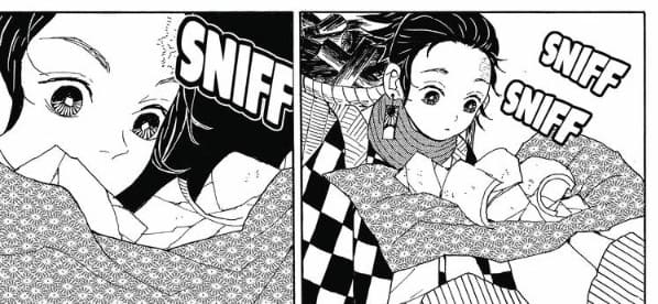
    However, Tanjirō above all seems to be an ordinary boy, not a samurai. The only slightly intriguing thing is that he seems to have a highly developed sense of smell.

    One might assume he will become a warrior, but nothing indicates exceptional physical ability.

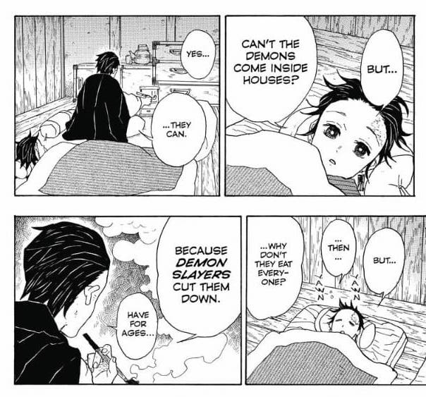
    He even sleeps at an old man’s house, who advises him not to travel at night because of demons. Like the reader, Tanjirō asks an essential question: can demons enter houses to kill the inhabitants?

    No, the old man replies: demon slayers kill them first.

    Zombie?

    This simple dialogue introduces a new variation in the chapter: sword fights will take place between demons and demon slayers.

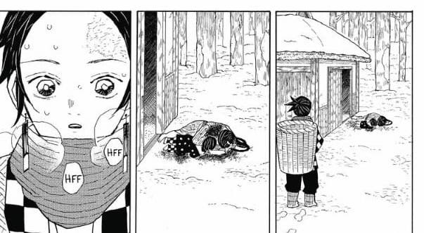
    And even if there is still no warrior by page 13, the dramatic aspect is highlighted in the last panel of the page. A wide shot shows Tanjirō stopped in front of bodies in the snow next to the house.

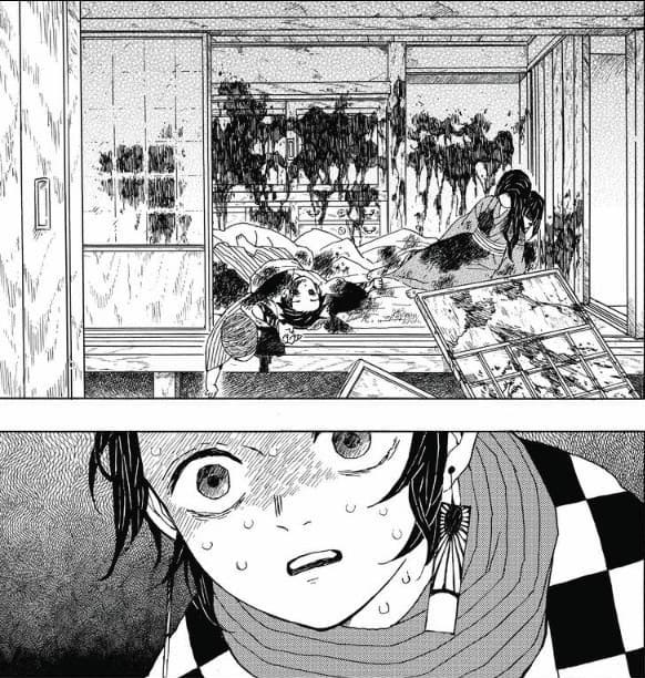
    The tighter framing of the next panel confirms that they are dead. The last panel is a close-up of the hero’s horrified face, which encourages us to turn the page to find out what happened.

    The following double-page spread shows the carnage. Like Tanjirō, the reader discovers that they are all dead.

    Page 20 picks up where the first page began. Tanjirō is carrying his sister Nezuko on his back. She is unconscious and injured but alive.

    Well, almost.

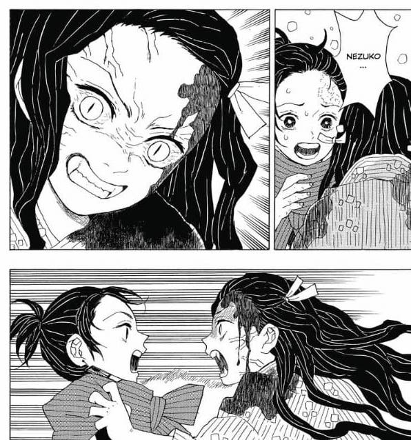
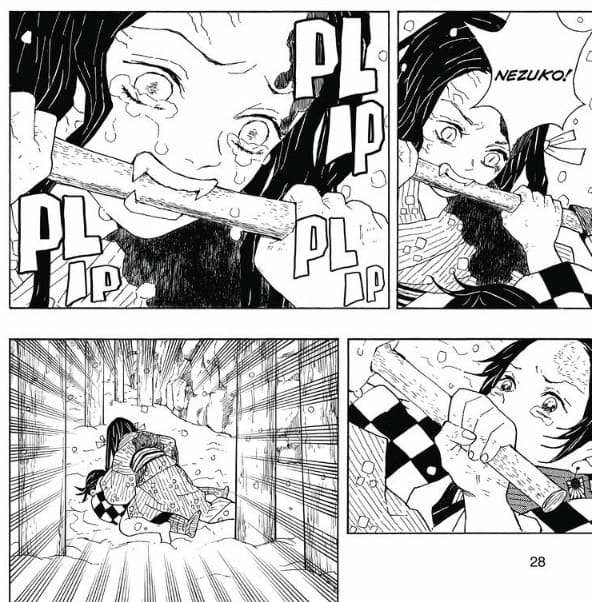
    She wakes up and tries to bite him. She has become a demon. For a Western reader, the depiction brings to mind the undead from Hollywood films.

    The fratricidal struggle is punctuated by Tanjirō’s thoughts. As in Naruto, the reader accesses the hero’s stream of consciousness, which makes the sequence more dramatic. He feels guilty for not having defended his family.

    Nezuko has become a zombie, but the transformation is not complete. She is still able to recognize him. She cries. And one might expect the fight to stop.

    But no.

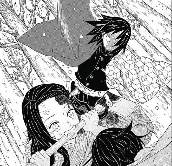
    After an alternation between the faces of the two characters in a form of shot-reverse-shot, the last panel of the page has a wide framing. This makes us understand that another protagonist is watching them.

    He intervenes, attempting to kill Nezuko, but Tanjirō and his sister manage to avoid the sword strike.

    The Hero’s Quest

    Just as the first page is in medias res, the appearance of the new character happens in the middle of the ongoing action. And, as in the first page, Tanjirō’s thoughts correspond to ours in order to encourage reader identification.

    Who is this man?

    This time, Koyoharu Gotōge uses what in Europe is called the topos of the unknown.

    The enigmatic nature heightens the suspense to hold the reader’s attention. The character’s name is only revealed at the end of the chapter: Giyū Tomioka.

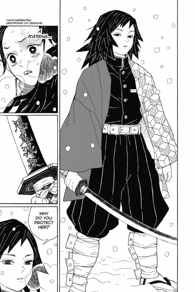
    In the meantime, many clues allow us to understand who he is. A full-body presentation shows his presence.

    One panel serves as an insert on the handle of his katana to suggest that he is one of the demon slayers mentioned by the old man who hosted Tanjirō the night before.

    Giyū’s thoughts let us understand that he has been in the same situation as Tanjirō. This suggests that the hero will also become a demon slayer.

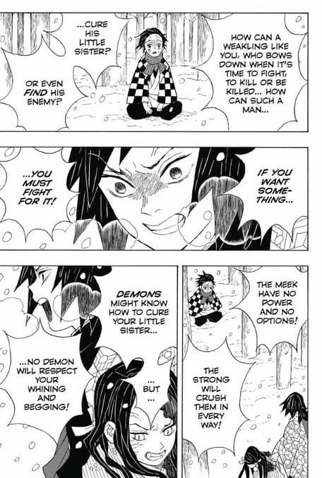
    But for now, the teenager doesn’t have the right attitude. He begs Giyū to spare his sister, which triggers the latter’s anger.

    He especially declares that there is doubtless a remedy known to demons, which launches the hero’s quest. Tanjirō does not draw his strength from anger but from the hope of a cure and love for his sister.

    He manages to save her from Giyū, and Nezuko begins to protect her brother instead of devouring him. Brotherly love weakens the demon slayer’s convictions; he lets them live and advises them to go see a master to find help.

    The first weekly installment of Demon Slayer thus ends with new questions to be resolved in the next chapter.

    Who is Sakonji Urokodaki? What relationship does he have with Giyū? How will this help Tanjirō and Nezuko find a cure? How can they travel without Nezuko devouring someone or being killed?

    These are some of the questions the reader may ask.

    Since this first chapter managed to create mystery (in medias res and the unknown character) while resolving the enigmas initially posed, it is extremely satisfying to read.

    We find the usual motifs of the hero’s quest, but at the same time the author introduces variations that make the whole thing unexpected.

    This incipit is therefore particularly effective in the way it establishes a complex universe and a somewhat unusual sibling relationship. What follows is even more delightful, and it’s not for nothing that the series is so popular.

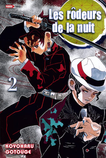
    Panini Manga published a first French version under the title Les Rôdeurs de la nuit (2017–2018) before republishing it with the title Demon Slayer.

    The excerpts used in this article are taken from the official Jump mobile app.

    And if you’ve read this far and enjoyed the article, support this blog by buying me a coffee 🙂